
找到
47
篇与
源码
相关的结果
-
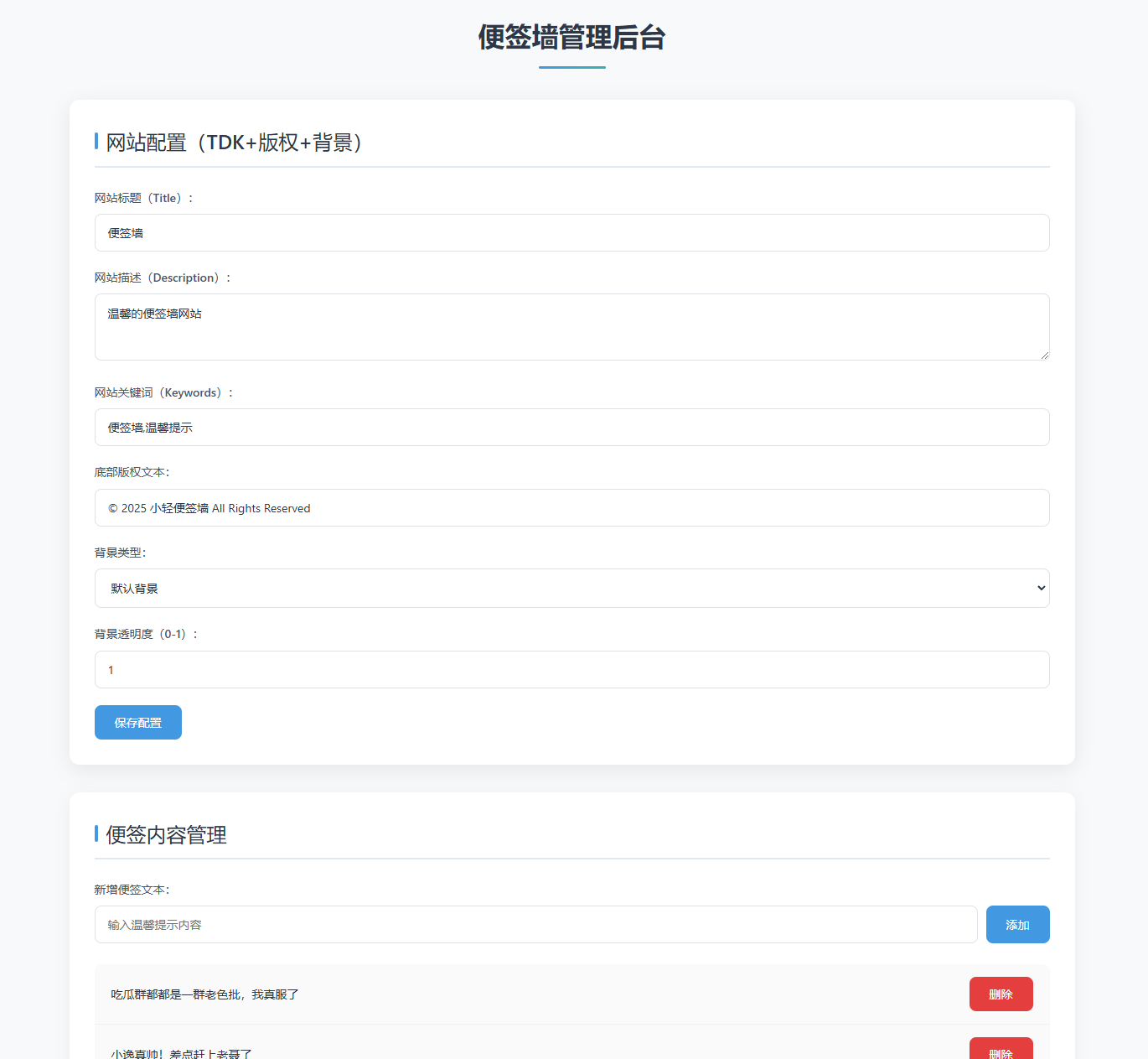
 智能排版小工具 mm0nfh3e.png图片 本工具旨在帮助您快速整理老师们提交的德育案例、校刊稿件、教学手册等 Word 文档,自动识别标题层级,并允许您对文字样式进行局部调整,最终导出格式规范的 Word 或 PDF 文件。 ✨ 主要功能: 支持上传 ZIP 压缩包(内含 .docx 文件或嵌套 ZIP),自动解压并提取所有文档。自动识别常见的标题序号(如“一、”“(一)”“1.”“1.1”等)及无序号标题(如“背景:”“总结”),并按首次出现顺序分配层级。在预览区可以直接修改文字内容(点击文字即可编辑)。用鼠标选中文字后,可通过操作台单独修改选中部分的字体、字号、颜色。将当前预览内容(含图片、样式)导出为 .doc 文件,可用 Microsoft Word 打开。通过浏览器打印功能生成 PDF 文件,保留所有排版和图片。 <!DOCTYPE html> <html lang="zh"> <head> <meta charset="UTF-8"> <meta name="viewport" content="width=device-width, initial-scale=1.0"> <title>智能校刊排版 · 选中编辑版</title> <style> * { box-sizing: border-box; } body { font-family: 'Segoe UI', Roboto, 'Helvetica Neue', sans-serif; background-color: #f5f3f0; margin: 0; min-height: 100vh; display: flex; align-items: center; justify-content: center; padding: 20px; } .card { max-width: 1300px; width: 100%; background: white; border-radius: 28px; box-shadow: 0 25px 50px -12px rgba(0,0,0,0.3); padding: 35px; } h1 { margin-top: 0; color: #3a2c1b; font-weight: 400; border-left: 6px solid #b78c5a; padding-left: 20px; font-size: 2.2rem; } .sub { color: #6b5a48; margin-bottom: 30px; font-style: italic; } .upload-area { border: 2px dashed #c9b69c; border-radius: 32px; padding: 40px 20px; text-align: center; background: #fefcf9; transition: background 0.2s; cursor: pointer; } .upload-area:hover { background: #f9f3ea; } .upload-icon { font-size: 48px; margin-bottom: 10px; color: #b78c5a; } /* 操作台样式 */ .toolbar { background: #f0e9e0; border-radius: 50px; padding: 15px 25px; margin: 20px 0; display: flex; flex-wrap: wrap; gap: 15px; align-items: center; justify-content: center; } .tool-item { display: flex; align-items: center; gap: 8px; } .tool-item label { font-weight: 500; color: #5e4b36; font-size: 0.9rem; } .tool-item select, .tool-item input[type="number"], .tool-item input[type="color"] { padding: 6px 10px; border: 1px solid #dcd0c0; border-radius: 30px; background: white; font-size: 0.9rem; } .tool-item input[type="number"] { width: 70px; } .style-btn { background: #b78c5a; color: white; border: none; padding: 6px 18px; border-radius: 30px; cursor: pointer; font-weight: 500; font-size: 0.9rem; margin-left: 5px; } .style-btn:hover { background: #a07344; } .btn-group { display: flex; gap: 15px; flex-wrap: wrap; margin: 20px 0 20px; justify-content: center; } button { background: #b78c5a; border: none; color: white; padding: 12px 30px; border-radius: 40px; font-size: 1.1rem; font-weight: 500; cursor: pointer; box-shadow: 0 8px 16px -4px rgba(140,90,40,0.3); transition: all 0.2s; border: 1px solid transparent; min-width: 140px; } button:disabled { opacity: 0.4; pointer-events: none; filter: grayscale(0.5); } button.secondary { background: #ece3d9; color: #5e4b36; box-shadow: none; } button.secondary:hover { background: #dfd2c2; } button:hover { background: #a07344; transform: translateY(-2px); } .preview { background: #fefcf9; border-radius: 20px; border: 1px solid #e7dccc; padding: 25px; margin-top: 20px; } .preview h3 { margin-top: 0; color: #4e3e2b; font-weight: 400; display: flex; align-items: center; gap: 8px; } /* 预览容器 */ .preview-content { background: white; border-radius: 16px; padding: 2cm 2cm 2cm 2cm; max-height: 600px; overflow-y: auto; box-shadow: inset 0 0 0 1px #eee7de; font-family: '宋体', 'SimSun', serif; font-size: 10.5pt; line-height: 1.5; outline: none; } /* 标题样式(基础结构,字体大小固定) */ .preview-content .chapter-title { font-family: '黑体', 'Hei', sans-serif; font-size: 18pt; font-weight: bold; text-align: center; margin: 24pt 0 18pt 0; } .preview-content .h1 { font-family: '黑体', 'Hei', sans-serif; font-size: 16pt; font-weight: bold; margin: 18pt 0 12pt 0; } .preview-content .h2 { font-family: '黑体', 'Hei', sans-serif; font-size: 14pt; font-weight: bold; margin: 12pt 0 6pt 0; } .preview-content .h3 { font-family: '黑体', 'Hei', sans-serif; font-size: 12pt; font-weight: bold; margin: 6pt 0 3pt 0; } .preview-content .h4 { font-family: '黑体', 'Hei', sans-serif; font-size: 11pt; font-weight: bold; margin: 3pt 0 3pt 0; } .preview-content .h5 { font-family: '黑体', 'Hei', sans-serif; font-size: 10.5pt; font-weight: bold; margin: 3pt 0 3pt 0; } .preview-content p { font-family: '宋体', 'SimSun', serif; font-size: 10.5pt; line-height: 1.5; margin: 0 0 0 0; text-indent: 2em; text-align: justify; } .preview-content .image-container { text-align: center; margin: 12pt 0; } .preview-content .image-container img { max-width: 100%; height: auto; display: block; margin: 0 auto; } .status { margin: 15px 0; padding: 12px; border-radius: 40px; background: #f0e9e0; color: #3f352b; text-align: center; font-weight: 500; min-height: 60px; display: flex; align-items: center; justify-content: center; word-break: break-word; } .footer-note { margin-top: 20px; font-size: 0.8rem; color: #9b8c7a; text-align: center; } hr { border: none; border-top: 1px solid #e2d7cb; margin: 20px 0; } @media print { body * { visibility: hidden; } .printable-area, .printable-area * { visibility: visible; } .printable-area { position: absolute; left: 0; top: 0; width: 100%; background: white; padding: 2cm 2cm 2cm 2cm !important; margin: 0; box-shadow: none; max-height: none; overflow: visible; } .toolbar, .btn-group, .upload-area, .preview h3, .status, .footer-note, hr { display: none !important; } } </style> <!-- 核心库 --> <script src="https://cdnjs.cloudflare.com/ajax/libs/jszip/3.10.1/jszip.min.js"></script> <script>if (typeof JSZip === 'undefined') document.write('<script src="https://unpkg.com/jszip@3.10.1/dist/jszip.min.js"><\/script>');</script> <script src="https://cdnjs.cloudflare.com/ajax/libs/mammoth/1.6.0/mammoth.browser.min.js"></script> <script>if (typeof mammoth === 'undefined') document.write('<script src="https://unpkg.com/mammoth@1.6.0/mammoth.browser.min.js"><\/script>');</script> <script src="https://cdnjs.cloudflare.com/ajax/libs/FileSaver.js/2.0.5/FileSaver.min.js"></script> <script>if (typeof saveAs === 'undefined') document.write('<script src="https://unpkg.com/file-saver@2.0.5/dist/FileSaver.min.js"><\/script>');</script> </head> <body> <div class="card"> <h1>📚 智能校刊排版 · 选中编辑版</h1> <div class="sub">先选中文字,再点击操作台按钮修改选中内容的样式</div> <!-- 上传区域 --> <div class="upload-area" id="dropZone"> <div class="upload-icon">📂</div> <div><strong>点击选择 或 拖拽ZIP到此</strong></div> <div style="font-size:0.9rem; margin-top:8px; color:#7f6e5b;">支持多级标题,图片自动居中</div> <input type="file" id="fileInput" accept=".zip,application/zip" style="display:none;"> </div> <!-- 操作台(选中编辑版) --> <div class="toolbar" id="toolbar"> <div class="tool-item"> <label>字体</label> <select id="fontSelect"> <option value="宋体">宋体</option> <option value="黑体">黑体</option> <option value="楷体">楷体</option> <option value="仿宋">仿宋</option> <option value="微软雅黑">微软雅黑</option> </select> <button class="style-btn" id="applyFontBtn">应用</button> </div> <div class="tool-item"> <label>字号</label> <select id="fontSizeSelect"> <option value="1">8pt (极小)</option> <option value="2">10pt (小)</option> <option value="3" selected>12pt (正常)</option> <option value="4">14pt (中)</option> <option value="5">18pt (大)</option> <option value="6">24pt (很大)</option> <option value="7">36pt (极大)</option> </select> <button class="style-btn" id="applySizeBtn">应用</button> </div> <div class="tool-item"> <label>字色</label> <input type="color" id="colorInput" value="#000000"> <button class="style-btn" id="applyColorBtn">应用</button> </div> </div> <!-- 状态和按钮组 --> <div class="status" id="statusMsg">⏳ 等待上传压缩包</div> <div class="btn-group"> <button id="processBtn" disabled>🧠 智能顺序定级</button> <button id="downloadWordBtn" disabled class="secondary">📄 导出 Word (.doc)</button> <button id="printPdfBtn" disabled class="secondary">🖨️ 打印 / PDF</button> </div> <!-- 预览区域 (可编辑) --> <div class="preview"> <h3>🔍 可编辑预览 (选中文字后修改样式)</h3> <div class="preview-content" id="previewContent" contenteditable="true"> <p style="color:#b7a48e; text-align:center;">上传并解析后点击「智能顺序定级」生成预览</p> </div> </div> <div class="footer-note">※ 选中文字后点击操作台按钮,可单独修改选中部分的样式</div> </div> <script> (function() { // DOM 元素 const dropZone = document.getElementById('dropZone'); const fileInput = document.getElementById('fileInput'); const statusMsg = document.getElementById('statusMsg'); const processBtn = document.getElementById('processBtn'); const downloadWordBtn = document.getElementById('downloadWordBtn'); const printPdfBtn = document.getElementById('printPdfBtn'); const previewContent = document.getElementById('previewContent'); // 操作台按钮 const applyFontBtn = document.getElementById('applyFontBtn'); const applySizeBtn = document.getElementById('applySizeBtn'); const applyColorBtn = document.getElementById('applyColorBtn'); const fontSelect = document.getElementById('fontSelect'); const fontSizeSelect = document.getElementById('fontSizeSelect'); const colorInput = document.getElementById('colorInput'); // 全局数据 let chapters = []; let hasError = false; // ---------- 选中编辑功能 ---------- // 使用 mousedown 而不是 click,防止按钮点击导致选区丢失 applyFontBtn.addEventListener('mousedown', (e) => { e.preventDefault(); // 阻止默认行为,避免失去焦点 const font = fontSelect.value; document.execCommand('fontName', false, font); }); applySizeBtn.addEventListener('mousedown', (e) => { e.preventDefault(); const size = fontSizeSelect.value; // 1-7 的数字 document.execCommand('fontSize', false, size); }); applyColorBtn.addEventListener('mousedown', (e) => { e.preventDefault(); const color = colorInput.value; document.execCommand('foreColor', false, color); }); // ---------- 状态更新 ---------- function setStatus(msg, isError = false, isWarning = false) { statusMsg.innerText = msg; if (isError) { statusMsg.style.background = '#ffded9'; statusMsg.style.color = '#b33c2f'; } else if (isWarning) { statusMsg.style.background = '#fff3d6'; statusMsg.style.color = '#8a6d3b'; } else { statusMsg.style.background = '#f0e9e0'; statusMsg.style.color = '#3f352b'; } } function escapeHtml(unsafe) { return unsafe.replace(/[&<>"']/g, function(m) { if(m === '&') return '&'; if(m === '<') return '<'; if(m === '>') return '>'; if(m === '"') return '"'; return '''; }); } function extractTitleFromFilename(path) { let fileName = path.split('/').pop(); fileName = fileName.replace(/\.docx$/i, '').replace(/[_-]/g, ' '); return fileName || '未命名案例'; } // ---------- 递归解压ZIP ---------- async function extractAllFiles(zipFile) { let fileEntries = []; try { const rootZip = await JSZip.loadAsync(zipFile); const queue = [{ zip: rootZip, pathPrefix: '' }]; while (queue.length > 0) { const { zip, pathPrefix } = queue.shift(); const entries = Object.keys(zip.files); for (const relPath of entries) { const zipEntry = zip.files[relPath]; if (zipEntry.dir) continue; const fullPath = pathPrefix ? `${pathPrefix}/${relPath}` : relPath; try { if (relPath.toLowerCase().endsWith('.zip')) { const data = await zipEntry.async('arraybuffer'); const nestedZip = await JSZip.loadAsync(data); queue.push({ zip: nestedZip, pathPrefix: fullPath.replace(/\.zip$/i, '') }); } else { const data = await zipEntry.async('arraybuffer'); fileEntries.push({ path: fullPath, data: data }); } } catch (innerErr) { console.warn('跳过文件:', fullPath, innerErr); setStatus(`⚠️ 文件 ${fullPath} 解压失败,已跳过`, false, true); } } } } catch (err) { throw new Error('解压失败: ' + err.message); } return fileEntries; } // 提取 HTML(含图片) async function extractHtmlFromDocx(arrayBuffer) { const result = await mammoth.convertToHtml({ arrayBuffer }); return result.value; } // 上传处理 async function handleFileUpload(file) { setStatus('📦 正在解压...'); hasError = false; try { const allFiles = await extractAllFiles(file); const docxFiles = allFiles.filter(f => f.path.toLowerCase().endsWith('.docx')); if (docxFiles.length === 0) { setStatus('❌ 未找到 .docx 文件', true); return false; } setStatus(`🔍 找到 ${docxFiles.length} 个文档,提取中...`); docxFiles.sort((a, b) => a.path.localeCompare(b.path, 'zh')); const chapterPromises = docxFiles.map(async (file) => { try { const html = await extractHtmlFromDocx(file.data); const plainText = html.replace(/<[^>]*>/g, '').replace(/\s+/g, ' ').trim(); const paragraphs = plainText.split(/\n/).filter(p => p.trim().length > 0); return { title: extractTitleFromFilename(file.path), html: html, paragraphs: paragraphs }; } catch (err) { console.error('解析失败:', file.path, err); hasError = true; return { title: extractTitleFromFilename(file.path), html: '<p>文档解析错误</p>', paragraphs: ['[文档解析错误]'] }; } }); chapters = await Promise.all(chapterPromises); if (hasError) { setStatus('✅ 解析完成(部分错误),可点击「智能顺序定级」', false, true); } else { setStatus(`✅ 解析完成,共 ${chapters.length} 章`); } return true; } catch (err) { setStatus('❌ 解压失败:' + err.message, true); return false; } } // ---------- 标题识别 ---------- const headingKeywords = [ '摘要','引言','前言','背景','目的','意义','对象','方法','过程','结果', '分析','讨论','结论','建议','反思','总结','附录','参考文献','注','说明', '关键词','概述','缘由','思路','举措','成效','思考','问题','对策','缘由', '基本情况','主要做法','取得成效','存在不足','下一步打算','案例描述', '案例反思','案例背景','案例过程','案例分析','案例启示','教育建议', '教育对策','教育反思','教育叙事','教育案例','德育案例','管理案例' ]; function detectTitlePattern(text) { const trimmed = text.trim(); if (!trimmed || trimmed.length > 80 || trimmed.length < 2) return null; const patterns = [ { name: 'chinese_num', regex: /^\s*[一二三四五六七八九十百千]+[、..]/ }, { name: 'paren_chinese', regex: /^\s*[((][一二三四五六七八九十百千]+[))]/ }, { name: 'arabic_num', regex: /^\s*\d+[、..]/ }, { name: 'paren_arabic', regex: /^\s*[((]\d+[))]/ }, { name: 'multi_arabic', regex: /^\s*\d+(\.\d+)+[\s\.::]?/ } ]; for (let p of patterns) if (p.regex.test(trimmed)) return p.name; if (/[。!?;]$/.test(trimmed)) return null; if (/[::]/.test(trimmed)) { let parts = trimmed.split(/[::]/); if (parts[0].length < 25) return 'plain_heading'; } if (headingKeywords.includes(trimmed)) return 'plain_heading'; for (let kw of headingKeywords) if (trimmed.startsWith(kw) && trimmed.length < 30) return 'plain_heading'; return null; } function enhanceHeadingDetection(paragraphs) { let candidates = []; paragraphs.forEach((para, idx) => { let pattern = detectTitlePattern(para); if (pattern) candidates.push({ idx, pattern }); }); let order = []; let seen = new Set(); candidates.forEach(c => { if (!seen.has(c.pattern)) { seen.add(c.pattern); order.push(c.pattern); } }); const levelMap = {}; order.forEach((p, i) => { if (i === 0) levelMap[p] = 'h1'; else if (i === 1) levelMap[p] = 'h2'; else if (i === 2) levelMap[p] = 'h3'; else if (i === 3) levelMap[p] = 'h4'; else levelMap[p] = 'h5'; }); let classified = paragraphs.map((text, idx) => { let cand = candidates.find(c => c.idx === idx); return { text, level: cand ? levelMap[cand.pattern] : 'body' }; }); for (let i = 0; i < classified.length; i++) { if (classified[i].level === 'body') { let t = classified[i].text; if (t.length < 40 && !/[。!?;]$/.test(t)) { let prevLevel = i > 0 ? classified[i-1].level : null; let nextLevel = i < classified.length-1 ? classified[i+1].level : null; if (prevLevel && prevLevel.startsWith('h')) { classified[i].level = prevLevel; } else if (nextLevel && nextLevel.startsWith('h')) { classified[i].level = nextLevel; } } } } return classified; } // 构建预览HTML function buildPreviewHtmlFromChapters() { if (!chapters.length) return '<p style="color:#b7a48e;">请先上传并解析文档</p>'; let html = ''; for (const ch of chapters) { if (!ch.classified) continue; html += `<div class="chapter-title">${escapeHtml(ch.title)}</div>`; const tempDiv = document.createElement('div'); tempDiv.innerHTML = ch.html; const children = Array.from(tempDiv.children); if (children.length === ch.classified.length) { for (let i = 0; i < children.length; i++) { const elem = children[i]; const level = ch.classified[i].level; if (level.startsWith('h')) { const wrapper = document.createElement('div'); wrapper.className = level; wrapper.innerHTML = elem.innerHTML; html += wrapper.outerHTML; } else { html += elem.outerHTML; } } } else { let content = ch.html .replace(/<h1>/g, '<div class="h1">').replace(/<\/h1>/g, '</div>') .replace(/<h2>/g, '<div class="h2">').replace(/<\/h2>/g, '</div>') .replace(/<h3>/g, '<div class="h3">').replace(/<\/h3>/g, '</div>') .replace(/<h4>/g, '<div class="h4">').replace(/<\/h4>/g, '</div>') .replace(/<h5>/g, '<div class="h5">').replace(/<\/h5>/g, '</div>') .replace(/<h6>/g, '<div class="h5">').replace(/<\/h6>/g, '</div>') .replace(/<img([^>]+)>/g, '<div class="image-container"><img$1></div>'); html += content; } html += `<div style="page-break-before: always; margin: 0;"></div>`; } return html; } function updatePreview() { let html = buildPreviewHtmlFromChapters(); previewContent.innerHTML = html; } // 下载函数 function downloadBlob(blob, filename) { return new Promise((resolve, reject) => { try { if (typeof window.saveAs === 'function') { window.saveAs(blob, filename); resolve(); } else { const url = window.URL.createObjectURL(blob); const a = document.createElement('a'); a.href = url; a.download = filename; document.body.appendChild(a); a.click(); setTimeout(() => { document.body.removeChild(a); window.URL.revokeObjectURL(url); resolve(); }, 100); } } catch (err) { reject(err); } }); } // 事件绑定 dropZone.addEventListener('click', () => fileInput.click()); dropZone.addEventListener('dragover', (e) => e.preventDefault()); dropZone.addEventListener('drop', async (e) => { e.preventDefault(); const file = e.dataTransfer.files[0]; if (file && (file.type === 'application/zip' || file.name.endsWith('.zip'))) { const success = await handleFileUpload(file); if (success) { processBtn.disabled = false; downloadWordBtn.disabled = true; printPdfBtn.disabled = true; } } else { setStatus('请上传ZIP压缩包', true); } }); fileInput.addEventListener('change', async (e) => { const file = e.target.files[0]; if (file) { const success = await handleFileUpload(file); if (success) { processBtn.disabled = false; downloadWordBtn.disabled = true; printPdfBtn.disabled = true; } } }); processBtn.addEventListener('click', () => { if (!chapters.length) { setStatus('请先上传有效压缩包', true); return; } try { for (let i = 0; i < chapters.length; i++) { chapters[i].classified = enhanceHeadingDetection(chapters[i].paragraphs); } updatePreview(); downloadWordBtn.disabled = false; printPdfBtn.disabled = false; setStatus('🎯 标题识别完成,可选中文字修改样式'); } catch (err) { setStatus('❌ 处理失败: ' + err.message, true); } }); // 导出 Word downloadWordBtn.addEventListener('click', async () => { if (!chapters.length) { setStatus('没有可导出的内容', true); return; } setStatus('📄 正在准备导出 Word 文件...'); try { const fullHtml = previewContent.innerHTML; const styles = document.querySelector('style').innerHTML; const fullDocument = `<!DOCTYPE html> <html> <head> <meta charset="UTF-8"> <style> ${styles} .preview-content { padding: 2cm; max-height: none; overflow: visible; } body { margin: 0; background: white; } </style> </head> <body> <div class="preview-content"> ${fullHtml} </div> </body> </html>`; const blob = new Blob([fullDocument], { type: 'application/msword' }); await downloadBlob(blob, '校刊排版.doc'); setStatus('✅ 文档已导出为 .doc 格式'); } catch (err) { console.error(err); setStatus('❌ 导出失败: ' + err.message, true); } }); // 打印 PDF printPdfBtn.addEventListener('click', () => { if (!chapters.length) { setStatus('没有可打印的内容', true); return; } previewContent.classList.add('printable-area'); setTimeout(() => window.print(), 50); window.addEventListener('afterprint', function onAfterPrint() { previewContent.classList.remove('printable-area'); window.removeEventListener('afterprint', onAfterPrint); }); }); // 初始预览 previewContent.innerHTML = '<p style="color:#b7a48e; text-align:center;">上传并解析后点击「智能顺序定级」预览</p>'; })(); </script> </body> </html>
-
分享一个网站维护中的网页源码 用豆包帮忙写的,分享给大家! mkwvf5xm.png图片 源码完整版: <!DOCTYPE html> <html lang="zh-CN"> <head> <meta charset="UTF-8"> <meta name="viewport" content="width=device-width, initial-scale=1.0"> <title>网站升级维护中 - 敬请期待</title> <!-- 引入 Tailwind CSS --> <script src="https://cdn.tailwindcss.com"></script> <!-- 引入 Font Awesome 图标 --> <link rel="stylesheet" href="https://cdnjs.cloudflare.com/ajax/libs/font-awesome/6.5.1/css/all.min.css"> <!-- 自定义 Tailwind 配置 --> <script> tailwind.config = { theme: { extend: { colors: { primary: '#3b82f6', // 主色调:蓝色 secondary: '#f97316', // 强调色:橙色 neutral: '#1f2937', // 中性色:深灰 }, fontFamily: { sans: ['Inter', 'system-ui', 'sans-serif'], }, } } } </script> <!-- 自定义工具类 --> <style type="text/tailwindcss"> @layer utilities { .content-auto { content-visibility: auto; } .text-shadow { text-shadow: 0 2px 4px rgba(0,0,0,0.1); } .bg-gradient { background: linear-gradient(135deg, #eff6ff 0%, #dbeafe 100%); } } </style> </head> <body class="min-h-screen bg-gradient flex flex-col items-center justify-center px-4 py-8 font-sans text-neutral"> <!-- 页面容器 --> <div class="max-w-lg w-full bg-white rounded-2xl shadow-xl p-8 md:p-10 transform transition-all duration-300 hover:shadow-2xl"> <!-- 图标区域 --> <div class="flex justify-center mb-6"> <div class="w-24 h-24 bg-primary/10 rounded-full flex items-center justify-center"> <i class="fa-solid fa-gears text-5xl text-primary animate-spin [animation-duration:3s]"></i> </div> </div> <!-- 标题和描述 --> <div class="text-center mb-8"> <h1 class="text-[clamp(1.8rem,4vw,2.5rem)] font-bold text-neutral mb-4 text-shadow">网站升级维护中</h1> <p class="text-gray-600 text-lg leading-relaxed mb-6"> 为了给你提供更好的服务体验,我们正在对网站进行升级优化。 升级期间网站暂时无法访问,给你带来不便,敬请谅解。 </p> <!-- 预计恢复时间 --> <div class="bg-secondary/10 rounded-lg p-4 inline-block mb-4"> <p class="text-secondary font-semibold"> <i class="fa-solid fa-clock mr-2"></i> 预计恢复时间:2026年02月01日 08:00 </p> </div> </div> <!-- 联系方式 --> <div class="border-t border-gray-200 pt-6 text-center"> <h2 class="font-semibold text-lg mb-4">如有紧急需求,请通过以下方式联系我们</h2> <div class="flex flex-col md:flex-row justify-center gap-4"> <a href="tel:4008888888" class="flex items-center justify-center gap-2 bg-primary/5 hover:bg-primary/10 transition-colors rounded-lg px-6 py-3"> <i class="fa-solid fa-phone text-primary"></i> <span class="text-primary font-medium">400-888-8888</span> </a> <a href="mailto:support@example.com" class="flex items-center justify-center gap-2 bg-primary/5 hover:bg-primary/10 transition-colors rounded-lg px-6 py-3"> <i class="fa-solid fa-envelope text-primary"></i> <span class="text-primary font-medium">support@example.com</span> </a> </div> </div> <!-- 页脚 --> <div class="mt-8 text-center text-gray-500 text-sm"> <p>© 2026 你的公司名称 版权所有</p> </div> </div> <!-- 页面加载动画(可选) --> <script> // 页面加载完成后的简单动画效果 document.addEventListener('DOMContentLoaded', () => { const container = document.querySelector('.max-w-lg'); container.classList.add('opacity-100'); container.classList.remove('opacity-0'); }); </script> </body> </html>
-
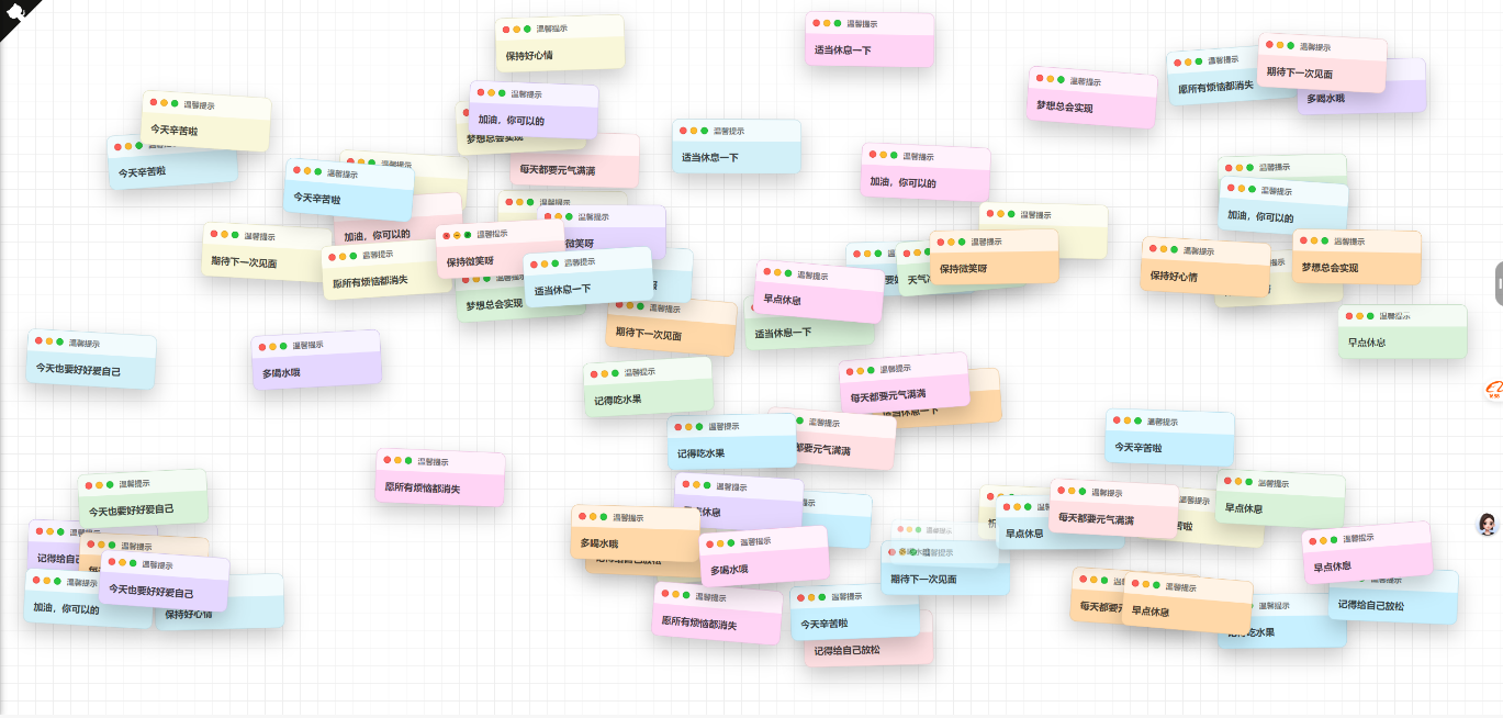
发现一个有趣的便签墙网站 发现一个不错的网站,这个网站作者是:https://github.com/uninto/notes,纯html、css、js实现。 有人说这个类似之前的许愿墙,我觉得也可以把这个元素加进去,毕竟我群里很多宅男腐女,最喜欢这个玩意儿了,晚些我直接上线到我的工具箱里 mhgb3msq.png图片 因为这个只有一个前端页面,代码如下,我就准备做个后端出来,到时候重新开个帖子,供大家使用。 <html lang="zh-CN"> <head> <meta charset="UTF-8" /> <meta name="viewport" content="width=device-width, initial-scale=1.0" /> <title>便签墙</title> <style> * { box-sizing: border-box; margin: 0; padding: 0; } body { font-family: -apple-system, BlinkMacSystemFont, 'Segoe UI', sans-serif; background-image: linear-gradient(0deg, #eee 1px, transparent 0), linear-gradient(90deg, #eee 1px, transparent 0); background-size: 30px 30px; color: #333; min-height: 100dvh; overflow: hidden; } body.has-maximized-card { overflow: hidden; } body.is-mobile { overflow-y: auto; } #board { position: relative; width: 100vw; height: 100dvh; overflow: hidden; } body.is-mobile #board { height: auto; min-height: 100dvh; } .card { position: absolute; width: 220px; border-radius: 12px; box-shadow: 0 16px 35px rgba(0, 0, 0, 0.2); background: #fff; border: 1px solid rgba(0, 0, 0, 0.08); overflow: hidden; opacity: 0; transform-origin: center; transition: transform 0.35s ease, opacity 0.35s ease, left 0.35s ease, top 0.35s ease, width 0.35s ease, height 0.35s ease, border-radius 0.35s ease; } .card.dragging { transition: none; box-shadow: 0 22px 45px rgba(0, 0, 0, 0.35); } .card.maximized { position: fixed; inset: 0; width: 100vw; height: 100vh; height: 100dvh; border-radius: 0; box-shadow: 0 28px 60px rgba(0, 0, 0, 0.4); } .card-header { display: flex; align-items: center; justify-content: space-between; padding: 10px 12px; background: rgba(255, 255, 255, 0.7); cursor: grab; user-select: none; touch-action: pan-y; } .card-header.dragging { cursor: grabbing; } .window-controls { display: flex; align-items: center; gap: 6px; } .window-controls .control { position: relative; width: 12px; height: 12px; border-radius: 50%; border: 1px solid rgba(0, 0, 0, 0.08); background: #ccc; cursor: pointer; outline: none; padding: 0; display: inline-flex; align-items: center; justify-content: center; } .window-controls .control.close { background: #ff5f57; border-color: #e0443e; } .window-controls .control.minimize { background: #febb2e; border-color: #dea123; } .window-controls .control.maximize { background: #28c840; border-color: #1aab2c; } .window-controls .control::after { content: ''; position: absolute; top: 50%; left: 50%; transform: translate(-50%, -50%); opacity: 0; transition: opacity 0.2s ease; } .card-header:hover .window-controls .control::after { opacity: 0.8; } .window-controls .control.close::after { content: '×'; width: auto; height: auto; background: none; font-size: 10px; line-height: 1; font-weight: 700; color: rgba(0, 0, 0, 0.7); } .window-controls .control.minimize::after { width: 6px; height: 2px; background: rgba(0, 0, 0, 0.6); } .window-controls .control.maximize::after { width: 6px; height: 6px; background: linear-gradient( 45deg, rgba(0, 0, 0, 0.6) 0%, rgba(0, 0, 0, 0.6) 45%, transparent 45%, transparent 55%, rgba(0, 0, 0, 0.6) 55%, rgba(0, 0, 0, 0.6) 100% ); } .card-title { font-size: 13px; font-weight: 600; color: rgba(0, 0, 0, 0.55); padding-left: 10px; flex: 1; } .card-body { padding: 16px; font-size: 16px; line-height: 1.4; font-weight: 600; color: rgba(0, 0, 0, 0.72); word-break: break-word; overflow-wrap: anywhere; white-space: normal; } .card.maximized { display: flex; flex-direction: column; } .card.maximized .card-title { display: none; } .card.maximized .card-body { flex: 1; display: flex; align-items: center; justify-content: center; width: 100%; height: 100%; text-align: center; padding: clamp(32px, min(10vw, 10vh), 128px); padding-top: clamp(72px, min(14vw, 14vh), 192px); font-size: clamp(48px, min(18vw, 18vh), 200px); line-height: 1.05; } @media (max-width: 768px) { .card { width: 180px; border-radius: 10px; } .card-body { padding: 14px; font-size: 14px; } .card-title { font-size: 12px; } } </style> </head> <body> <div id="board"></div> <script> const board = document.getElementById('board') const messages = [ '保持好心情', '多喝水哦', '今天辛苦啦', '早点休息', '记得吃水果', '加油,你可以的', '祝你顺利', '保持微笑呀', '愿所有烦恼都消失', '期待下一次见面', '梦想总会实现', '天气冷了,多穿衣服', '记得给自己放松', '每天都要元气满满', '今天也要好好爱自己', '适当休息一下' ] const colors = [ '#ffe0e3', '#c7f0ff', '#ffd8a8', '#d9f2d9', '#e5d7ff', '#f9f7d9', '#d2f0f8', '#ffd4f5' ] const cardStates = new WeakMap() // Reserve a very high层级给全屏卡片,避免被后续元素覆盖 const MAXIMIZED_LAYER = 1000000 let activeMaximizedCard = null const pointerMediaQuery = window.matchMedia('(pointer: coarse)') let isMobile = pointerMediaQuery.matches || window.innerWidth <= 768 let maxCards = isMobile ? 120 : 180 // 限制 DOM 节点数量,减轻移动端压力 const initialCardCount = isMobile ? 18 : 30 let spawnInterval = isMobile ? 700 : 400 let zIndexCursor = 200 let spawnTimer = null document.body.classList.toggle('is-mobile', isMobile) function randomFrom(array) { return array[Math.floor(Math.random() * array.length)] } function clamp(value, min, max) { return Math.min(Math.max(value, min), max) } function applyTransform(card, state) { const scale = state.scale ?? 1 const angle = state.angle ?? 0 card.style.transform = `scale(${scale}) rotate(${angle}deg)` } function bringToFront(card) { if (card === activeMaximizedCard) { card.style.zIndex = MAXIMIZED_LAYER return } zIndexCursor += 1 if (activeMaximizedCard && zIndexCursor >= MAXIMIZED_LAYER) { zIndexCursor = MAXIMIZED_LAYER - 1 } card.style.zIndex = zIndexCursor } function updateBodyMaximizedState() { document.body.classList.toggle( 'has-maximized-card', Boolean(activeMaximizedCard) ) } function scheduleNextSpawn() { clearTimeout(spawnTimer) spawnTimer = setTimeout(() => { if (!document.hidden) { createCard() } scheduleNextSpawn() }, spawnInterval) } function syncMobileMode() { const nextIsMobile = pointerMediaQuery.matches || window.innerWidth <= 768 if (nextIsMobile === isMobile) return isMobile = nextIsMobile maxCards = isMobile ? 120 : 180 spawnInterval = isMobile ? 700 : 400 document.body.classList.toggle('is-mobile', isMobile) scheduleNextSpawn() } function handleBoardClick(event) { const control = event.target.closest('.control') if (!control) return const card = control.closest('.card') if (!card || !board.contains(card)) return event.preventDefault() if (control.classList.contains('close')) { closeCard(card) } else if (control.classList.contains('minimize')) { minimizeCard(card) } else if (control.classList.contains('maximize')) { toggleMaximize(card) } } function handleBoardPointerDown(event) { const card = event.target.closest('.card') if (!card || !board.contains(card)) return const control = event.target.closest('.control') const header = event.target.closest('.card-header') const pointerType = event.pointerType || 'mouse' const isPrimaryPointer = event.isPrimary !== false if ( header && !control && pointerType !== 'touch' && isPrimaryPointer ) { startDrag(event, card) return } bringToFront(card) } function handleBoardDoubleClick(event) { const header = event.target.closest('.card-header') if (!header || event.target.closest('.control')) return const card = header.closest('.card') if (!card || !board.contains(card)) return toggleMaximize(card) } board.addEventListener('click', handleBoardClick) board.addEventListener('pointerdown', handleBoardPointerDown) board.addEventListener('dblclick', handleBoardDoubleClick) function closeCard(card) { const state = cardStates.get(card) if (!state || state.closing) return if (card === activeMaximizedCard) { activeMaximizedCard = null updateBodyMaximizedState() } state.closing = true state.scale = 0.1 card.style.opacity = '0' applyTransform(card, state) const handleTransitionEnd = event => { if (event.propertyName === 'opacity') { card.removeEventListener('transitionend', handleTransitionEnd) card.remove() } } card.addEventListener('transitionend', handleTransitionEnd) } function minimizeCard(card) { const state = cardStates.get(card) if (!state || state.closing) return // 最小化动画:缩小并淡出到底部,结束时移除节点释放内存 const runMinimize = () => { state.closing = true bringToFront(card) const bottom = Math.max(window.innerHeight - 24, 0) const targetLeft = clamp( state.left, 16, Math.max(window.innerWidth - card.offsetWidth - 16, 16) ) state.left = targetLeft state.top = bottom state.scale = 0.1 state.angle = 0 card.style.left = `${targetLeft}px` card.style.top = `${bottom}px` card.style.opacity = '0.35' applyTransform(card, state) const handleTransitionEnd = event => { if (event.propertyName === 'transform') { card.removeEventListener('transitionend', handleTransitionEnd) card.remove() } } card.addEventListener('transitionend', handleTransitionEnd) } if (state.maximized) { restoreFromMaximize(card, state) requestAnimationFrame(() => { requestAnimationFrame(runMinimize) }) return } runMinimize() } function toggleMaximize(card) { const state = cardStates.get(card) if (!state || state.closing) return if (state.maximized) { restoreFromMaximize(card, state) } else { maximizeCard(card, state) } } function maximizeCard(card, state) { if (activeMaximizedCard && activeMaximizedCard !== card) { const activeState = cardStates.get(activeMaximizedCard) if (activeState) { restoreFromMaximize(activeMaximizedCard, activeState) } } state.beforeMaximize = { left: state.left, top: state.top, scale: state.scale ?? 1, angle: state.angle ?? 0, width: card.offsetWidth, height: card.offsetHeight, inlinePosition: card.style.position } card.classList.add('maximized') card.style.position = 'fixed' card.style.left = '0px' card.style.top = '0px' card.style.width = '100vw' card.style.height = '100dvh' card.style.borderRadius = '0' state.left = 0 state.top = 0 state.scale = 1 state.angle = 0 applyTransform(card, state) activeMaximizedCard = card bringToFront(card) state.maximized = true updateBodyMaximizedState() } function restoreFromMaximize(card, state) { const previous = state.beforeMaximize if (!previous) return card.classList.remove('maximized') card.style.position = previous.inlinePosition || 'absolute' card.style.left = `${previous.left}px` card.style.top = `${previous.top}px` card.style.width = `${previous.width}px` card.style.height = `${previous.height}px` card.style.borderRadius = '12px' state.left = previous.left state.top = previous.top state.scale = previous.scale ?? 1 state.angle = previous.angle ?? state.angle ?? 0 applyTransform(card, state) state.maximized = false if (activeMaximizedCard === card) { activeMaximizedCard = null updateBodyMaximizedState() } bringToFront(card) setTimeout(() => { if (!state.maximized) { card.style.width = '' card.style.height = '' card.style.borderRadius = '' if (previous.inlinePosition) { card.style.position = previous.inlinePosition } else { card.style.position = '' } state.beforeMaximize = null } }, 360) } function startDrag(event, card) { const control = event.target.closest('.control') if (control) return const state = cardStates.get(card) if (!state || state.closing || state.maximized) return // 鼠标拖拽使用 rAF 节流,避免频繁触发布局计算 event.preventDefault() bringToFront(card) const header = card.querySelector('.card-header') card.classList.add('dragging') header.classList.add('dragging') state.dragging = true state.dragOffsetX = event.clientX - state.left state.dragOffsetY = event.clientY - state.top let dragFrame = null let pendingLeft = state.left let pendingTop = state.top const commitDrag = () => { dragFrame = null const maxLeft = Math.max(window.innerWidth - card.offsetWidth, 0) const maxTop = Math.max(window.innerHeight - card.offsetHeight, 0) state.left = clamp(pendingLeft, -card.offsetWidth * 0.4, maxLeft) state.top = clamp(pendingTop, -card.offsetHeight * 0.4, maxTop) card.style.left = `${state.left}px` card.style.top = `${state.top}px` } const handlePointerMove = moveEvent => { if (!state.dragging) return pendingLeft = moveEvent.clientX - state.dragOffsetX pendingTop = moveEvent.clientY - state.dragOffsetY if (dragFrame === null) { dragFrame = requestAnimationFrame(commitDrag) } } const handlePointerUp = () => { state.dragging = false card.classList.remove('dragging') header.classList.remove('dragging') if (dragFrame !== null) { cancelAnimationFrame(dragFrame) commitDrag() } document.removeEventListener('pointermove', handlePointerMove) document.removeEventListener('pointerup', handlePointerUp) } document.addEventListener('pointermove', handlePointerMove) document.addEventListener('pointerup', handlePointerUp) } function createCard() { const card = document.createElement('div') card.className = 'card' const color = randomFrom(colors) const angleRange = isMobile ? 6 : 10 const angle = (Math.random() - 0.5) * angleRange const entryScale = isMobile ? 0.8 : 0.65 const cardWidth = isMobile ? 180 : 220 const cardHeight = isMobile ? 130 : 140 const horizontalMargin = isMobile ? 12 : 16 const verticalMargin = isMobile ? 12 : 20 const left = horizontalMargin + Math.random() * Math.max(window.innerWidth - cardWidth - horizontalMargin * 2, 0) const top = verticalMargin + Math.random() * Math.max(window.innerHeight - cardHeight - verticalMargin * 2, 0) card.style.background = color card.style.left = `${left}px` card.style.top = `${top}px` card.style.opacity = '0' if (activeMaximizedCard && zIndexCursor >= MAXIMIZED_LAYER - 2) { zIndexCursor = MAXIMIZED_LAYER - 2 } card.style.zIndex = ++zIndexCursor card.innerHTML = ` <div class="card-header"> <div class="window-controls"> <button class="control close" type="button" aria-label="关闭"></button> <button class="control minimize" type="button" aria-label="最小化"></button> <button class="control maximize" type="button" aria-label="最大化"></button> </div> <div class="card-title">温馨提示</div> </div> <div class="card-body">${randomFrom(messages)}</div> ` const state = { angle, scale: entryScale, left, top, maximized: false, closing: false } cardStates.set(card, state) applyTransform(card, state) board.appendChild(card) requestAnimationFrame(() => { requestAnimationFrame(() => { state.scale = 1 applyTransform(card, state) card.style.opacity = '1' }) }) if (board.children.length > maxCards) { const oldest = board.firstElementChild if (oldest && oldest !== card) { oldest.remove() } } } for (let i = 0; i < initialCardCount; i++) { setTimeout(createCard, i * (isMobile ? 60 : 40)) } scheduleNextSpawn() document.addEventListener('visibilitychange', () => { if (!document.hidden) { scheduleNextSpawn() } }) if (typeof pointerMediaQuery.addEventListener === 'function') { pointerMediaQuery.addEventListener('change', syncMobileMode) } else if (typeof pointerMediaQuery.addListener === 'function') { pointerMediaQuery.addListener(syncMobileMode) } window.addEventListener('resize', syncMobileMode) </script> </body> </html>
-
一个花里胡哨的确认按钮(可复制源代码) 640.gif图片 真的很不错! <!DOCTYPE html> <html lang="zh"> <head> <meta charset="UTF-8" /> <title>一个花里胡哨的确认按钮</title> <style>.button{ --background: #1e2235; --color: #f6f8ff; --shadow: rgba(0, 9, 61, 0.24); --cannon-dark: #a6accd; --cannon-light: #f6f8ff; --cannon-shadow: rgba(13, 15, 24, 0.9); --confetti-1: #892ab8; --confetti-2: #ea4c89; --confetti-3: #ffff04; --confetti-4: #4af2fd; --z-before: -6; display: block; outline: none; cursor: pointer; position: relative; border: 0; background: none; padding: 9px22px9px16px; line-height: 26px; font-family: inherit; font-weight: 600; font-size: 14px; color: var(--color); -webkit-appearance: none; -webkit-tap-highlight-color: transparent; transition: transform var(--transform-duration, 0.4s); will-change: transform; transform-style: preserve-3d; transform: perspective(440px) rotateX(calc(var(--rx, 0) * 1deg)) rotateY(calc(var(--ry, 0) * 1deg)) translateZ(0);} .button:hover{ --transform-duration: 0.16s;} .button.success{ --confetti-scale: 0; --stroke-dashoffset: 15;} .button:before{ content: ""; position: absolute; left: 0; top: 0; right: 0; bottom: 0; border-radius: 12px; transform: translateZ(calc(var(--z-before) * 1px)); background: var(--background); box-shadow: 04px8pxvar(--shadow);} .button.icon, .buttonspan{ display: inline-block; vertical-align: top; position: relative; z-index: 1;} .button.icon{ --z: 2px; width: 24px; height: 14px; margin: 8px16px00; transform: translate( calc(var(--icon-x, 0) * 1px), calc(var(--icon-y, 0) * 1px) ) translateZ(2px);} .button.icon.confetti{ position: absolute; left: 17px; bottom: 9px;} .button.icon.confettisvg{ width: 18px; height: 16px; display: block; stroke-width: 1px; fill: none; stroke-linejoin: round; stroke-linecap: round;} .button.icon.confettisvg *{ transition: stroke-dashoffset 0.2s; stroke-dasharray: 1520; stroke-dashoffset: var(--stroke-dashoffset, 0); stroke: var(--stroke-all, var(--stroke, var(--confetti-2)));} .button.icon.confettisvg *:nth-child(2){ --stroke: var(--confetti-3);} .button.icon.confettisvg *:nth-child(3){ --stroke: var(--confetti-1);} .button.icon.confetti.emitter{ position: absolute; left: 4px; bottom: 4px; pointer-events: none;} .button.icon.confetti.emitterdiv{ width: 4px; height: 4px; margin: -2px00 -2px; border-radius: 1px; position: absolute; left: 0; top: 0; transform-style: preserve-3d; background: var(--confetti-all, var(--b, none));} .button.icon.confettii{ width: 4px; height: 4px; display: block; transform: scale(var(--confetti-scale, 0.5)); position: absolute; transition: transform 0.25s; left: var(--left, -1px); top: var(--top, 3px); border-radius: var(--border-radius, 1px); background: var(--confetti-background, var(--confetti-3));} .button.icon.confettii:nth-child(2){ --left: 9px; --top: -1px; --border-radius: 2px; --confetti-background: var(--confetti-4);} .button.icon.confettii:nth-child(3){ --left: 5px; --top: 3px; --confetti-background: var(--confetti-1);} .button.icon.confettii:nth-child(4){ --left: 10px; --top: 14px; --confetti-background: var(--confetti-2);} .button.icon.confettii:nth-child(5){ --left: 9px; --top: 7px; --confetti-background: var(--confetti-4);} .button.icon.confettii:nth-child(6){ --left: 6px; --top: 8px; --border-radius: 2px; --confetti-background: var(--confetti-2);} .button.icon.cannon{ position: relative; width: 24px; height: 14px; transform: translate(0, 3px) rotate(-45deg); filter: drop-shadow(-2px2px2px var(--cannon-shadow));} .button.icon.cannon:before, .button.icon.cannon:after{ content: ""; display: block; height: 14px;} .button.icon.cannon:before{ background: linear-gradient( var(--cannon-dark), var(--cannon-light) 50%, var(--cannon-dark) ); width: 100%; -webkit-clip-path: polygon(25px -1px, 052%, 25px15px); clip-path: polygon(25px -1px, 052%, 25px15px);} .button.icon.cannon:after{ width: 6px; position: absolute; right: -3px; top: 0; border-radius: 50%; box-shadow: inset 0000.5pxvar(--cannon-light); background: linear-gradient( 90deg, var(--cannon-dark), var(--cannon-light) );} .button.white{ --background: #fff; --color: #1e2235; --border: #e1e6f9; --shadow: none; --cannon-dark: #103fc5; --cannon-light: #275efe; --cannon-shadow: rgba(0, 9, 61, 0.2);} .button.white:before{ box-shadow: inset 0001pxvar(--border);} .button.grey{ --background: #404660; --cannon-shadow: rgba(13, 15, 24, 0.2); --cannon-dark: #d1d6ee; --cannon-light: #ffffff;} html{ box-sizing: border-box; -webkit-font-smoothing: antialiased;} *{ box-sizing: inherit;} *:before, *:after{ box-sizing: inherit;} body{ min-height: 100vh; display: flex; font-family: "Inter", Arial; justify-content: center; align-items: center; background: #f6f8ff;} body.button{ margin: 012px;} body.dribbble{ position: fixed; display: block; right: 20px; bottom: 20px;} body.dribbbleimg{ display: block; height: 28px;} body.twitter{ position: fixed; display: block; right: 64px; bottom: 14px;} body.twittersvg{ width: 32px; height: 32px; fill: #1da1f2;} </style> </head> <body> <button class="button"><div class="icon"><div class="cannon"></div><div class="confetti"><svg viewBox="0 0 18 16"><polyline points="1 10 4 7 4 5 6 1" /><path d="M4,13 C5.33333333,9 7,7 9,7 C11,7 12.3340042,6 13.0020125,4" /><path d="M6,15 C7.83362334,13.6666667 9.83362334,12.6666667 12,12 C14.1663767,11.3333333 15.8330433,9.66666667 17,7" /></svg><i></i><i></i><i></i><i></i><i></i><i></i><div class="emitter"></div></div></div><span>Confirm</span></button> <script src="https://cdn.jsdelivr.net/npm/gsap@3.13.0/dist/gsap.min.js"></script> <script src="https://cdn.jsdelivr.net/npm/gsap@3.13.0/dist/Physics2DPlugin.min.js"></script> <script>document.querySelectorAll(".button").forEach((button)=>{ const bounding=button.getBoundingClientRect(); button.addEventListener("mousemove", (e)=>{ let dy=(e.clientY - bounding.top - bounding.height / 2) / -1; let dx=(e.clientX - bounding.left - bounding.width / 2) / 10; dy=dy >10 ? 10 : dy < -10 ? -10 : dy; dx=dx >4 ? 4 : dx < -4 ? -4 : dx; button.style.setProperty("--rx", dy); button.style.setProperty("--ry", dx);}); button.addEventListener("mouseleave", (e)=>{ button.style.setProperty("--rx", 0); button.style.setProperty("--ry", 0);}); button.addEventListener("click", (e)=>{ button.classList.add("success"); gsap.to(button,{ "--icon-x": -3, "--icon-y": 3, "--z-before": 0, duration: 0.2, onComplete(){ particles(button.querySelector(".emitter"), 100, -4, 6, -80, -50); gsap.to(button,{ "--icon-x": 0, "--icon-y": 0, "--z-before": -6, duration: 1, ease: "elastic.out(1, .5)", onComplete(){ button.classList.remove("success");},});},});});}); function particles(parent, quantity, x, y, minAngle, maxAngle){ let colors=["#FFFF04", "#EA4C89", "#892AB8", "#4AF2FD"]; for (let i=quantity - 1; i >=0; i--){ let angle=gsap.utils.random(minAngle, maxAngle), velocity=gsap.utils.random(70, 140), dot=document.createElement("div"); dot.style.setProperty( "--b", colors[Math.floor(gsap.utils.random(0, 4))] ); parent.appendChild(dot); gsap.set(dot,{ opacity: 0, x: x, y: y, scale: gsap.utils.random(0.4, 0.7),}); gsap .timeline({ onComplete(){ dot.remove();},}) .to( dot, { duration: 0.05, opacity: 1,}, 0 ) .to( dot, { duration: 1.8, rotationX: `-=${gsap.utils.random(720, 1440)}`, rotationZ: `+=${gsap.utils.random(720, 1440)}`, physics2D:{ angle: angle, velocity: velocity, gravity: 120,},}, 0 ) .to( dot, { duration: 1, opacity: 0,}, 0.8 );}} </script> </body> </html>
-
豆包生成的一个财务报表的页面 用豆包生成了一个财务报表的页面,觉得比较好看,大家可以参考学些下: mdj1gphj.png图片 <!DOCTYPE html> <html lang="zh-CN"> <head> <meta charset="UTF-8"> <meta name="viewport" content="width=device-width, initial-scale=1.0"> <title>财务报表分析</title> <script src="https://cdn.tailwindcss.com"></script> <link href="https://cdn.jsdelivr.net/npm/font-awesome@4.7.0/css/font-awesome.min.css" rel="stylesheet"> <script src="https://cdn.jsdelivr.net/npm/chart.js@4.4.8/dist/chart.umd.min.js"></script> <link href="https://fonts.googleapis.com/css2?family=Inter:wght@300;400;500;600;700&display=swap" rel="stylesheet"> <!-- Tailwind 配置 --> <script> tailwind.config = { theme: { extend: { colors: { primary: '#165DFF', secondary: '#36CFC9', success: '#52C41A', warning: '#FAAD14', danger: '#FF4D4F', neutral: { 100: '#F5F7FA', 200: '#E5E6EB', 300: '#C9CDD4', 400: '#86909C', 500: '#4E5969', 600: '#272E3B', 700: '#1D2129', } }, fontFamily: { inter: ['Inter', 'sans-serif'], }, } } } </script> <style type="text/tailwindcss"> @layer utilities { .content-auto { content-visibility: auto; } .card-shadow { box-shadow: 0 2px 14px 0 rgba(0, 0, 0, 0.06); } .transition-custom { transition: all 0.3s ease; } } </style> </head> <body class="font-inter bg-neutral-100 text-neutral-700 min-h-screen flex flex-col"> <!-- 顶部导航栏 --> <header class="bg-white shadow-sm sticky top-0 z-50"> <div class="container mx-auto px-4 py-3 flex items-center justify-between"> <div class="flex items-center space-x-4"> <i class="fa fa-line-chart text-primary text-2xl"></i> <h1 class="text-xl font-semibold">财务报表分析系统</h1> </div> <div class="flex items-center space-x-6"> <nav class="hidden md:flex space-x-6"> <a href="#" class="text-primary font-medium">仪表盘</a> <a href="#" class="text-neutral-500 hover:text-primary transition-custom">收支记录</a> <a href="#" class="text-neutral-500 hover:text-primary transition-custom">预算管理</a> <a href="#" class="text-neutral-500 hover:text-primary transition-custom">财务分析</a> </nav> <div class="flex items-center space-x-4"> <button class="text-neutral-500 hover:text-primary transition-custom"> <i class="fa fa-bell-o text-lg"></i> </button> <div class="flex items-center space-x-2"> <div class="w-8 h-8 rounded-full bg-primary/10 flex items-center justify-center"> <span class="text-primary font-medium">JD</span> </div> <span class="hidden md:inline text-sm font-medium">贾东</span> </div> </div> </div> </div> </header> <!-- 主内容区 --> <main class="flex-grow container mx-auto px-4 py-6"> <!-- 页面标题和筛选区 --> <div class="mb-6"> <div class="flex flex-col md:flex-row md:items-center md:justify-between mb-4"> <h2 class="text-[clamp(1.5rem,3vw,2rem)] font-semibold mb-2 md:mb-0">财务报表分析</h2> <div class="flex items-center space-x-4"> <div class="relative"> <select class="appearance-none bg-white border border-neutral-200 rounded-lg py-2 pl-4 pr-10 text-sm focus:outline-none focus:ring-2 focus:ring-primary/30 focus:border-primary transition-custom"> <option>全部账户</option> <option>招商银行(6288)</option> <option>工商银行(8866)</option> <option>支付宝</option> <option>微信支付</option> </select> <div class="pointer-events-none absolute inset-y-0 right-0 flex items-center px-2 text-neutral-400"> <i class="fa fa-chevron-down text-xs"></i> </div> </div> <button class="bg-primary hover:bg-primary/90 text-white px-4 py-2 rounded-lg text-sm font-medium transition-custom flex items-center"> <i class="fa fa-download mr-2"></i>导出报表 </button> </div> </div> <!-- 总开关和时间筛选器 --> <div class="bg-white rounded-xl p-4 shadow-sm mb-6"> <div class="flex flex-col md:flex-row md:items-center md:justify-between"> <div class="flex flex-wrap gap-2 mb-4 md:mb-0"> <button class="px-4 py-2 bg-primary text-white rounded-lg text-sm font-medium transition-custom"> 收支趋势 </button> <button class="px-4 py-2 bg-white border border-neutral-200 hover:border-primary/50 text-neutral-600 rounded-lg text-sm font-medium transition-custom"> 支出分类 </button> <button class="px-4 py-2 bg-white border border-neutral-200 hover:border-primary/50 text-neutral-600 rounded-lg text-sm font-medium transition-custom"> 收入来源 </button> <button class="px-4 py-2 bg-white border border-neutral-200 hover:border-primary/50 text-neutral-600 rounded-lg text-sm font-medium transition-custom"> 资产负债 </button> </div> <!-- 时间筛选器 - 移动到总开关区域 --> <div class="flex items-center space-x-3"> <div class="flex space-x-2"> <button class="px-3 py-1.5 bg-primary/10 text-primary rounded-md text-sm font-medium transition-custom"> 近7天 </button> <button class="px-3 py-1.5 bg-white border border-neutral-200 hover:border-primary/50 text-neutral-600 rounded-md text-sm font-medium transition-custom"> 近30天 </button> <button class="px-3 py-1.5 bg-white border border-neutral-200 hover:border-primary/50 text-neutral-600 rounded-md text-sm font-medium transition-custom"> 近90天 </button> </div> <div class="relative"> <input type="text" placeholder="选择日期范围" class="appearance-none bg-white border border-neutral-200 rounded-lg py-2 pl-4 pr-10 text-sm focus:outline-none focus:ring-2 focus:ring-primary/30 focus:border-primary transition-custom w-full md:w-48"> <div class="pointer-events-none absolute inset-y-0 right-0 flex items-center px-2 text-neutral-400"> <i class="fa fa-calendar"></i> </div> </div> </div> </div> </div> </div> <!-- 数据概览卡片 --> <div class="grid grid-cols-1 md:grid-cols-2 lg:grid-cols-4 gap-4 mb-6"> <div class="bg-white rounded-xl p-5 card-shadow transition-custom hover:shadow-md"> <div class="flex items-center justify-between mb-3"> <h3 class="text-neutral-500 font-medium text-sm">总收入</h3> <div class="w-10 h-10 rounded-full bg-primary/10 flex items-center justify-center"> <i class="fa fa-arrow-down text-primary"></i> </div> </div> <div class="flex items-end"> <p class="text-2xl font-semibold">¥28,642.50</p> <p class="ml-2 text-success text-sm flex items-center"> <i class="fa fa-arrow-up mr-1"></i>12.5% </p> </div> <p class="text-neutral-400 text-xs mt-1">较上月增长 ¥3,125.75</p> </div> <div class="bg-white rounded-xl p-5 card-shadow transition-custom hover:shadow-md"> <div class="flex items-center justify-between mb-3"> <h3 class="text-neutral-500 font-medium text-sm">总支出</h3> <div class="w-10 h-10 rounded-full bg-danger/10 flex items-center justify-center"> <i class="fa fa-arrow-up text-danger"></i> </div> </div> <div class="flex items-end"> <p class="text-2xl font-semibold">¥19,285.30</p> <p class="ml-2 text-danger text-sm flex items-center"> <i class="fa fa-arrow-up mr-1"></i>8.2% </p> </div> <p class="text-neutral-400 text-xs mt-1">较上月增长 ¥1,476.23</p> </div> <div class="bg-white rounded-xl p-5 card-shadow transition-custom hover:shadow-md"> <div class="flex items-center justify-between mb-3"> <h3 class="text-neutral-500 font-medium text-sm">净收入</h3> <div class="w-10 h-10 rounded-full bg-secondary/10 flex items-center justify-center"> <i class="fa fa-balance-scale text-secondary"></i> </div> </div> <div class="flex items-end"> <p class="text-2xl font-semibold">¥9,357.20</p> <p class="ml-2 text-success text-sm flex items-center"> <i class="fa fa-arrow-up mr-1"></i>18.3% </p> </div> <p class="text-neutral-400 text-xs mt-1">较上月增长 ¥1,649.52</p> </div> <div class="bg-white rounded-xl p-5 card-shadow transition-custom hover:shadow-md"> <div class="flex items-center justify-between mb-3"> <h3 class="text-neutral-500 font-medium text-sm">结余率</h3> <div class="w-10 h-10 rounded-full bg-warning/10 flex items-center justify-center"> <i class="fa fa-percent text-warning"></i> </div> </div> <div class="flex items-end"> <p class="text-2xl font-semibold">32.7%</p> <p class="ml-2 text-success text-sm flex items-center"> <i class="fa fa-arrow-up mr-1"></i>3.2% </p> </div> <p class="text-neutral-400 text-xs mt-1">较上月增长 3.2 个百分点</p> </div> </div> <!-- 图表区域 --> <div class="grid grid-cols-1 lg:grid-cols-3 gap-6"> <!-- 收支趋势图表 --> <div class="bg-white rounded-xl p-5 card-shadow lg:col-span-2"> <div class="flex items-center justify-between mb-4"> <h3 class="font-semibold">收支趋势</h3> <div class="flex space-x-2"> <button class="px-3 py-1 text-xs bg-primary/10 text-primary rounded-md">日</button> <button class="px-3 py-1 text-xs bg-white border border-neutral-200 text-neutral-500 rounded-md">周</button> <button class="px-3 py-1 text-xs bg-white border border-neutral-200 text-neutral-500 rounded-md">月</button> </div> </div> <div class="h-80"> <canvas id="incomeExpenseChart"></canvas> </div> </div> <!-- 支出分类统计图表 --> <div class="bg-white rounded-xl p-5 card-shadow"> <div class="flex items-center justify-between mb-4"> <h3 class="font-semibold">支出分类统计</h3> <div class="relative"> <select id="expenseCategoryFilter" class="appearance-none bg-white border border-neutral-200 rounded-lg py-1 pl-3 pr-8 text-xs focus:outline-none focus:ring-2 focus:ring-primary/30 focus:border-primary transition-custom"> <option>全部类别</option> <option>餐饮美食</option> <option>购物消费</option> <option>交通出行</option> <option>住房缴费</option> <option>休闲娱乐</option> <option>医疗健康</option> <option>其他支出</option> </select> <div class="pointer-events-none absolute inset-y-0 right-0 flex items-center px-2 text-neutral-400"> <i class="fa fa-chevron-down text-xs"></i> </div> </div> </div> <div class="h-64 mb-4"> <canvas id="expenseCategoryChart"></canvas> </div> <div class="space-y-3"> <div class="flex items-center justify-between"> <div class="flex items-center"> <div class="w-3 h-3 rounded-full bg-primary mr-2"></div> <span class="text-sm text-neutral-600">餐饮美食</span> </div> <div class="flex items-center"> <span class="text-sm font-medium">¥4,285.75</span> <span class="text-xs text-neutral-400 ml-2">22.2%</span> </div> </div> <div class="flex items-center justify-between"> <div class="flex items-center"> <div class="w-3 h-3 rounded-full bg-secondary mr-2"></div> <span class="text-sm text-neutral-600">购物消费</span> </div> <div class="flex items-center"> <span class="text-sm font-medium">¥3,842.30</span> <span class="text-xs text-neutral-400 ml-2">19.9%</span> </div> </div> <div class="flex items-center justify-between"> <div class="flex items-center"> <div class="w-3 h-3 rounded-full bg-success mr-2"></div> <span class="text-sm text-neutral-600">交通出行</span> </div> <div class="flex items-center"> <span class="text-sm font-medium">¥2,756.80</span> <span class="text-xs text-neutral-400 ml-2">14.3%</span> </div> </div> <div class="flex items-center justify-between"> <div class="flex items-center"> <div class="w-3 h-3 rounded-full bg-warning mr-2"></div> <span class="text-sm text-neutral-600">住房缴费</span> </div> <div class="flex items-center"> <span class="text-sm font-medium">¥5,680.20</span> <span class="text-xs text-neutral-400 ml-2">29.4%</span> </div> </div> <div class="flex items-center justify-between"> <div class="flex items-center"> <div class="w-3 h-3 rounded-full bg-danger mr-2"></div> <span class="text-sm text-neutral-600">其他支出</span> </div> <div class="flex items-center"> <span class="text-sm font-medium">¥2,720.25</span> <span class="text-xs text-neutral-400 ml-2">14.1%</span> </div> </div> </div> </div> </div> <!-- 交易记录表格 --> <div class="bg-white rounded-xl p-5 card-shadow mt-6"> <div class="flex items-center justify-between mb-4"> <h3 class="font-semibold">最近交易记录</h3> <div class="flex items-center space-x-3"> <div class="relative"> <input type="text" placeholder="搜索交易..." class="appearance-none bg-white border border-neutral-200 rounded-lg py-2 pl-9 pr-4 text-sm focus:outline-none focus:ring-2 focus:ring-primary/30 focus:border-primary transition-custom w-full md:w-64"> <div class="pointer-events-none absolute inset-y-0 left-0 flex items-center pl-3 text-neutral-400"> <i class="fa fa-search"></i> </div> </div> <button class="text-neutral-500 hover:text-primary transition-custom"> <i class="fa fa-filter"></i> </button> </div> </div> <div class="overflow-x-auto"> <table class="min-w-full"> <thead> <tr class="border-b border-neutral-200"> <th class="text-left py-3 px-4 text-xs font-medium text-neutral-500 uppercase tracking-wider">日期</th> <th class="text-left py-3 px-4 text-xs font-medium text-neutral-500 uppercase tracking-wider">描述</th> <th class="text-left py-3 px-4 text-xs font-medium text-neutral-500 uppercase tracking-wider">类别</th> <th class="text-left py-3 px-4 text-xs font-medium text-neutral-500 uppercase tracking-wider">账户</th> <th class="text-right py-3 px-4 text-xs font-medium text-neutral-500 uppercase tracking-wider">金额</th> </tr> </thead> <tbody> <tr class="border-b border-neutral-100 hover:bg-neutral-50 transition-custom"> <td class="py-3 px-4 text-sm text-neutral-600">2025-07-25</td> <td class="py-3 px-4 text-sm text-neutral-600">星巴克咖啡</td> <td class="py-3 px-4 text-sm"> <span class="px-2 py-1 bg-warning/10 text-warning rounded-full text-xs">餐饮美食</span> </td> <td class="py-3 px-4 text-sm text-neutral-600">支付宝</td> <td class="py-3 px-4 text-sm font-medium text-danger">-¥38.50</td> </tr> <tr class="border-b border-neutral-100 hover:bg-neutral-50 transition-custom"> <td class="py-3 px-4 text-sm text-neutral-600">2025-07-25</td> <td class="py-3 px-4 text-sm text-neutral-600">京东购物</td> <td class="py-3 px-4 text-sm"> <span class="px-2 py-1 bg-secondary/10 text-secondary rounded-full text-xs">购物消费</span> </td> <td class="py-3 px-4 text-sm text-neutral-600">招商银行(6288)</td> <td class="py-3 px-4 text-sm font-medium text-danger">-¥285.90</td> </tr> <tr class="border-b border-neutral-100 hover:bg-neutral-50 transition-custom"> <td class="py-3 px-4 text-sm text-neutral-600">2025-07-24</td> <td class="py-3 px-4 text-sm text-neutral-600">工资入账</td> <td class="py-3 px-4 text-sm"> <span class="px-2 py-1 bg-success/10 text-success rounded-full text-xs">工资收入</span> </td> <td class="py-3 px-4 text-sm text-neutral-600">工商银行(8866)</td> <td class="py-3 px-4 text-sm font-medium text-success">+¥12,500.00</td> </tr> <tr class="border-b border-neutral-100 hover:bg-neutral-50 transition-custom"> <td class="py-3 px-4 text-sm text-neutral-600">2025-07-24</td> <td class="py-3 px-4 text-sm text-neutral-600">地铁通勤</td> <td class="py-3 px-4 text-sm"> <span class="px-2 py-1 bg-primary/10 text-primary rounded-full text-xs">交通出行</span> </td> <td class="py-3 px-4 text-sm text-neutral-600">微信支付</td> <td class="py-3 px-4 text-sm font-medium text-danger">-¥8.00</td> </tr> <tr class="border-b border-neutral-100 hover:bg-neutral-50 transition-custom"> <td class="py-3 px-4 text-sm text-neutral-600">2025-07-23</td> <td class="py-3 px-4 text-sm text-neutral-600">超市购物</td> <td class="py-3 px-4 text-sm"> <span class="px-2 py-1 bg-secondary/10 text-secondary rounded-full text-xs">购物消费</span> </td> <td class="py-3 px-4 text-sm text-neutral-600">支付宝</td> <td class="py-3 px-4 text-sm font-medium text-danger">-¥156.20</td> </tr> </tbody> </table> </div> <div class="flex items-center justify-between mt-4"> <p class="text-sm text-neutral-500">显示 1 至 5 条,共 24 条记录</p> <div class="flex space-x-1"> <button class="w-8 h-8 flex items-center justify-center rounded border border-neutral-200 text-neutral-500 hover:border-primary hover:text-primary transition-custom"> <i class="fa fa-angle-left"></i> </button> <button class="w-8 h-8 flex items-center justify-center rounded border border-primary bg-primary text-white">1</button> <button class="w-8 h-8 flex items-center justify-center rounded border border-neutral-200 text-neutral-500 hover:border-primary hover:text-primary transition-custom">2</button> <button class="w-8 h-8 flex items-center justify-center rounded border border-neutral-200 text-neutral-500 hover:border-primary hover:text-primary transition-custom">3</button> <button class="w-8 h-8 flex items-center justify-center rounded border border-neutral-200 text-neutral-500 hover:border-primary hover:text-primary transition-custom"> <i class="fa fa-angle-right"></i> </button> </div> </div> </div> </main> <!-- 页脚 --> <footer class="bg-white border-t border-neutral-200 py-4"> <div class="container mx-auto px-4"> <div class="flex flex-col md:flex-row md:items-center md:justify-between"> <div class="text-center md:text-left mb-4 md:mb-0"> <p class="text-sm text-neutral-500">© 2025 财务报表分析系统. 保留所有权利.</p> </div> <div class="flex justify-center md:justify-end space-x-6"> <a href="#" class="text-neutral-500 hover:text-primary transition-custom"> <i class="fa fa-question-circle"></i> 帮助中心 </a> <a href="#" class="text-neutral-500 hover:text-primary transition-custom"> <i class="fa fa-file-text-o"></i> 隐私政策 </a> <a href="#" class="text-neutral-500 hover:text-primary transition-custom"> <i class="fa fa-cog"></i> 设置 </a> </div> </div> </div> </footer> <!-- JavaScript --> <script> // 等待DOM加载完成 document.addEventListener('DOMContentLoaded', function() { // 收支趋势图表 const incomeExpenseCtx = document.getElementById('incomeExpenseChart').getContext('2d'); const incomeExpenseChart = new Chart(incomeExpenseCtx, { type: 'line', data: { labels: ['7/19', '7/20', '7/21', '7/22', '7/23', '7/24', '7/25'], datasets: [ { label: '收入', data: [1250, 0, 0, 12500, 0, 0, 0], borderColor: '#52C41A', backgroundColor: 'rgba(82, 196, 26, 0.1)', tension: 0.3, fill: true }, { label: '支出', data: [350, 210, 180, 260, 156, 8, 38], borderColor: '#FF4D4F', backgroundColor: 'rgba(255, 77, 79, 0.1)', tension: 0.3, fill: true } ] }, options: { responsive: true, maintainAspectRatio: false, plugins: { legend: { position: 'top', labels: { boxWidth: 12, usePointStyle: true, pointStyle: 'circle' } }, tooltip: { mode: 'index', intersect: false, backgroundColor: 'rgba(255, 255, 255, 0.95)', titleColor: '#1D2129', bodyColor: '#4E5969', borderColor: 'rgba(22, 93, 255, 0.1)', borderWidth: 1, padding: 10, boxPadding: 5, usePointStyle: true, callbacks: { label: function(context) { let label = context.dataset.label || ''; if (label) { label += ': '; } if (context.parsed.y !== null) { label += new Intl.NumberFormat('zh-CN', { style: 'currency', currency: 'CNY' }).format(context.parsed.y); } return label; } } } }, scales: { x: { grid: { display: false } }, y: { beginAtZero: true, grid: { color: 'rgba(0, 0, 0, 0.05)' }, ticks: { callback: function(value) { return '¥' + value; } } } }, interaction: { mode: 'nearest', axis: 'x', intersect: false }, animation: { duration: 1000, easing: 'easeOutQuart' } } }); // 支出分类统计图表 const expenseCategoryCtx = document.getElementById('expenseCategoryChart').getContext('2d'); const expenseCategoryChart = new Chart(expenseCategoryCtx, { type: 'doughnut', data: { labels: ['餐饮美食', '购物消费', '交通出行', '住房缴费', '其他支出'], datasets: [{ data: [4285.75, 3842.30, 2756.80, 5680.20, 2720.25], backgroundColor: [ '#165DFF', '#36CFC9', '#52C41A', '#FAAD14', '#FF4D4F' ], borderWidth: 0, hoverOffset: 4 }] }, options: { responsive: true, maintainAspectRatio: false, cutout: '70%', plugins: { legend: { display: false }, tooltip: { backgroundColor: 'rgba(255, 255, 255, 0.95)', titleColor: '#1D2129', bodyColor: '#4E5969', borderColor: 'rgba(22, 93, 255, 0.1)', borderWidth: 1, padding: 10, boxPadding: 5, usePointStyle: true, callbacks: { label: function(context) { const label = context.label || ''; const value = context.raw || 0; const total = context.dataset.data.reduce((acc, val) => acc + val, 0); const percentage = Math.round((value / total) * 100); return [ label, new Intl.NumberFormat('zh-CN', { style: 'currency', currency: 'CNY' }).format(value), `占比: ${percentage}%` ]; } } } }, animation: { animateRotate: true, animateScale: true, duration: 1000, easing: 'easeOutQuart' } } }); // 使用AJAX加载图表数据 function loadChartData(timeRange) { // 显示加载状态 document.getElementById('incomeExpenseChart').classList.add('opacity-50'); document.getElementById('expenseCategoryChart').classList.add('opacity-50'); // 模拟AJAX请求 setTimeout(() => { // 更新收支趋势图表数据 if (timeRange === 'day') { incomeExpenseChart.data.labels = ['7/19', '7/20', '7/21', '7/22', '7/23', '7/24', '7/25']; incomeExpenseChart.data.datasets[0].data = [1250, 0, 0, 12500, 0, 0, 0]; incomeExpenseChart.data.datasets[1].data = [350, 210, 180, 260, 156, 8, 38]; } else if (timeRange === 'week') { incomeExpenseChart.data.labels = ['第1周', '第2周', '第3周', '第4周', '第5周', '第6周', '第7周']; incomeExpenseChart.data.datasets[0].data = [5200, 6800, 4500, 12500, 3800, 5600, 0]; incomeExpenseChart.data.datasets[1].data = [3200, 2800, 3400, 2600, 2900, 1800, 400]; } else if (timeRange === 'month') { incomeExpenseChart.data.labels = ['1月', '2月', '3月', '4月', '5月', '6月', '7月']; incomeExpenseChart.data.datasets[0].data = [28500, 25600, 32400, 29800, 31200, 28600, 13750]; incomeExpenseChart.data.datasets[1].data = [18500, 16800, 19200, 17500, 20100, 18900, 9600]; } incomeExpenseChart.update(); // 更新支出分类图表数据 expenseCategoryChart.data.datasets[0].data = [4285.75, 3842.30, 2756.80, 5680.20, 2720.25]; expenseCategoryChart.update(); // 隐藏加载状态 document.getElementById('incomeExpenseChart').classList.remove('opacity-50'); document.getElementById('expenseCategoryChart').classList.remove('opacity-50'); }, 800); } // 绑定时间筛选按钮事件 const timeButtons = document.querySelectorAll('#incomeExpenseChart').parentElement.parentElement.querySelectorAll('button'); timeButtons.forEach(button => { button.addEventListener('click', function() { // 移除所有按钮的激活状态 timeButtons.forEach(btn => { btn.classList.remove('bg-primary/10', 'text-primary'); btn.classList.add('bg-white', 'border', 'border-neutral-200', 'text-neutral-500'); }); // 设置当前按钮为激活状态 this.classList.remove('bg-white', 'border', 'border-neutral-200', 'text-neutral-500'); this.classList.add('bg-primary/10', 'text-primary'); // 加载对应时间范围的数据 const timeRange = this.textContent.trim().toLowerCase(); loadChartData(timeRange); }); }); // 绑定支出分类筛选事件 const categoryFilter = document.getElementById('expenseCategoryFilter'); categoryFilter.addEventListener('change', function() { // 显示加载状态 document.getElementById('expenseCategoryChart').classList.add('opacity-50'); // 模拟AJAX请求 setTimeout(() => { // 根据选择的类别更新图表数据 const selectedCategory = this.value; // 这里应该根据实际选择的类别过滤数据 // 这里只是模拟数据更新 if (selectedCategory === '餐饮美食') { expenseCategoryChart.data.datasets[0].data = [4285.75, 0, 0, 0, 0]; } else if (selectedCategory === '购物消费') { expenseCategoryChart.data.datasets[0].data = [0, 3842.30, 0, 0, 0]; } else if (selectedCategory === '交通出行') { expenseCategoryChart.data.datasets[0].data = [0, 0, 2756.80, 0, 0]; } else if (selectedCategory === '住房缴费') { expenseCategoryChart.data.datasets[0].data = [0, 0, 0, 5680.20, 0]; } else if (selectedCategory === '休闲娱乐') { expenseCategoryChart.data.datasets[0].data = [0, 0, 0, 0, 1850.50]; } else if (selectedCategory === '医疗健康') { expenseCategoryChart.data.datasets[0].data = [0, 0, 0, 0, 869.75]; } else { // 全部类别 expenseCategoryChart.data.datasets[0].data = [4285.75, 3842.30, 2756.80, 5680.20, 2720.25]; } expenseCategoryChart.update(); // 隐藏加载状态 document.getElementById('expenseCategoryChart').classList.remove('opacity-50'); }, 600); }); }); </script> </body> </html>
-
下载移动应用的代码块,需要的自取 mdah5tqv.png图片 以下是bootstrap样式的下载弹窗样式,可以用在你们的网站上。 <!DOCTYPE html> <html lang="zh-CN"> <head> <meta charset="UTF-8"> <meta name="viewport" content="width=device-width, initial-scale=1.0"> <title>下载APP卡片示例</title> <!-- 引入Tailwind CSS --> <script src="https://cdn.tailwindcss.com"></script> <!-- 引入Font Awesome图标库 --> <link rel="stylesheet" href="https://cdnjs.cloudflare.com/ajax/libs/font-awesome/6.4.0/css/all.min.css"> <!-- 配置Tailwind自定义颜色 --> <script> tailwind.config = { theme: { extend: { colors: { primary: '#4F46E5', // 定义primary颜色(此处使用靛蓝色示例) }, } } } </script> <!-- 自定义工具类 --> <style type="text/tailwindcss"> @layer utilities { .content-auto { content-visibility: auto; } .fade-in { animation: fadeIn 0.5s ease-in-out; } } @keyframes fadeIn { from { opacity: 0; transform: translateY(10px); } to { opacity: 1; transform: translateY(0); } } </style> </head> <body class="bg-gray-100 dark:bg-gray-900 min-h-screen p-6"> <!-- 页面容器 --> <div class="max-w-md mx-auto"> <!-- 下载APP卡片 --> <div class="bg-gradient-to-r from-primary to-indigo-600 dark:from-primary dark:to-indigo-600 rounded-xl shadow-sm p-5 text-white mb-6 fade-in"> <h3 class="text-lg font-semibold mb-2">下载移动应用</h3> <p class="text-sm text-white/80 mb-4">随时随地获取最新资源,享受更便捷的服务</p> <div class="flex gap-3"> <a href="#" class="flex items-center justify-center gap-2 bg-white/20 hover:bg-white/30 rounded-lg p-2 flex-1 transition-colors"> <i class="fab fa-apple text-xl"></i> <span class="text-sm">App Store</span> </a> <a href="#" class="flex items-center justify-center gap-2 bg-white/20 hover:bg-white/30 rounded-lg p-2 flex-1 transition-colors"> <i class="fab fa-android text-xl"></i> <span class="text-sm">Google Play</span> </a> </div> </div> </div> </body> </html>
-
HTML+CSS实现片单卡片设计!!附源码!! mbtfvdjk.png图片 完整源码 html: <!DOCTYPE html> <html lang="en"> <head> <meta charset="UTF-8" /> <meta name="viewport" content="width=device-width, initial-scale=1.0" /> <title>片单UI设计 </title> <link rel="stylesheet" href="https://cdnjs.cloudflare.com/ajax/libs/Swiper/9.0.0/swiper-bundle.css" /> <link rel="stylesheet" href="https://chinese-fonts-cdn.deno.dev/packages/maple-mono-cn/dist/MapleMono-CN-SemiBold/result.css" /> <link rel="stylesheet" href="css/style.css" /> </head> <body> <div class="swiper-box"> <div class="swiper main-swiper"> <div class="swiper-wrapper"> <!--一个框为一部影片的海报--> <div class="swiper-slide"> <img src="img/战狼2.jpg" alt="" /> <div class="overlay"> <h2>战狼2</h2> </div> </div> <div class="swiper-slide"> <img src="img/八百.jpg" alt="" /> <div class="overlay"> <h2>八百</h2> </div> </div> <div class="swiper-slide"> <img src="img/流浪地球.jpg" alt="" /> <div class="overlay"> <h2>流浪地球</h2> </div> </div> <div class="swiper-slide"> <img src="img/烈火英雄.jpg" alt="" /> <div class="overlay"> <h2>烈火英雄</h2> </div> </div> <div class="swiper-slide"> <img src="img/长泾湖.jpg" alt="" /> <div class="overlay"> <h2>长津湖</h2> </div> </div> </div> <div class="swiper-pagination"></div> </div> <div class="swiper sub-swiper"> <div class="swiper-wrapper"> <div class="swiper-slide subbg"> <h1>战狼2</h1> <div class="year"> <span class="tag">年份</span> <span>2017</span> </div> <div class="actor"> <span class="tag">主演</span> <span>吴京/弗兰克·格里罗/卢靖姗</span> </div> <div class="cate"> <span class="tag">地区</span> <span>中国·动作 / 军事</span> </div> <div class="time"> <span class="tag">时长</span> <span>2 小时 3分</span> </div> <div class="describ"> <span> 该片讲述了脱下军装的冷锋被卷入了一场非洲国家的叛乱,本来能够安全撤离的他无法忘记军人的职责,重回战场展开救援的故事. </span> </div> </div><!--一个框为一部影片的信息--> <div class="swiper-slide subbg"> <h1>八百</h1> <div class="year"> <span class="tag">年份</span> <span>2020</span> </div> <div class="actor"> <span class="tag">主演</span> <span>欧豪 / 张译</span> </div> <div class="cate"> <span class="tag">地区</span> <span>中国·战争 / 冒险</span> </div> <div class="time"> <span class="tag">时长</span> <span>2 小时 27 分</span> </div> <div class="describ"> <span class=""> 1937年淞沪会战末期,中日双方激战已持续三个月,上海濒临沦陷。第88师262旅524团团副谢晋元率420余人,孤军坚守最后的防线,留守上海四行仓库 。与租界一河之隔,造就了罕见的被围观的战争。为壮声势,实际人数四百人而对外号称八百人 。“八百壮士”奉命留守上海闸北,在苏州河畔的四行仓库鏖战四天,直至10月30日才获令撤往英租界。 </span> </div> </div> <div class="swiper-slide subbg"> <h1>流浪地球</h1> <div class="year"> <span class="tag">年份</span> <span>2019</span> </div> <div class="actor"> <span class="tag">主演</span> <span>吴京 / 赵今麦</span> </div> <div class="cate"> <span class="tag">地区</span> <span>中国·科幻 / 灾难 / 冒险</span> </div> <div class="time"> <span class="tag">时长</span> <span>2小时17分</span> </div> <div class="describ"> <span class=""> 近年来,科学家们发现太阳急速衰老膨胀,短时间内包括地球在内的整个太阳系都将被太阳所吞没。为了自救,人类提出一个名为“流浪地球”的大胆计划,即倾全球之力在地球表面建造上万座发动机和转向发动机,推动地球离开太阳系,用2500年的时间奔往新家园。中国航天员刘培强(吴京饰)在儿子刘启四岁那年前往领航员空间站,和国际同侪肩负起领航者的重任。转眼刘启(屈楚萧 饰)长大,他带着妹妹韩朵朵(赵今麦 饰)偷偷跑到地表,偷开外公韩子昂(吴孟达 饰)的运输车,结果不仅遭到逮捕,还遭遇了全球发动机停摆的事件。为了修好发动机,阻止地球与木星相撞,全球开始展开饱和式营救,连刘启他们的车也被强征加入。在与时间赛跑的过程中,无数的人前仆后继,奋不顾身,只为延续百代子孙生存的希望。 </span> </div> </div> <div class="swiper-slide subbg"> <h1>烈火英雄</h1> <div class="year"> <span class="tag">年份</span> <span>2019</span> </div> <div class="actor"> <span class="tag">主演</span> <span> 黄晓明/ 杜江</span> </div> <div class="cate"> <span class="tag">地区</span> <span>中国 / 剧情 / 灾难 </span> </div> <div class="time"> <span class="tag">时长</span> <span>2小时00分</span> </div> <div class="describ"> <span class=""> 一场滨海城市石油码头的管道爆炸,牵连了整个原油储存区,一座储油量高达10万立方米的储油罐已经爆炸并且泄露,泄露的原油随时可能引爆临近的油罐,火灾不断升级,爆炸接连发生,然而这还都不是最恐怖的,火场不远处伫立的危险化学物储藏区,像跃跃欲试的魔鬼等待着被点燃,刹那便能带走几百万人的生命,威胁全市、全省,甚至邻国的安全。在这样的危难时刻,一批批消防队员告别家人,赶赴火场. </span> </div> </div> <div class="swiper-slide subbg"> <h1>长津湖</h1> <div class="year"> <span class="tag">年份</span> <span>2021</span> </div> <div class="actor"> <span class="tag">主演</span> <span>吴京 / 欧豪</span> </div> <div class="cate"> <span class="tag">地区</span> <span>中国 / 剧情·历史 / 战争</span> </div> <div class="time"> <span class="tag">时长</span> <span>2 小时 56分</span> </div> <div class="describ"> <span class=""> 1950年,中国人民志愿军部队与美军在朝鲜长津湖地区交战,中国人民志愿军第9兵团将美军1个多师分割包围于长津湖地区,歼敌1.3万余人,扭转了战场势态。这次战役收复了三八线以北的东部广大地区,是扭转局势的关键一战,而中国人民志愿军也付出了惨痛的牺牲,在零下三十多摄氏度的极端天气中,很多先烈是以端着枪的姿势被冻僵,体现了志愿军战士服从命令、视死如归,冻成冰雕也不退缩的革命精神。 </span> </div> </div> </div> </div> </div> <script src="https://cdnjs.cloudflare.com/ajax/libs/Swiper/9.0.0/swiper-bundle.min.js"></script> <script src="js/app.js"></script> </body> </html>CSS: *, *::before, *::after { margin: 0; padding: 0; box-sizing: border-box; } html, body { height: 100%; margin: 0; } body{ display: flex; justify-content: center; align-items: center; background: #65805e; font-family: Arial, Helvetica, sans-serif; } .swiper-box{ position: absolute; display: flex; flex-direction: row; justify-content: center; align-items: center; gap: 20px; background: linear-gradient(180deg,rgba(255,255,255,0.28) 0%,rgba(255,255,255,0) 100%); backdrop-filter: blur(30px); border-radius: 20px; box-shadow: 0 0.5px 0 1px rgba(255,255,255,0.23) inset,0 1px 0 0 rgba(255,255,255,0.66) inset,0 4px 16px rgba(0,0,0,0.12); z-index: 10; padding: 10px 30px; } .swiper{ width: 210px; height: 300px; padding: 20px; } .swiper-slide{ position: relative; border-radius: 10px; user-select: none; box-shadow: 0 15px 50px rgba(0,0,0,0.2); } .swiper-slide img{ position: absolute; inset: 0; width: 100%; height: 100%; object-fit: cover; } .sub-swiper{ width: 320px; } .subbg{ display: grid; gap: 10px; box-shadow: none; } h1{ color: #fff; margin-bottom: 5px; font-family: 'Maple Mono CN SemiBold',serif; font-weight: 400; } .year, .actor, .cate, .time{ display: flex; align-items: center; gap: 15px; color: #292626; } .tag{ color: #fff; padding: 1px 7px; font-size: 13px; border-radius: 5px; } .describ{ height: 100px; overflow: auto; font-size: 15px; color: #d6d5d5; /*其他隐藏滚动条*/ -ms-overflow-style: none; scrollbar-width: none; } /*chrome隐藏滚动条*/ .describ::-webkit-scrollbar{ display: none; } /*遮罩层*/ .overlay{ position: absolute; inset: 0; width: 100%; height: 100%; background: linear-gradient(to top,#0f2027,transparent,transparent); background-repeat: no-repeat; background-size: cover; } .overlay h2{ position: absolute; bottom: 0; left: 0; color: #fff; font-weight: 400; font-size: 1.1rem; line-height: 1.4; margin: 0 0 20px 20px; } .swiper-pagination{ transform: translateY(10px); }JS: //swiper js库,轮播图 const subSwiper = new Swiper(".sub-swiper", { allowTouchMove: false, // 禁止触摸滑动 loop: true, effect: "fade",//切换动画 fadeEffect: { crossFade: true // 开启交叉淡入淡出 }, }); const mainSwiper = new Swiper(".main-swiper", { effect: "cards",//卡片效果 grabCursor: true,//鼠标滑动显示小手 initialSlide: 2,//初始化时显示第几张图片,0是第一张 loop: true,//无限循环 mousewheel: { //鼠标滑动切换 invert: false, }, pagination: { el: ".swiper-pagination", }, //自动轮播 autoplay: { delay: 3000, // 间隔3秒 disableOnInteraction: false, //操作后停止自动播放 }, thumbs: { swiper: subSwiper, }, }); //通过类名获取所有元素 const coloritems = document.querySelectorAll('.tag'); //定义颜色组 const colors = ["#f35a5a","#f89e37","#3a77fa","#27c263"]; //按组循环赋予颜色 coloritems.forEach((element,index)=>{ const colorindex = index % colors.length; element.style.backgroundColor = colors[colorindex]; });
-
一款开源的纯H5直播流播放器,兼容几乎所有浏览器 项目介绍 Jessibuca是一款开源的纯H5直播流播放器,它通过Emscripten技术将音视频解码库编译成JavaScript(WebAssembly)运行于浏览器之中。这款播放器兼容几乎所有浏览器,并能在PC、手机、微信等平台上无缝运行,无需用户安装任何额外插件。 应用场景 在线直播:适用于各类在线直播场景,如教育直播、娱乐直播、体育赛事直播等。 视频监控:可用于远程视频监控,如安防监控、智能家居监控等。 点播服务:支持MP4和HLS格式的点播文件播放,适用于视频点播、影视播放等场景。 多媒体应用:可作为多媒体应用中的视频播放组件,集成到各类Web应用中。 功能模块 核心播放:负责音视频流的解码和播放。 协议支持:支持多种传输协议,包括http-flv、websocket-flv、websocket-raw等。 解码能力:支持H.264、H.265视频解码,以及AAC、PCMA、PCMU等音频解码。 UI组件:提供底部UI操作栏,支持播放/暂停、音量调节、截屏、录制等功能。 扩展功能:支持视频录制、多屏播放、加密流解密等高级功能。 功能特点 跨平台兼容:兼容所有主流浏览器,支持PC、手机、微信等多平台播放。 低延迟播放:可设置播放缓冲区时长,支持0缓冲极限低延迟播放。 智能丢帧:采用WASM智能不花屏丢帧技术,确保前台长时间播放不累积延迟。 多实例支持:可同时创建多个播放实例,满足多路视频播放需求。 协议丰富:同时支持http-flv、websocket-flv等多种协议,以及websocket-raw私有协议。 安全传输:支持HTTPS/WSS加密视频传输,保障视频内容安全。 移动端优化:手机浏览器内打开视频不会全屏播放,且长时间不会息屏。 硬件解码:支持WebCodecs和MediaSourceExtensions硬件解码,提升播放性能。 高级功能:支持视频录制、画面旋转、镜像、水印添加等高级功能。 项目技术栈 前端技术:HTML5、JavaScript、CSS3 音视频处理:Emscripten、WebAssembly、FFmpeg 网络通信:WebSocket、HTTP/HTTPS UI框架:自定义UI组件,适配H5移动端和Web端 性能优化:WebWorker多核解码、OffscreenCanvas、GZIP压缩 安全加密:HTTPS/WSS、M7S加密、国标SM4加密、XOR加密 功能演示 mbexcdjw.png图片 mbexcp5z.png图片 开源地址 隐藏内容,请前往内页查看详情
-
在Bootstrap中设置一天一次的自动弹窗功能 m7c281q5.png图片 在 Bootstrap v5.3.0 中实现一天显示一次的自动弹窗功能,可借助 JavaScript 操作 localStorage 或 cookie 来记录弹窗的显示状态,结合 Bootstrap 的模态框组件实现该功能。下面给出一个使用 localStorage 的示例代码: 引入必要的文件 确保在 HTML 文件中引入 Bootstrap 的 CSS 和 JavaScript 文件,同时引入 jQuery(因为示例代码使用了 jQuery 简化 DOM 操作)。 <!DOCTYPE html> <html lang="en"> <head> <meta charset="UTF-8"> <meta name="viewport" content="width=device-width, initial-scale=1.0"> <!-- 引入 Bootstrap CSS --> <link href="https://cdn.jsdelivr.net/npm/bootstrap@5.3.0/dist/css/bootstrap.min.css" rel="stylesheet"> <title>One-time Popup</title> </head> <body> <!-- 模态框 --> <div class="modal fade" id="myModal" tabindex="-1" aria-labelledby="exampleModalLabel" aria-hidden="true"> <div class="modal-dialog"> <div class="modal-content"> <div class="modal-header"> <h5 class="modal-title" id="exampleModalLabel">每日提示</h5> <button type="button" class="btn-close" data-bs-dismiss="modal" aria-label="Close"></button> </div> <div class="modal-body"> 这是每天仅显示一次的弹窗提示信息。 </div> <div class="modal-footer"> <button type="button" class="btn btn-secondary" data-bs-dismiss="modal">关闭</button> </div> </div> </div> </div> <!-- 引入 jQuery --> <script src="https://code.jquery.com/jquery-3.6.0.min.js"></script> <!-- 引入 Bootstrap JavaScript --> <script src="https://cdn.jsdelivr.net/npm/bootstrap@5.3.0/dist/js/bootstrap.bundle.min.js"></script> <script> $(document).ready(function () { // 获取当前日期 const currentDate = new Date().toLocaleDateString(); // 从 localStorage 中获取上次显示弹窗的日期 const lastShownDate = localStorage.getItem('lastPopupDate'); if (lastShownDate !== currentDate) { // 如果上次显示日期与当前日期不同,则显示模态框 const myModal = new bootstrap.Modal(document.getElementById('myModal')); myModal.show(); // 更新 localStorage 中的日期 localStorage.setItem('lastPopupDate', currentDate); } }); </script> </body> </html>代码解释 HTML 部分: 创建了一个 Bootstrap 模态框,其 id 为 myModal,用于显示弹窗内容。 模态框包含标题、主体内容和底部的关闭按钮。 JavaScript 部分: 页面加载完成后,使用 $(document).ready() 函数执行代码。 获取当前日期并转换为字符串格式。 从 localStorage 中获取上次显示弹窗的日期。 若上次显示日期与当前日期不同,使用 bootstrap.Modal 实例化模态框并调用 show() 方法显示模态框。 将当前日期存储到 localStorage 中,以便下次访问时进行比较。 注意事项 兼容性:localStorage 在现代浏览器中得到广泛支持,但在旧版本浏览器中可能存在兼容性问题。若需要支持旧版本浏览器,可考虑使用 cookie 替代。 数据清除:localStorage 中的数据不会自动过期,若要清除数据,可手动调用 localStorage.removeItem('lastPopupDate') 或使用 localStorage.clear() 清除所有数据。
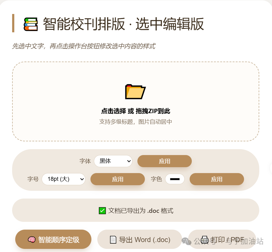