找到
173
篇与
站长可乐
相关的结果
- 第 14 页
-
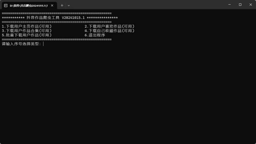
 抖音爬虫 V20240922.1 批量解析主页|喜欢|合集 视频|图片 软件介绍 基于python的selenium模块编写的具备批量下载抖音主页、喜欢、合集、收藏里的视频、图片的小工具,模拟人工操作,单线程,运行稳定。代码已开源,有兴趣的可以自己继续加工。 使用说明 config.ini是配置文件,可配置保存的文件名规则、下载视频图文音乐描述等。 DownloadList.txt是批量下载清单,可配置批量下载类型和地址。 打开软件,选择对应的功能,第一次扫码登录(后续可自动加载cookie登录),手动过验证码,开始自动下载。 1.下载用户主页作品 2.下载用户喜欢作品 3.下载用户作品合集 4.下载自己收藏作品 5.批量下载用户作品 使用教程 1.软件需要固定版本的Chrome浏览器,必须先到网盘下载基础版本后再下载最新版本替换(WIN7下载【抖音爬虫20230116.1】版本,WIN10下载【抖音爬虫20231223.2】版本)。 2.比如先下载【抖音爬虫20231223.2.7z.001.cfg】和【抖音爬虫20231223.2.7z.002.cfg】,删除两个压缩包的.cfg后缀,得到【抖音爬虫20231223.2.7z.001】和【抖音爬虫20231223.2.7z.002】文件,再解压缩。 3.然后再下载最新的版本(如抖音爬虫20240922.1.zip)替换文件即可。 4.打开软件窗口TiktokVideo.exe,输入功能编号,比如我想把某作者全部作品无水印下载到本地,输入1,再输入作者的主页。 5.作者主页获取方法:抖音作者主页右上角---分享主页---复制链接----提取网址粘贴到本软件。 6.下载的时候不能最小化浏览器,可以不置顶。 更新说明 V20241015.1 2024年10月15日08:47:00 修复了首页数据抓取异常的问题 V20240922.1 2024年9月22日23:56:01 增强程序健壮性 修复了自动滚屏失效的问题 V20240627.1 2024年6月27日21:33:15 增加了自动修复配置文件utf-8 BOM的功能。 修复下载失败的问题。(抖音对直链加了Referer检测) 运行截图 2024-10-18T15:46:36.png图片 2024-10-18T15:58:54.png图片 2024-10-18T16:02:44.png图片 下载地址 官方下载 完整下载 特别说明:这里提供了一个官方下载和完整下载,官方下载需要在新版的软件包中移入Chrome浏览器软件才能下载,为了避免大家去下载旧版的复杂步骤(详见上面的使用教程),我直接帮大家整理到这个“完整下载”的链接中了。后期也可以直接移入这个Chrome浏览器文件夹到官方提供的新版软件中使用。注意了!如果不用这个Chrome浏览器就会提示浏览器无法调用。
-
真强啊!纯 CSS 撸一个小黄人 2024-10-18T15:26:54.png图片 这样的小黄人,谁不喜欢呢? 源代码 <!DOCTYPE html> <html lang="zh"> <head> <meta charset="UTF-8"> <meta name="viewport" content="width=device-width, initial-scale=1.0"> <title></title> </head> <style> body{display:flex;justify-content:center;margin-top:200px;background-color:#fff;} :before, :after { content:""; position:absolute; } .container { max-width:550px; padding:0; margin:0 auto; min-height:450px; display:inline; perspective:800px; perspective-origin:50% 50%; } .minion { position:absolute; top:calc(48% - (250px / 2)); left:calc(50% - (140px / 2)); height:250px; width:140px; } .minion * { position:absolute; } .minion .hair { top:-15px; margin:0; padding:0; } .minion .hair.back li:nth-of-type(1) { transform:rotate(-70deg); margin-top:36px; } .minion .hair.back li:nth-of-type(2) { transform:rotate(-50deg); margin-top:19px; } .minion .hair.back li:nth-of-type(3) { transform:rotate(-30deg); margin-top:12px; } .minion .hair.back li:nth-of-type(4) { transform:rotate(-10deg); margin-top:3px; } .minion .hair.back li:nth-of-type(5) { transform:rotate(2deg); border-left:1px solid #333333; border-radius:80% 0 0 0; } .minion .hair.back li:nth-of-type(6) { transform:rotate(10deg); margin-top:3px; } .minion .hair.back li:nth-of-type(7) { transform:rotate(30deg); margin-top:12px; } .minion .hair.back li:nth-of-type(8) { transform:rotate(50deg); margin-top:19px; } .minion .hair.back li:nth-of-type(9) { transform:rotate(70deg); margin-top:36px; } .minion .hair.front { margin-top:3px; z-index:4; } .minion .hair.front li:nth-of-type(1) { transform:rotate(-60deg); margin-top:21px; } .minion .hair.front li:nth-of-type(2) { transform:rotate(-46deg); margin-top:12px; } .minion .hair.front li:nth-of-type(3) { transform:rotate(-28deg); margin-top:7px; } .minion .hair.front li:nth-of-type(4) { transform:rotate(-12deg); margin-top:5px; } .minion .hair.front li:nth-of-type(5) { transform:rotate(-2deg); border-right:1px solid #333333; border-radius:0 80% 0 0; margin-top:3px; } .minion .hair.front li:nth-of-type(6) { transform:rotate(12deg); margin-top:6px; } .minion .hair.front li:nth-of-type(7) { transform:rotate(28deg); margin-top:7px; } .minion .hair.front li:nth-of-type(8) { transform:rotate(46deg); margin-top:12px; } .minion .hair.front li:nth-of-type(9) { transform:rotate(60deg); margin-top:21px; } .minion .hair li { list-style:none; height:30px; width:10px; float:left; } .minion .hair li:nth-of-type(n+6) { border-left:1px solid #333333; border-radius:80% 0 0 0; } .minion .hair li:nth-of-type(-n+4) { border-right:1px solid #333333; border-radius:0 80% 0 0; } .minion .minody { position:relative; height:250px; width:140px; border-radius:80px 80px 50px 50px; background:#FFCB4F; overflow:hidden; } .minion .minody:after, .minion .minody:before { top:0; left:0; } .minion .minody:before { width:80%; height:100%; border-radius:20px; background-image:radial-gradient(rgba(250, 250, 250, 0.6) 0%, rgba(250, 250, 250, 0) 60%); filter:blur(5px); z-index:1; left:-10px; } .minion .minody:after { height:250px; width:140px; border-radius:80px 80px 50px 50px; background-image:linear-gradient(left, rgba(0, 0, 0, 0) 70%, rgba(0, 0, 0, 0.2) 100%); filter:blur(5px); z-index:1; } .minion .minody .dunfrt { bottom:0; height:90px; width:140px; overflow:hidden; border-top:1px solid #4883b8; } .minion .minody .dunfrt:before { left:-30px; border-radius:0 0 35% 0; box-shadow:40px -40px 30px 40px #6D9CC6; } .minion .minody .dunfrt:after { right:-30px; box-shadow:-40px -40px 30px 40px #6D9CC6; border-radius:0 0 0 35%; } .minion .minody .dunfrt:before, .minion .minody .dunfrt:after { width:56px; height:75%; top:0; border:1px solid #4883b8; } .minion .minody .dunpet { bottom:35px; left:50%; margin-left:-17.5px; height:35px; width:35px; border-radius:0 0 15px 15px; border-left:1px solid #4883b8; border-right:1px solid #4883b8; border-bottom:1px solid #4883b8; } .minion .minody .dunpet:before { top:-13px; left:-2px; height:15px; width:37px; border-bottom:1px solid #4883b8; border-left:1px solid transparent; border-right:1px solid transparent; border-radius:20px; } .minion .minody .dunpet .logo { top:50%; left:50%; margin-left:-12.5px; margin-top:-10.5px; height:25px; width:25px; background:#333333; border-radius:50%; } .minion .minody .dunpet .logo:before { top:50%; left:50%; margin-left:-7.5px; margin-top:-7.5px; height:15px; width:15px; background:#6D9CC6; transform:rotate(45deg); } .minion .minody .dunpet .logo:after { top:50%; left:50%; margin-left:-3.5px; margin-top:-3.5px; height:7px; width:7px; background:#333333; border-radius:50%; z-index:5; } .minion .minody .dunpet .logo span { height:2px; background:#333333; border-bottom:1px solid #6D9CC6; width:12.5px; right:0; top:48%; margin-top:-1px; z-index:6; } .minion .minody .dunbtm { bottom:0; height:40px; width:140px; background-color:#6d9cc6; background-image:linear-gradient(top, #6d9cc6 45%, #4b6587 100%); border-top:1px solid #4883b8; } .minion .minody .dunsap { top:127px; height:60px; width:12px; background:#6D9CC6; border:1px solid #4883b8; } .minion .minody .dunsap.left { left:5px; transform:rotate(-65deg); } .minion .minody .dunsap.right { right:5px; transform:rotate(65deg); } .minion .minody .dunsap .button { bottom:0; left:2px; height:8px; width:8px; border-radius:50%; background:#333333; } .minion .hair li:nth-of-type(1) { transform:rotate(-70deg); position:absolute; left:8px; height:30px; } .minion .hair li:nth-of-type(2) { transform:rotate(-50deg); left:18px; } .minion .hair li:nth-of-type(3) { transform:rotate(-30deg); left:30px; } .minion .hair li:nth-of-type(4) { transform:rotate(-10deg); left:45px; } .minion .hair li:nth-of-type(5) { left:60px; } .minion .hair li:nth-of-type(6) { transform:rotate(10deg); left:76px; } .minion .hair li:nth-of-type(7) { transform:rotate(30deg); left:93px; } .minion .hair li:nth-of-type(8) { transform:rotate(50deg); left:107px; } .minion .hair li:nth-of-type(9) { transform:rotate(70deg); left:119px; height:30px; } .minion .gorap { top:68px; height:3px; background:black; width:16px; z-index:6; } .minion .gorap.left { left:-2px; } .minion .gorap.left:before, .minion .gorap.left:after { border-right:16px solid #444444; } .minion .gorap.right { right:-2px; } .minion .gorap.right:before, .minion .gorap.right:after { border-left:16px solid #444444; } .minion .gorap:before, .minion .gorap:after { height:6px; } .minion .gorap:before { top:-7px; border-top:2px solid transparent; } .minion .gorap:after { top:3px; border-bottom:2px solid transparent; } .minion .gorlnk { top:58px; height:25px; width:5px; background:#999999; z-index:7; } .minion .gorlnk.left { left:12px; } .minion .gorlnk.right { right:12px; } .minion .gofme { top:40px; height:50px; width:50px; border:5px solid #CCCCCC; border-radius:50%; overflow:hidden; z-index:8; } .minion .gofme.left { left:30%; margin-left:-30px; } .minion .gofme.left .goggle { left:-1px; } .minion .gofme.left .goggle .pupil { right:40%; } .minion .gofme.right { right:30%; margin-right:-30px; } .minion .gofme.right .goggle { right:-1px; } .minion .gofme.right .goggle .pupil { left:40%; } .minion .gofme .goggle { height:50px; width:50px; border:3px solid #666666; border-radius:50%; } .minion .gofme .goggle .eye { background:whitesmoke; height:46px; width:50px; border-radius:50%; margin:1px 0; box-shadow:inset 0px 2px 10px 0px rgba(51, 51, 51, 0.5), inset 0px -1px 5px 0px rgba(51, 51, 51, 0.3); } .minion .gofme .goggle .eye .pupil { top:50%; margin:-7.5px; height:15px; width:15px; background-color:#e7a452; background-image:radial-gradient(#e7a452 0%, #91695c 49%, #91695c 74%, #000000 99%); border-radius:50%; } .minion .gofme .goggle .eye .pupil .dot { top:50%; left:50%; margin-top:-2.5px; margin-left:-2.5px; height:5px; width:5px; background:#333333; border-radius:50%; } .minion .gogdow { height:75px; top:45px; border-radius:50%; background-image:radial-gradient(rgba(0, 0, 0, 0.8) 0%, rgba(0, 0, 0, 0) 50%); z-index:5; } .minion .gogdow.left { left:5px; width:130px; } .minion .gogdow.right { left:55px; width:100px; } .minion .mouth { top:110px; left:50%; margin-left:-30px; height:20px; width:60px; border-bottom:2px solid #DE9A33; border-right:1px solid tranparent; border-left:1px solid tranparent; border-radius:70%; z-index:5; box-shadow:inset 0 -1px 2px -1px rgba(0, 0, 0, 0.3); } .minion .arm { top:160px; height:80px; width:12px; z-index:-1; background:#FFCB4F; overflow:hidden; } .minion .arm.left { left:-12px; border-radius:20px 0 0 20px / 80px 0 0 20px; transform:rotate(0deg); } .minion .arm.left:before { background-image:linear-gradient(left, rgba(250, 250, 250, 0.3) 20%, rgba(0, 0, 0, 0) 100%); } .minion .arm.right { right:-12px; border-radius:0 20px 20px 0 / 0 80px 20px 0; transform:rotate(0deg); } .minion .arm.right:before { background-image:linear-gradient(left, rgba(0, 0, 0, 0.2) 0%, rgba(0, 0, 0, 0) 90%); } .minion .arm:before { height:100%; width:100%; filter-gradient:#000000, #000000, horizontal; } .minion .shoe { bottom:-26px; width:30px; height:10px; background:#222222; z-index:-2; } .minion .shoe.left { right:74px; border-radius:50px 20px 15px 10px; transform:rotate(-3deg); } .minion .shoe.left:before { right:0px; } .minion .shoe.left:after { right:0; border-radius:10px 0 0 10px; } .minion .shoe.right { left:74px; border-radius:20px 50px 10px 15px; transform:rotate(3deg); } .minion .shoe.right:before { left:0px; } .minion .shoe.right:after { left:0; border-radius:0 10px 10px 0; } .minion .ardow { top:180px; height:30px; width:5px; border-radius:50%; } .minion .ardow.left { left:0px; box-shadow:inset 2px 0 3px -1px rgba(0, 0, 0, 0.3); transform:rotate(5deg); } .minion .ardow.right { right:0px; box-shadow:inset -2px 0 3px -1px rgba(0, 0, 0, 0.3); transform:rotate(-5deg); } .minion .glove { bottom:0; width:17px; height:18px; background:#333333; border-radius:0 0 30px 30px; } .minion .glove:before { bottom:0px; height:20px; width:10px; background:#333333; border-radius:0 0 20px 20px; } .minion .glove:after { bottom:-4px; height:20px; width:10px; background:#333333; border-radius:0 0 20px 20px; } .minion .glove .finger { bottom:-6px; height:20px; width:10px; background:#333333; border-radius:0 0 20px 20px; z-index:10; } .minion .wrist { height:30px; width:16px; border-radius:40%; } .minion .wrist.front { bottom:15px; border-bottom:5px solid #333333; border-right:5px solid transparent; border-left:5px solid transparent; } .minion .wrist.back { bottom:-11px; border-top:5px solid #333333; border-right:5px solid transparent; border-left:5px solid transparent; z-index:-2; } .minion .wrist.left { left:-19px; } .minion .wrist.right { right:-19px; } .minion .leg { bottom:-15px; height:15px; width:25px; background:#4B6587; z-index:-1; border-left:1px solid #4883b8; border-right:1px solid #4883b8; } .minion .leg.left { left:40px; border-radius:0 0 10% 20% / 0 0 80% 80%; } .minion .leg.left:after { transform:rotate(55deg); left:-12px; } .minion .leg.right { right:40px; border-radius:0 0 20% 10% / 0 0 80% 80%; } .minion .leg.right:after { transform:rotate(-55deg); right:-12px; } .minion .leg:after { top:-10px; background:#4B6587; height:10px; width:20px; border-bottom:1px solid #4883b8; } .minion .glove.left { left:-14px; transform:rotate(-10deg); } .minion .glove.left:before { left:-2px; transform:rotate(20deg); } .minion .glove.left:after { left:13px; transform:rotate(-30deg); } .minion .glove.left .finger { left:5px; transform:rotate(0deg); } .minion .glove.right { right:-14px; transform:rotate(10deg); } .minion .glove.right:before { right:-2px; transform:rotate(-20deg); } .minion .glove.right:after { right:13px; transform:rotate(30deg); } .minion .glove.right .finger { right:5px; transform:rotate(0deg); } .minion .shoe:before { top:-10px; height:15px; width:22px; background:#222222; } .minion .shoe:after { bottom:-3px; height:3px; width:30px; background-image:linear-gradient(top, #666666 0%, #222222 58%); } .minion .shadow { bottom:-38px; left:-10%; width:140%; height:30px; background:radial-gradient(rgba(0, 0, 0, 0.4), rgba(0, 0, 0, 0.1) 40%, rgba(0, 0, 0, 0) 50%); z-index:-5; } </style> <body> <div class="container"> <div class="minion"> <ul class="hair back"> <li></li> <li></li> <li></li> <li></li> <li></li> <li></li> <li></li> <li></li> <li></li> </ul> <div class="minody"> <div class="dunbtm"></div> <div class="dunfrt"></div> <div class="dunpet"> <div class="logo"><span></span></div> </div> <div class="dunsap left"> <div class="button"></div> </div> <div class="dunsap right"> <div class="button"></div> </div> </div> <ul class="hair front"> <li></li> <li></li> <li></li> <li></li> <li></li> <li></li> <li></li> <li></li> <li></li> </ul> <div class="gorap left"></div> <div class="gorap right"></div> <div class="gorlnk left"></div> <div class="gorlnk right"></div> <div class="gofme left"> <div class="goggle"> <div class="eye"> <div class="pupil"> <div class="dot"></div> </div> </div> </div> </div> <div class="gofme right"> <div class="goggle"> <div class="eye"> <div class="pupil"> <div class="dot"></div> </div> </div> </div> </div> <div class="gogdow left"></div> <div class="gogdow right"></div> <div class="mouth"></div> <div class="ardow left"></div> <div class="ardow right"></div> <div class="arm left"></div> <div class="arm right"></div> <div class="glove left"> <div class="finger"></div> </div> <div class="glove right"> <div class="finger"></div> </div> <div class="wrist front left"></div> <div class="wrist front right"></div> <div class="wrist back left"></div> <div class="wrist back right"></div> <div class="leg left"></div> <div class="leg right"></div> <div class="shoe left"></div> <div class="shoe right"></div> <div class="shadow"></div> </div> </div> </body> <script type="module"> </script> </html>
-
跟屁球(可复制源代码) 640.gif图片 小球会跟着鼠标移动,很有趣的效果。 源代码 <!DOCTYPE html> <html lang="en"> <head> <meta charset="UTF-8"> <meta name="viewport" content="width=device-width, initial-scale=1.0"> <title>跟屁球</title> <script src="https://cdnjs.cloudflare.com/ajax/libs/gsap/3.9.1/gsap.min.js"></script> <script src="https://libs.baidu.com/jquery/2.1.4/jquery.min.js"></script> <style> html,body{width:100%;height:100%;background:#202022;overflow:hidden}*{position:absolute;user-select:none} </style> </head> <body> <div class="ball"> <div class="marble"> <img class="lighting lighting1" draggable="false" src="https://assets.codepen.io/721952/marbleLighting.png" width="120" height="120"> <img class="lighting lighting2" draggable="false" src="https://assets.codepen.io/721952/marbleLighting.png" width="120" height="120"> </div> <div class="shadow"></div> </div> </body> <script> gsap.timeline().set('.ball',{scale:0.5,width:100,height:100,borderRadius:'50%',xPercent:-50,yPercent:-50}).set('.marble',{background:'url("https://assets.codepen.io/721952/marble.jpg") center',width:'100%',height:'100%',borderRadius:'50%',overflow:'hidden'}).set('.lighting',{left:'50%',top:'50%',xPercent:-50,yPercent:-50}).set('.lighting2',{mixBlendMode:'multiply',opacity:0.7}).set('.lighting1',{mixBlendMode:'overlay'}).set('.shadow',{width:'100%',height:'100%',scaleX:2.2,background:'radial-gradient(circle at 50% 60%, rgba(0, 0, 0, 0.4), rgba(0, 0, 0, 0.1) 40%, rgba(0, 0, 0, 0) 50%)'}).from('.ball',{autoAlpha:0,duration:0.5});let pos={x:window.innerWidth/2,y:window.innerHeight+500};let mouse={x:pos.x,y:window.innerHeight/2};let speed=0.05;let xSet=gsap.quickSetter(".ball","x","px");let ySet=gsap.quickSetter(".ball","y","px");let bgSet=gsap.quickSetter(".marble","backgroundPosition","");let lightRotSet=gsap.quickSetter(".lighting","rotation","deg");let lightYSet=gsap.quickSetter(".lighting","y","px");window.addEventListener("mousemove",e=>{mouse.x=e.x;mouse.y=e.y;});gsap.ticker.add(()=>{pos.x+=(mouse.x-pos.x)*speed;pos.y+=(mouse.y-pos.y)*speed;xSet(pos.x);ySet(pos.y);bgSet(pos.x+'px '+pos.y+'px');lightRotSet(-80+60*pos.x/window.innerWidth);lightYSet(-6+17*pos.y/window.innerHeight);gsap.set('.shadow',{x:35-70*pos.x/window.innerWidth,scaleY:0.2+0.3*pos.y/window.innerHeight,y:50-7*pos.y/window.innerHeight})}); </script> </html>
-
光标有反转效果的侧边导航(附源代码) 效果预览图片 源码介绍 这是一个侧边导航效果,这个展开的效果给人一种很柔和的感觉,展开后菜单内容依次显示,最后是增加了一个聚焦的圆跟随光标移动,当遇到菜单内容时会放大圆形并反转显示菜单文字,加深了对导航的交互,这里的反转色基于 mix-blend-mode: difference 实现。这个效果还有两个主题色切换,有兴趣的可以在线看效果。 使用方式 复制源代码到空白的html格式文件,在浏览中打开运行即可。 源代码 <!DOCTYPE html> <html lang="en"> <head> <link href="https://cdnjs.cloudflare.com/ajax/libs/twitter-bootstrap/4.1.3/css/bootstrap.min.css"> <script src="https://cdnjs.cloudflare.com/ajax/libs/jquery/3.3.1/jquery.min.js"></script> <style> @import url('https://fonts.googleapis.com/css?family=Montserrat:100,100i,200,200i,300,300i,400,400i,500,500i,600,600i,700,700i,800,800i,900,900i'); @import url('https://fonts.googleapis.com/css?family=Poppins:400,500,600,700,800,900'); body{ font-family: 'Montserrat', sans-serif; font-weight: 300; font-size: 15px; line-height: 1.7; color: #c4c3ca; background-color: #1f2029; background-image: url('https://s3-us-west-2.amazonaws.com/s.cdpn.io/1462889/pat-back.svg'); background-position: center; background-repeat: repeat; background-size: 4%; overflow-x: hidden; -webkit-transition: all 300ms linear; transition: all 300ms linear; } a { cursor: pointer; } a:hover { text-decoration: none; } /* #Cursor ================================================== */ .cursor, .cursor2, .cursor3{ position: fixed; border-radius: 50%; transform: translateX(-50%) translateY(-50%); pointer-events: none; left: -100px; top: 50%; mix-blend-mode: difference; -webkit-transition: all 300ms linear; transition: all 300ms linear; } .cursor{ background-color: #fff; height: 0; width: 0; z-index: 99999; } .cursor2,.cursor3{ height: 36px; width: 36px; z-index:99998; -webkit-transition:all 0.3s ease-out; transition:all 0.3s ease-out } .cursor2.hover, .cursor3.hover{ -webkit-transform:scale(2) translateX(-25%) translateY(-25%); transform:scale(2) translateX(-25%) translateY(-25%); border:none } .cursor2{ border: 2px solid #fff; box-shadow: 0 0 22px rgba(255, 255, 255, 0.6); } .cursor2.hover{ background: rgba(255,255,255,1); box-shadow: 0 0 12px rgba(255, 255, 255, 0.2); } @media screen and (max-width: 1200px){ .cursor,.cursor2,.cursor3{ display: none } } /* #Primary style ================================================== */ .section { position: relative; width: 100%; display: block; } .over-hide{ overflow: hidden; } .full-height { height: 100vh; } /* #Navigation ================================================== */ .cd-header{ position: fixed; width:100%; top:0; left:0; z-index:100; } .header-wrapper{ position: relative; width: calc(100% - 100px); margin-left: 50px; } .logo-wrap { position: absolute; display:block; right:0; top: 40px; cursor: pointer; } .logo-wrap a { cursor: pointer; font-family: 'Montserrat', sans-serif; font-weight: 900; font-size: 20px; line-height: 20px; text-transform: uppercase; letter-spacing: 2px; color: #fff; transition : all 0.3s ease-out; } .logo-wrap a span{ color: #8167a9; } .logo-wrap a:hover { opacity: 0.9; } .nav-but-wrap{ position: relative; display: inline-block; float: left; padding-left: 15px; padding-top: 15px; margin-top: 26px; transition : all 0.3s ease-out; } .menu-icon { height: 30px; width: 30px; position: relative; z-index: 2; cursor: pointer; display: block; } .menu-icon__line { height: 2px; width: 30px; display: block; background-color: #fff; margin-bottom: 7px; cursor: pointer; -webkit-transition: background-color .5s ease, -webkit-transform .2s ease; transition: background-color .5s ease, -webkit-transform .2s ease; transition: transform .2s ease, background-color .5s ease; transition: transform .2s ease, background-color .5s ease, -webkit-transform .2s ease; } .menu-icon__line-left { width: 16.5px; -webkit-transition: all 200ms linear; transition: all 200ms linear; } .menu-icon__line-right { width: 16.5px; float: right; -webkit-transition: all 200ms linear; -moz-transition: all 200ms linear; -o-transition: all 200ms linear; -ms-transition: all 200ms linear; transition: all 200ms linear; } .menu-icon:hover .menu-icon__line-left, .menu-icon:hover .menu-icon__line-right { width: 30px; } .nav { position: fixed; z-index: 98; } .nav:before, .nav:after { content: ""; position: fixed; top: 20px; left: 50px; width: 0; height: 0; background-color: rgba(20, 21, 26,0.6); border-bottom-right-radius: 200%; z-index: -1; transition: border-radius linear 0.8s, width cubic-bezier(0.77, 0, 0.175, 1) 0.6s, height cubic-bezier(0.77, 0, 0.175, 1) 0.6s; } .nav:after { background-color: rgba(9,9,12,1); background-image: url('https://s3-us-west-2.amazonaws.com/s.cdpn.io/1462889/pat.svg'); background-position: bottom center; background-repeat: no-repeat; background-size: 300%; -webkit-transition-delay: 0s; transition-delay: 0s; box-shadow: 6px 7px 28px 0 rgba(16, 16, 16, 0.3); } .nav:before { -webkit-transition-delay: .2s; transition-delay: .2s; } .nav__content { position: fixed; visibility: hidden; top: 90px; left: 50px; width: 280px; text-align: left; } .nav__list { position: relative; padding: 0; margin: 0; z-index: 2; } .nav__list-item { position: relative; display: block; -webkit-transition-delay: 0.8s; transition-delay: 0.8s; opacity: 0; text-align: left; color: #fff; overflow: hidden; font-family: 'Poppins', sans-serif; font-size: 22px; line-height: 1.2; letter-spacing: 2px; -webkit-transform: translate(30px, 0%); transform: translate(30px, 0%); -webkit-transition: opacity .2s ease, -webkit-transform .3s ease; transition: opacity .2s ease, -webkit-transform .2s ease; transition: opacity .2s ease, transform .2s ease; transition: opacity .2s ease, transform .2s ease, -webkit-transform .2s ease; margin-top: 7px; margin-bottom: 7px; } .nav__list-item a{ position: relative; text-decoration: none; color: rgba(255,255,255,0.6); overflow: hidden; cursor: pointer; font-family: 'Poppins', sans-serif; font-weight: 600; z-index: 2; padding-left: 40px; padding-top:5px; padding-bottom: 5px; display: inline-block; -webkit-transition: all 200ms linear; transition: all 200ms linear; } .nav__list-item a:after{ position: absolute; content: ''; top: 50%; left: 0; width: 5px; height: 0; opacity: 0; background-color: #8167a9; z-index: 1; -webkit-transition: all 200ms linear; transition: all 200ms linear; } .nav__list-item a:hover:after{ height: 100%; opacity: 1; top: 0; } .nav__list-item a:hover{ color: rgba(255,255,255,1); } .nav__list-item.active-nav a{ color: rgba(255,255,255,1); } .nav__list-item.active-nav a:after{ height: 100%; opacity: 1; top: 0; } body.nav-active .nav__content { visibility: visible; } body.nav-active .menu-icon__line { background-color: #fff; -webkit-transform: translate(0px, 0px) rotate(-45deg); transform: translate(0px, 0px) rotate(-45deg); } body.nav-active .menu-icon__line-left { width: 15px; -webkit-transform: translate(2px, 4px) rotate(45deg); transform: translate(2px, 4px) rotate(45deg); } body.nav-active .menu-icon__line-right { width: 15px; float: right; -webkit-transform: translate(-3px, -3.5px) rotate(45deg); transform: translate(-3px, -3.5px) rotate(45deg); } body.nav-active .menu-icon:hover .menu-icon__line-left, body.nav-active .menu-icon:hover .menu-icon__line-right { width: 15px; } body.nav-active .nav { visibility: visible; } body.nav-active .nav:before, body.nav-active .nav:after { width: 250px; height: 350px; border-radius: 15px; } body.nav-active .nav:after { -webkit-transition-delay: .1s; transition-delay: .1s; } body.nav-active .nav:before { -webkit-transition-delay: 0s; transition-delay: 0s; } body.nav-active .nav__list-item { opacity: 1; -webkit-transform: translateX(0%); transform: translateX(0%); -webkit-transition: opacity .3s ease, color .3s ease, -webkit-transform .3s ease; transition: opacity .3s ease, color .3s ease, -webkit-transform .3s ease; transition: opacity .3s ease, transform .3s ease, color .3s ease; transition: opacity .3s ease, transform .3s ease, color .3s ease, -webkit-transform .3s ease; } body.nav-active .nav__list-item:nth-child(0) { -webkit-transition-delay: 0.7s; transition-delay: 0.7s; } body.nav-active .nav__list-item:nth-child(1) { -webkit-transition-delay: 0.8s; transition-delay: 0.8s; } body.nav-active .nav__list-item:nth-child(2) { -webkit-transition-delay: 0.9s; transition-delay: 0.9s; } body.nav-active .nav__list-item:nth-child(3) { -webkit-transition-delay: 1s; transition-delay: 1s; } body.nav-active .nav__list-item:nth-child(4) { -webkit-transition-delay: 1.1s; transition-delay: 1.1s; } body.nav-active .nav__list-item:nth-child(5) { -webkit-transition-delay: 1.2s; transition-delay: 1.2s; } body.nav-active .nav__list-item:nth-child(6) { -webkit-transition-delay: 1.3s; transition-delay: 1.3s; } body.nav-active .nav__list-item:nth-child(7) { -webkit-transition-delay: 1.4s; transition-delay: 1.4s; } body.nav-active .nav__list-item:nth-child(8) { -webkit-transition-delay: 1.5s; transition-delay: 1.5s; } body.nav-active .nav__list-item:nth-child(9) { -webkit-transition-delay: 1.6s; transition-delay: 1.6s; } body.nav-active .nav__list-item:nth-child(10) { -webkit-transition-delay: 1.7s; transition-delay: 1.7s; } .switch-wrap { position: absolute; top: 50%; left: 0; z-index: 10; transform: translateY(-50%); width: 100%; -webkit-transition: all 500ms linear; transition: all 500ms linear; margin: 0 auto; text-align: center; } .switch-wrap h1 { font-weight: 900; font-size: 46px; line-height: 1; color: #fff; text-align: center; text-transform: uppercase; margin-bottom: 40px; -webkit-transition: all 300ms linear; transition: all 300ms linear; } @media screen and (max-width: 580px){ .switch-wrap h1 { font-size: 32px; } } .switch-wrap p { font-weight: 600; font-size: 14px; letter-spacing: 1px; line-height: 1; color: #8167a9; text-align: center; margin-top: 15px; } .switch-wrap p span { position: relative; } .switch-wrap p span:before { position: absolute; content: ''; width: 100%; height: 2px; background-color: #fff; left: 0; bottom: -4px; -webkit-transition: all 300ms linear; transition: all 300ms linear; } .switch-wrap p span:nth-child(2):before { opacity: 0; } #switch, #circle { cursor: pointer; -webkit-transition: all 300ms linear; transition: all 300ms linear; } #switch { width: 60px; height: 8px; margin: 0 auto; text-align: center; border: 2px solid #000; border-radius: 27px; background: #8167a9; position: relative; display: inline-block; } #circle { position: absolute; top: -11px; left: -13px; width: 26px; height: 26px; border-radius: 50%; box-shadow: 0 4px 4px rgba(26,53,71,0.25), 0 0 0 1px rgba(26,53,71,0.07); background: #fff; } .switched { border-color: #8167a9 !important; background: #000 !important; } .switched #circle { left: 43px; background: #000; } /* #Light ================================================== */ body.light{ background-color: #fff; } body.light .cursor, body.light .cursor2, body.light .cursor3{ mix-blend-mode: normal; } body.light .cursor2{ border: 2px solid #1f2029; box-shadow: 0 0 4px rgba(0, 0, 0, 0.1); } body.light .cursor2.hover{ background: rgba(0,0,0,0.06); box-shadow: 0 0 2px rgba(0, 0, 0, 0.1); border-color: transparent; } body.light .logo-wrap a { color: #1f2029; } body.light .menu-icon__line { background-color: #1f2029; } body.light .nav:before { background-color: rgba(235, 235, 235,0.4); } body.light .nav:after { background-color: rgb(246,239,249); box-shadow: 6px 6px 22px rgba(42, 31, 63, 0.1); } body.light .nav__list-item a{ color: rgba(0,0,0,0.6); } body.light .nav__list-item a:hover{ color: #1f2029; } body.light .nav__list-item.active-nav a{ color: #1f2029; } body.light .switch-wrap h1 { color: #000; } body.light .switch-wrap p span:nth-child(2):before { opacity: 1; background-color: #000; } body.light .switch-wrap p span:nth-child(1):before { opacity: 0; } /* #Link to page ================================================== */ .link-to-portfolio { position: fixed; bottom: 40px; right: 50px; z-index: 200; cursor: pointer; width: 50px; height: 50px; text-align: center; border-radius: 3px; background-position: center center; background-size: 65%; background-repeat: no-repeat; background-image: url('https://assets.codepen.io/1462889/fcy.png'); box-shadow: 0 0 0 2px rgba(255,255,255,.1); transition: opacity .2s, border-radius .2s, box-shadow .2s; transition-timing-function: ease-out; } .link-to-portfolio:hover { opacity: 0.8; border-radius: 50%; box-shadow: 0 0 0 20px rgba(255,255,255,.1); } </style> </head> <body> <header class="cd-header"> <div class="header-wrapper"> <div class="logo-wrap"> <a href="#" class="hover-target"><span>your</span>logo</a> </div> <div class="nav-but-wrap"> <div class="menu-icon hover-target"> <span class="menu-icon__line menu-icon__line-left"></span> <span class="menu-icon__line"></span> <span class="menu-icon__line menu-icon__line-right"></span> </div> </div> </div> </header> <div class="nav"> <div class="nav__content"> <ul class="nav__list"> <li class="nav__list-item active-nav"><a href="#" class="hover-target">Home</a></li> <li class="nav__list-item"><a href="#" class="hover-target">Portfolio</a></li> <li class="nav__list-item"><a href="#" class="hover-target">Studio</a></li> <li class="nav__list-item"><a href="#" class="hover-target">News</a></li> <li class="nav__list-item"><a href="#" class="hover-target">Contact</a></li> </ul> </div> </div> <div class="section full-height over-hide"> <div class="switch-wrap"> <h1>Drop-down menu</h1> <div id="switch" class="hover-target"> <div id="circle"></div> </div> <p><span>dark</span> - <span>light</span></p> </div> </div> <div class='cursor' id="cursor"></div> <div class='cursor2' id="cursor2"></div> <div class='cursor3' id="cursor3"></div> <!-- Link to page ================================================== --> <a href="https://front.codes/" class="link-to-portfolio hover-target" target=”_blank”></a> </body> <script> /* Please ❤ this if you like it! */ (function($) { "use strict"; //Page cursors document.getElementsByTagName("body")[0].addEventListener("mousemove", function(n) { t.style.left = n.clientX + "px", t.style.top = n.clientY + "px", e.style.left = n.clientX + "px", e.style.top = n.clientY + "px", i.style.left = n.clientX + "px", i.style.top = n.clientY + "px" }); var t = document.getElementById("cursor"), e = document.getElementById("cursor2"), i = document.getElementById("cursor3"); function n(t) { e.classList.add("hover"), i.classList.add("hover") } function s(t) { e.classList.remove("hover"), i.classList.remove("hover") } s(); for (var r = document.querySelectorAll(".hover-target"), a = r.length - 1; a >= 0; a--) { o(r[a]) } function o(t) { t.addEventListener("mouseover", n), t.addEventListener("mouseout", s) } //Navigation var app = function () { var body = undefined; var menu = undefined; var menuItems = undefined; var init = function init() { body = document.querySelector('body'); menu = document.querySelector('.menu-icon'); menuItems = document.querySelectorAll('.nav__list-item'); applyListeners(); }; var applyListeners = function applyListeners() { menu.addEventListener('click', function () { return toggleClass(body, 'nav-active'); }); }; var toggleClass = function toggleClass(element, stringClass) { if (element.classList.contains(stringClass)) element.classList.remove(stringClass);else element.classList.add(stringClass); }; init(); }(); //Switch light/dark $("#switch").on('click', function () { if ($("body").hasClass("light")) { $("body").removeClass("light"); $("#switch").removeClass("switched"); } else { $("body").addClass("light"); $("#switch").addClass("switched"); } }); })(jQuery); </script> </html>