
找到
51
篇与
源码
相关的结果
- 第 3 页
-
 网站禁止PC电脑访问,只允许手机访问代码 网站禁止PC电脑访问,只允许手机访问代码 限制网页只在手机端中打开,网站屏蔽PC端访问JS代码,网站只允许手机端访问 <script type="text/javascript"> if(window.screen.width==0){window.location.replace("https://xxxx.com")}; var system={win:false,mac:false,xll:false}; var p = navigator.platform; system.win=p.indexOf("Win")==0; system.mac=p.indexOf("Mac")==0; system.x11=(p=="X11") || (p.indexOf("Linux")==0); if(system.win||system.mac||system.xll) { location.replace("https://xxxx.com"); } </script>
-
-
-
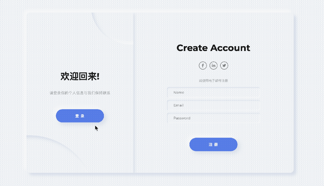
时尚UI设计扁平登录卡片效果(附源代码) 640 (1).gif图片 这是一个很有设计感的扁平登录卡片效果。这个设计结合了现代web开发技术和时尚的UI设计理念,创造出了一个视觉吸引力强、用户体验良好的登录/注册界面。 主要特点和核心技术如下: 1. 效果描述: 页面包含两个表单:注册表单和登录表单 用户可以通过点击按钮在这两个表单之间切换 切换时有平滑的动画效果,包括表单的滑动和背景元素的变化 2. 核心技术: CSS技术: Flexbox布局用于居中和对齐元素 CSS变量用于颜色管理 媒体查询(@media)用于响应式设计 CSS过渡(transition)和动画(animation)用于平滑的视觉效果 Box-shadow用于创建拟物化设计效果 设计技巧: 新拟物设计风格(Neo-morphism):使用柔和的阴影和高光创造出微妙的3D效果 响应式设计:通过CSS的transform: scale()属性调整不同屏幕尺寸下的显示 源代码 <!DOCTYPE html> <html lang="es" dir="ltr"> <head> <meta name="viewport" content="width=device-width, user-scalable=no, initial-scale=1.0"> <meta charset="utf-8"> <link rel="stylesheet" type="text/css" href="main.css"><link href="https://fonts.googleapis.com/css2?family=Montserrat:wght@400;700;800&display=swap" rel="stylesheet"> <style> *, *::after, *::before { margin: 0; padding: 0; box-sizing: border-box; user-select: none; } /* Generic */ body { width: 100%; height: 100vh; display: flex; justify-content: center; align-items: center; font-family: "Montserrat", sans-serif; font-size: 12px; background-color: #ecf0f3; color: #a0a5a8; } /**/ .main { position: relative; width: 1000px; min-width: 1000px; min-height: 600px; height: 600px; padding: 25px; background-color: #ecf0f3; box-shadow: 10px 10px 10px #d1d9e6, -10px -10px 10px #f9f9f9; border-radius: 12px; overflow: hidden; } @media (max-width: 1200px) { .main { transform: scale(0.7); } } @media (max-width: 1000px) { .main { transform: scale(0.6); } } @media (max-width: 800px) { .main { transform: scale(0.5); } } @media (max-width: 600px) { .main { transform: scale(0.4); } } .container { display: flex; justify-content: center; align-items: center; position: absolute; top: 0; width: 600px; height: 100%; padding: 25px; background-color: #ecf0f3; transition: 1.25s; } .form { display: flex; justify-content: center; align-items: center; flex-direction: column; width: 100%; height: 100%; } .form__icon { object-fit: contain; width: 30px; margin: 0 5px; opacity: 0.5; transition: 0.15s; } .form__icon:hover { opacity: 1; transition: 0.15s; cursor: pointer; } .form__input { width: 350px; height: 40px; margin: 4px 0; padding-left: 25px; font-size: 13px; letter-spacing: 0.15px; border: none; outline: none; font-family: "Montserrat", sans-serif; background-color: #ecf0f3; transition: 0.25s ease; border-radius: 8px; box-shadow: inset 2px 2px 4px #d1d9e6, inset -2px -2px 4px #f9f9f9; } .form__input:focus { box-shadow: inset 4px 4px 4px #d1d9e6, inset -4px -4px 4px #f9f9f9; } .form__span { margin-top: 30px; margin-bottom: 12px; } .form__link { color: #181818; font-size: 15px; margin-top: 25px; border-bottom: 1px solid #a0a5a8; line-height: 2; } .title { font-size: 34px; font-weight: 700; line-height: 3; color: #181818; } .description { font-size: 14px; letter-spacing: 0.25px; text-align: center; line-height: 1.6; } .button { width: 180px; height: 50px; border-radius: 25px; margin-top: 50px; font-weight: 700; font-size: 14px; letter-spacing: 1.15px; background-color: #4B70E2; color: #f9f9f9; box-shadow: 8px 8px 16px #d1d9e6, -8px -8px 16px #f9f9f9; border: none; outline: none; } /**/ .a-container { z-index: 100; left: calc(100% - 600px ); } .b-container { left: calc(100% - 600px ); z-index: 0; } .switch { display: flex; justify-content: center; align-items: center; position: absolute; top: 0; left: 0; height: 100%; width: 400px; padding: 50px; z-index: 200; transition: 1.25s; background-color: #ecf0f3; overflow: hidden; box-shadow: 4px 4px 10px #d1d9e6, -4px -4px 10px #f9f9f9; } .switch__circle { position: absolute; width: 500px; height: 500px; border-radius: 50%; background-color: #ecf0f3; box-shadow: inset 8px 8px 12px #d1d9e6, inset -8px -8px 12px #f9f9f9; bottom: -60%; left: -60%; transition: 1.25s; } .switch__circle--t { top: -30%; left: 60%; width: 300px; height: 300px; } .switch__container { display: flex; justify-content: center; align-items: center; flex-direction: column; position: absolute; width: 400px; padding: 50px 55px; transition: 1.25s; } .switch__button { cursor: pointer; } .switch__button:hover { box-shadow: 6px 6px 10px #d1d9e6, -6px -6px 10px #f9f9f9; transform: scale(0.985); transition: 0.25s; } .switch__button:active, .switch__button:focus { box-shadow: 2px 2px 6px #d1d9e6, -2px -2px 6px #f9f9f9; transform: scale(0.97); transition: 0.25s; } /**/ .is-txr { left: calc(100% - 400px ); transition: 1.25s; transform-origin: left; } .is-txl { left: 0; transition: 1.25s; transform-origin: right; } .is-z200 { z-index: 200; transition: 1.25s; } .is-hidden { visibility: hidden; opacity: 0; position: absolute; transition: 1.25s; } .is-gx { animation: is-gx 1.25s; } @keyframes is-gx { 0%, 10%, 100% { width: 400px; } 30%, 50% { width: 500px; } } </style> </head> <body> <div class="main"> <div class="container a-container" id="a-container"> <form class="form" id="a-form" method="" action=""> <h2 class="form_title title">Create Account</h2> <div class="form__icons"><img class="form__icon" src="data:image/svg+xml;base64,PD94bWwgdmVyc2lvbj0iMS4wIiA/PjxzdmcgaGVpZ2h0PSI1MHB4IiB2ZXJzaW9uPSIxLjEiIHZpZXdCb3g9IjAgMCA1MCA1MCIgd2lkdGg9IjUwcHgiIHhtbG5zPSJodHRwOi8vd3d3LnczLm9yZy8yMDAwL3N2ZyIgeG1sbnM6c2tldGNoPSJodHRwOi8vd3d3LmJvaGVtaWFuY29kaW5nLmNvbS9za2V0Y2gvbnMiIHhtbG5zOnhsaW5rPSJodHRwOi8vd3d3LnczLm9yZy8xOTk5L3hsaW5rIj48dGl0bGUvPjxkZWZzLz48ZyBmaWxsPSJub25lIiBmaWxsLXJ1bGU9ImV2ZW5vZGQiIGlkPSJQYWdlLTEiIHN0cm9rZT0ibm9uZSIgc3Ryb2tlLXdpZHRoPSIxIj48ZyBmaWxsPSIjMDAwMDAwIiBpZD0iRmFjZWJvb2siPjxwYXRoIGQ9Ik0yNSw1MCBDMzguODA3MTE5NCw1MCA1MCwzOC44MDcxMTk0IDUwLDI1IEM1MCwxMS4xOTI4ODA2IDM4LjgwNzExOTQsMCAyNSwwIEMxMS4xOTI4ODA2LDAgMCwxMS4xOTI4ODA2IDAsMjUgQzAsMzguODA3MTE5NCAxMS4xOTI4ODA2LDUwIDI1LDUwIFogTTI1LDQ3IEMzNy4xNTAyNjUxLDQ3IDQ3LDM3LjE1MDI2NTEgNDcsMjUgQzQ3LDEyLjg0OTczNDkgMzcuMTUwMjY1MSwzIDI1LDMgQzEyLjg0OTczNDksMyAzLDEyLjg0OTczNDkgMywyNSBDMywzNy4xNTAyNjUxIDEyLjg0OTczNDksNDcgMjUsNDcgWiBNMjYuODE0NTE5NywzNiBMMjYuODE0NTE5NywyNC45OTg3MTIgTDMwLjA2ODc0NDksMjQuOTk4NzEyIEwzMC41LDIxLjIwNzYwNzIgTDI2LjgxNDUxOTcsMjEuMjA3NjA3MiBMMjYuODIwMDQ4NiwxOS4zMTAxMjI3IEMyNi44MjAwNDg2LDE4LjMyMTM0NDIgMjYuOTIwNzIwOSwxNy43OTE1MzQxIDI4LjQ0MjU1MzgsMTcuNzkxNTM0MSBMMzAuNDc2OTYyOSwxNy43OTE1MzQxIEwzMC40NzY5NjI5LDE0IEwyNy4yMjIyNzY5LDE0IEMyMy4zMTI4NzU3LDE0IDIxLjkzNjg2NzgsMTUuODM5MDkzNyAyMS45MzY4Njc4LDE4LjkzMTg3MDkgTDIxLjkzNjg2NzgsMjEuMjA4MDM2NiBMMTkuNSwyMS4yMDgwMzY2IEwxOS41LDI0Ljk5OTE0MTMgTDIxLjkzNjg2NzgsMjQuOTk5MTQxMyBMMjEuOTM2ODY3OCwzNiBMMjYuODE0NTE5NywzNiBaIE0yNi44MTQ1MTk3LDM2IiBpZD0iT3ZhbC0xIi8+PC9nPjwvZz48L3N2Zz4=" alt=""><img class="form__icon" src="data:image/svg+xml;base64,PD94bWwgdmVyc2lvbj0iMS4wIiA/PjxzdmcgaGVpZ2h0PSI1MHB4IiB2ZXJzaW9uPSIxLjEiIHZpZXdCb3g9IjAgMCA1MCA1MCIgd2lkdGg9IjUwcHgiIHhtbG5zPSJodHRwOi8vd3d3LnczLm9yZy8yMDAwL3N2ZyIgeG1sbnM6c2tldGNoPSJodHRwOi8vd3d3LmJvaGVtaWFuY29kaW5nLmNvbS9za2V0Y2gvbnMiIHhtbG5zOnhsaW5rPSJodHRwOi8vd3d3LnczLm9yZy8xOTk5L3hsaW5rIj48dGl0bGUvPjxkZWZzLz48ZyBmaWxsPSJub25lIiBmaWxsLXJ1bGU9ImV2ZW5vZGQiIGlkPSJQYWdlLTEiIHN0cm9rZT0ibm9uZSIgc3Ryb2tlLXdpZHRoPSIxIj48ZyBmaWxsPSIjMDAwMDAwIiBpZD0iTGlua2VkSW4iPjxwYXRoIGQ9Ik0yNSw1MCBDMzguODA3MTE5NCw1MCA1MCwzOC44MDcxMTk0IDUwLDI1IEM1MCwxMS4xOTI4ODA2IDM4LjgwNzExOTQsMCAyNSwwIEMxMS4xOTI4ODA2LDAgMCwxMS4xOTI4ODA2IDAsMjUgQzAsMzguODA3MTE5NCAxMS4xOTI4ODA2LDUwIDI1LDUwIFogTTI1LDQ3IEMzNy4xNTAyNjUxLDQ3IDQ3LDM3LjE1MDI2NTEgNDcsMjUgQzQ3LDEyLjg0OTczNDkgMzcuMTUwMjY1MSwzIDI1LDMgQzEyLjg0OTczNDksMyAzLDEyLjg0OTczNDkgMywyNSBDMywzNy4xNTAyNjUxIDEyLjg0OTczNDksNDcgMjUsNDcgWiBNMTQsMjAuMTE4MDQ3OSBMMTQsMzQuNjU4MTgzNCBMMTguNzEwMDg1MSwzNC42NTgxODM0IEwxOC43MTAwODUxLDIwLjExODA0NzkgTDE0LDIwLjExODA0NzkgWiBNMTYuNjY0Njk2MiwxMyBDMTUuMDUzNDA1OCwxMyAxNCwxNC4wODU4NjExIDE0LDE1LjUxMTUxMjIgQzE0LDE2LjkwNzYzMzEgMTUuMDIyMjcxMSwxOC4wMjQ3NjE0IDE2LjYwMzU1NTYsMTguMDI0NzYxNCBMMTYuNjMzNjU1NiwxOC4wMjQ3NjE0IEMxOC4yNzU5ODY3LDE4LjAyNDc2MTQgMTkuMjk4ODIyMiwxNi45MDc2MzMxIDE5LjI5ODgyMjIsMTUuNTExNTEyMiBDMTkuMjY4MjUxOSwxNC4wODU4NjExIDE4LjI3NTk4NjcsMTMgMTYuNjY0Njk2MiwxMyBaIE0zMC41NzY5MjEzLDIwLjExODA0NzkgQzI4LjA3NjE3NiwyMC4xMTgwNDc5IDI2Ljk1NjU1MDEsMjEuNTI5MzE5OSAyNi4zMzE0MTA4LDIyLjUxOTM1MjcgTDI2LjMzMTQxMDgsMjAuNDU5ODY0NCBMMjEuNjIwNzYxNCwyMC40NTk4NjQ0IEMyMS42ODI4NDI3LDIxLjgyNDIzNTYgMjEuNjIwNzYxNCwzNSAyMS42MjA3NjE0LDM1IEwyNi4zMzE0MTA4LDM1IEwyNi4zMzE0MTA4LDI2Ljg3OTU4ODcgQzI2LjMzMTQxMDgsMjYuNDQ1MDMyIDI2LjM2MTk4MTIsMjYuMDExNTM2OCAyNi40ODY1MTk5LDI1LjcwMDQwODQgQzI2LjgyNjkzMiwyNC44MzIyNiAyNy42MDIwMDY5LDIzLjkzMzQyMzMgMjguOTAzMjY3NCwyMy45MzM0MjMzIEMzMC42MDgzMzgxLDIzLjkzMzQyMzMgMzEuMjg5OTE0OSwyNS4yNjY3MjAyIDMxLjI4OTkxNDksMjcuMjIwNjMzMyBMMzEuMjg5OTE0OSwzNC45OTk2MTQgTDM1Ljk5OTgxMTksMzQuOTk5NjE0IEwzNiwyNi42NjI3NDQ2IEMzNiwyMi4xOTY2NDM5IDMzLjY3NjM3NDMsMjAuMTE4MDQ3OSAzMC41NzY5MjEzLDIwLjExODA0NzkgWiBNMzAuNTc2OTIxMywyMC4xMTgwNDc5IiBpZD0iT3ZhbC0xIi8+PC9nPjwvZz48L3N2Zz4="><img class="form__icon" src="data:image/svg+xml;base64,PD94bWwgdmVyc2lvbj0iMS4wIiA/PjxzdmcgaGVpZ2h0PSI1MHB4IiB2ZXJzaW9uPSIxLjEiIHZpZXdCb3g9IjAgMCA1MCA1MCIgd2lkdGg9IjUwcHgiIHhtbG5zPSJodHRwOi8vd3d3LnczLm9yZy8yMDAwL3N2ZyIgeG1sbnM6c2tldGNoPSJodHRwOi8vd3d3LmJvaGVtaWFuY29kaW5nLmNvbS9za2V0Y2gvbnMiIHhtbG5zOnhsaW5rPSJodHRwOi8vd3d3LnczLm9yZy8xOTk5L3hsaW5rIj48dGl0bGUvPjxkZWZzLz48ZyBmaWxsPSJub25lIiBmaWxsLXJ1bGU9ImV2ZW5vZGQiIGlkPSJQYWdlLTEiIHN0cm9rZT0ibm9uZSIgc3Ryb2tlLXdpZHRoPSIxIj48ZyBmaWxsPSIjMDAwMDAwIiBpZD0iVHdpdHRlciI+PHBhdGggZD0iTTI1LDUwIEMzOC44MDcxMTk0LDUwIDUwLDM4LjgwNzExOTQgNTAsMjUgQzUwLDExLjE5Mjg4MDYgMzguODA3MTE5NCwwIDI1LDAgQzExLjE5Mjg4MDYsMCAwLDExLjE5Mjg4MDYgMCwyNSBDMCwzOC44MDcxMTk0IDExLjE5Mjg4MDYsNTAgMjUsNTAgWiBNMjUsNDcgQzM3LjE1MDI2NTEsNDcgNDcsMzcuMTUwMjY1MSA0NywyNSBDNDcsMTIuODQ5NzM0OSAzNy4xNTAyNjUxLDMgMjUsMyBDMTIuODQ5NzM0OSwzIDMsMTIuODQ5NzM0OSAzLDI1IEMzLDM3LjE1MDI2NTEgMTIuODQ5NzM0OSw0NyAyNSw0NyBaIE0yNC42ODIyNTU0LDIwLjU1NDI5NzUgTDI0LjcyOTk0NCwyMS4zNzYxMDExIEwyMy45MzUxMzMzLDIxLjI3NTQ3MjEgQzIxLjA0MjAyMjUsMjAuODg5NzI3NSAxOC41MTQ1MjQ2LDE5LjU4MTU1MDQgMTYuMzY4NTM1OCwxNy4zODQ0ODM3IEwxNS4zMTkzODU3LDE2LjI5NDMzNjEgTDE1LjA0OTE1MDEsMTcuMDk5MzY4MSBDMTQuNDc2ODg2NCwxOC44OTM5MTg4IDE0Ljg0MjQ5OTMsMjAuNzg5MDk4NSAxNi4wMzQ3MTUzLDIyLjA2MzczMjYgQzE2LjY3MDU2MzgsMjIuNzY4MTM1NyAxNi41Mjc0OTc5LDIyLjg2ODc2NDcgMTUuNDMwNjU5MiwyMi40NDk0NzcyIEMxNS4wNDkxNTAxLDIyLjMxNTMwNTEgMTQuNzE1MzI5NiwyMi4yMTQ2NzYxIDE0LjY4MzUzNzEsMjIuMjY0OTkwNyBDMTQuNTcyMjYzNywyMi4zODIzOTEyIDE0Ljk1Mzc3MjgsMjMuOTA4NTk3OCAxNS4yNTU4MDA4LDI0LjUxMjM3MTkgQzE1LjY2OTEwMjQsMjUuMzUwOTQ3IDE2LjUxMTYwMTcsMjYuMTcyNzUwNSAxNy40MzM1ODIsMjYuNjU5MTI0MSBMMTguMjEyNDk2NSwyNy4wNDQ4Njg2IEwxNy4yOTA1MTYxLDI3LjA2MTY0MDEgQzE2LjQwMDMyODIsMjcuMDYxNjQwMSAxNi4zNjg1MzU4LDI3LjA3ODQxMTYgMTYuNDYzOTEzMSwyNy40MzA2MTMxIEMxNi43ODE4Mzc0LDI4LjUyMDc2MDggMTguMDM3NjM4MiwyOS42Nzc5OTQ0IDE5LjQzNjUwNSwzMC4xODExMzk0IEwyMC40MjIwNzAxLDMwLjUzMzM0MSBMMTkuNTYzNjc0NiwzMS4wNzAwMjkgQzE4LjI5MTk3NzYsMzEuODQxNTE4MSAxNi43OTc3MzM1LDMyLjI3NzU3NzIgMTUuMzAzNDg5NSwzMi4zMTExMjAyIEMxNC41ODgxNTk5LDMyLjMyNzg5MTYgMTQsMzIuMzk0OTc3NiAxNCwzMi40NDUyOTIyIEMxNCwzMi42MTMwMDcxIDE1LjkzOTMzOCwzMy41NTIyMTEzIDE3LjA2Nzk2OTIsMzMuOTIxMTg0MyBDMjAuNDUzODYyNiwzNS4wMTEzMzE5IDI0LjQ3NTYwNDYsMzQuNTQxNzI5OCAyNy40OTU4ODUxLDMyLjY4MDA5MzIgQzI5LjY0MTg3MzksMzEuMzU1MTQ0NSAzMS43ODc4NjI4LDI4LjcyMjAxODggMzIuNzg5MzI0MiwyNi4xNzI3NTA1IEMzMy4zMjk3OTU0LDI0LjgxNDI1ODkgMzMuODcwMjY2NywyMi4zMzIwNzY3IDMzLjg3MDI2NjcsMjEuMTQxMyBDMzMuODcwMjY2NywyMC4zNjk4MTEgMzMuOTE3OTU1MywyMC4yNjkxODIgMzQuODA4MTQzMiwxOS4zNDY3NDk0IEMzNS4zMzI3MTgzLDE4LjgxMDA2MTMgMzUuODI1NTAwOSwxOC4yMjMwNTg4IDM1LjkyMDg3ODIsMTguMDU1MzQzNyBDMzYuMDc5ODQwMywxNy43MzY2ODUyIDM2LjA2Mzk0NDIsMTcuNzM2Njg1MiAzNS4yNTMyMzczLDE4LjAyMTgwMDcgQzMzLjkwMjA1OTEsMTguNTI0OTQ1OCAzMy43MTEzMDQ1LDE4LjQ1Nzg1OTggMzQuMzc4OTQ1NSwxNy43MDMxNDIyIEMzNC44NzE3MjgxLDE3LjE2NjQ1NDEgMzUuNDU5ODg4LDE2LjE5MzcwNzEgMzUuNDU5ODg4LDE1LjkwODU5MTUgQzM1LjQ1OTg4OCwxNS44NTgyNzcgMzUuMjIxNDQ0OCwxNS45NDIxMzQ2IDM0Ljk1MTIwOTIsMTYuMDkzMDc4IEMzNC42NjUwNzczLDE2LjI2MDc5MzEgMzQuMDI5MjI4OCwxNi41MTIzNjU2IDMzLjU1MjM0MjQsMTYuNjYzMzA5MSBMMzIuNjkzOTQ2OSwxNi45NDg0MjQ2IEwzMS45MTUwMzI0LDE2LjM5NDk2NSBDMzEuNDg1ODM0NiwxNi4wOTMwNzggMzAuODgxNzc4NiwxNS43NTc2NDggMzAuNTYzODU0MywxNS42NTcwMTkgQzI5Ljc1MzE0NzQsMTUuNDIyMjE4IDI4LjUxMzI0MjgsMTUuNDU1NzYxIDI3Ljc4MjAxNjksMTUuNzI0MTA1IEMyNS43OTQ5OTAzLDE2LjQ3ODgyMjYgMjQuNTM5MTg5NCwxOC40MjQzMTY4IDI0LjY4MjI1NTQsMjAuNTU0Mjk3NSBDMjQuNjgyMjU1NCwyMC41NTQyOTc1IDI0LjUzOTE4OTQsMTguNDI0MzE2OCAyNC42ODIyNTU0LDIwLjU1NDI5NzUgWiBNMjQuNjgyMjU1NCwyMC41NTQyOTc1IiBpZD0iT3ZhbC0xIi8+PC9nPjwvZz48L3N2Zz4="></div><span class="form__span"> 或使用电子邮件注册</span> <input class="form__input" type="text" placeholder="Name"> <input class="form__input" type="text" placeholder="Email"> <input class="form__input" type="password" placeholder="Password"> <button class="form__button button submit">注 册</button> </form> </div> <div class="container b-container" id="b-container"> <form class="form" id="b-form" method="" action=""> <h2 class="form_title title">登录网站</h2> <div class="form__icons"><img class="form__icon" src="data:image/svg+xml;base64,PD94bWwgdmVyc2lvbj0iMS4wIiA/PjxzdmcgaGVpZ2h0PSI1MHB4IiB2ZXJzaW9uPSIxLjEiIHZpZXdCb3g9IjAgMCA1MCA1MCIgd2lkdGg9IjUwcHgiIHhtbG5zPSJodHRwOi8vd3d3LnczLm9yZy8yMDAwL3N2ZyIgeG1sbnM6c2tldGNoPSJodHRwOi8vd3d3LmJvaGVtaWFuY29kaW5nLmNvbS9za2V0Y2gvbnMiIHhtbG5zOnhsaW5rPSJodHRwOi8vd3d3LnczLm9yZy8xOTk5L3hsaW5rIj48dGl0bGUvPjxkZWZzLz48ZyBmaWxsPSJub25lIiBmaWxsLXJ1bGU9ImV2ZW5vZGQiIGlkPSJQYWdlLTEiIHN0cm9rZT0ibm9uZSIgc3Ryb2tlLXdpZHRoPSIxIj48ZyBmaWxsPSIjMDAwMDAwIiBpZD0iRmFjZWJvb2siPjxwYXRoIGQ9Ik0yNSw1MCBDMzguODA3MTE5NCw1MCA1MCwzOC44MDcxMTk0IDUwLDI1IEM1MCwxMS4xOTI4ODA2IDM4LjgwNzExOTQsMCAyNSwwIEMxMS4xOTI4ODA2LDAgMCwxMS4xOTI4ODA2IDAsMjUgQzAsMzguODA3MTE5NCAxMS4xOTI4ODA2LDUwIDI1LDUwIFogTTI1LDQ3IEMzNy4xNTAyNjUxLDQ3IDQ3LDM3LjE1MDI2NTEgNDcsMjUgQzQ3LDEyLjg0OTczNDkgMzcuMTUwMjY1MSwzIDI1LDMgQzEyLjg0OTczNDksMyAzLDEyLjg0OTczNDkgMywyNSBDMywzNy4xNTAyNjUxIDEyLjg0OTczNDksNDcgMjUsNDcgWiBNMjYuODE0NTE5NywzNiBMMjYuODE0NTE5NywyNC45OTg3MTIgTDMwLjA2ODc0NDksMjQuOTk4NzEyIEwzMC41LDIxLjIwNzYwNzIgTDI2LjgxNDUxOTcsMjEuMjA3NjA3MiBMMjYuODIwMDQ4NiwxOS4zMTAxMjI3IEMyNi44MjAwNDg2LDE4LjMyMTM0NDIgMjYuOTIwNzIwOSwxNy43OTE1MzQxIDI4LjQ0MjU1MzgsMTcuNzkxNTM0MSBMMzAuNDc2OTYyOSwxNy43OTE1MzQxIEwzMC40NzY5NjI5LDE0IEwyNy4yMjIyNzY5LDE0IEMyMy4zMTI4NzU3LDE0IDIxLjkzNjg2NzgsMTUuODM5MDkzNyAyMS45MzY4Njc4LDE4LjkzMTg3MDkgTDIxLjkzNjg2NzgsMjEuMjA4MDM2NiBMMTkuNSwyMS4yMDgwMzY2IEwxOS41LDI0Ljk5OTE0MTMgTDIxLjkzNjg2NzgsMjQuOTk5MTQxMyBMMjEuOTM2ODY3OCwzNiBMMjYuODE0NTE5NywzNiBaIE0yNi44MTQ1MTk3LDM2IiBpZD0iT3ZhbC0xIi8+PC9nPjwvZz48L3N2Zz4=" alt=""><img class="form__icon" src="data:image/svg+xml;base64,PD94bWwgdmVyc2lvbj0iMS4wIiA/PjxzdmcgaGVpZ2h0PSI1MHB4IiB2ZXJzaW9uPSIxLjEiIHZpZXdCb3g9IjAgMCA1MCA1MCIgd2lkdGg9IjUwcHgiIHhtbG5zPSJodHRwOi8vd3d3LnczLm9yZy8yMDAwL3N2ZyIgeG1sbnM6c2tldGNoPSJodHRwOi8vd3d3LmJvaGVtaWFuY29kaW5nLmNvbS9za2V0Y2gvbnMiIHhtbG5zOnhsaW5rPSJodHRwOi8vd3d3LnczLm9yZy8xOTk5L3hsaW5rIj48dGl0bGUvPjxkZWZzLz48ZyBmaWxsPSJub25lIiBmaWxsLXJ1bGU9ImV2ZW5vZGQiIGlkPSJQYWdlLTEiIHN0cm9rZT0ibm9uZSIgc3Ryb2tlLXdpZHRoPSIxIj48ZyBmaWxsPSIjMDAwMDAwIiBpZD0iTGlua2VkSW4iPjxwYXRoIGQ9Ik0yNSw1MCBDMzguODA3MTE5NCw1MCA1MCwzOC44MDcxMTk0IDUwLDI1IEM1MCwxMS4xOTI4ODA2IDM4LjgwNzExOTQsMCAyNSwwIEMxMS4xOTI4ODA2LDAgMCwxMS4xOTI4ODA2IDAsMjUgQzAsMzguODA3MTE5NCAxMS4xOTI4ODA2LDUwIDI1LDUwIFogTTI1LDQ3IEMzNy4xNTAyNjUxLDQ3IDQ3LDM3LjE1MDI2NTEgNDcsMjUgQzQ3LDEyLjg0OTczNDkgMzcuMTUwMjY1MSwzIDI1LDMgQzEyLjg0OTczNDksMyAzLDEyLjg0OTczNDkgMywyNSBDMywzNy4xNTAyNjUxIDEyLjg0OTczNDksNDcgMjUsNDcgWiBNMTQsMjAuMTE4MDQ3OSBMMTQsMzQuNjU4MTgzNCBMMTguNzEwMDg1MSwzNC42NTgxODM0IEwxOC43MTAwODUxLDIwLjExODA0NzkgTDE0LDIwLjExODA0NzkgWiBNMTYuNjY0Njk2MiwxMyBDMTUuMDUzNDA1OCwxMyAxNCwxNC4wODU4NjExIDE0LDE1LjUxMTUxMjIgQzE0LDE2LjkwNzYzMzEgMTUuMDIyMjcxMSwxOC4wMjQ3NjE0IDE2LjYwMzU1NTYsMTguMDI0NzYxNCBMMTYuNjMzNjU1NiwxOC4wMjQ3NjE0IEMxOC4yNzU5ODY3LDE4LjAyNDc2MTQgMTkuMjk4ODIyMiwxNi45MDc2MzMxIDE5LjI5ODgyMjIsMTUuNTExNTEyMiBDMTkuMjY4MjUxOSwxNC4wODU4NjExIDE4LjI3NTk4NjcsMTMgMTYuNjY0Njk2MiwxMyBaIE0zMC41NzY5MjEzLDIwLjExODA0NzkgQzI4LjA3NjE3NiwyMC4xMTgwNDc5IDI2Ljk1NjU1MDEsMjEuNTI5MzE5OSAyNi4zMzE0MTA4LDIyLjUxOTM1MjcgTDI2LjMzMTQxMDgsMjAuNDU5ODY0NCBMMjEuNjIwNzYxNCwyMC40NTk4NjQ0IEMyMS42ODI4NDI3LDIxLjgyNDIzNTYgMjEuNjIwNzYxNCwzNSAyMS42MjA3NjE0LDM1IEwyNi4zMzE0MTA4LDM1IEwyNi4zMzE0MTA4LDI2Ljg3OTU4ODcgQzI2LjMzMTQxMDgsMjYuNDQ1MDMyIDI2LjM2MTk4MTIsMjYuMDExNTM2OCAyNi40ODY1MTk5LDI1LjcwMDQwODQgQzI2LjgyNjkzMiwyNC44MzIyNiAyNy42MDIwMDY5LDIzLjkzMzQyMzMgMjguOTAzMjY3NCwyMy45MzM0MjMzIEMzMC42MDgzMzgxLDIzLjkzMzQyMzMgMzEuMjg5OTE0OSwyNS4yNjY3MjAyIDMxLjI4OTkxNDksMjcuMjIwNjMzMyBMMzEuMjg5OTE0OSwzNC45OTk2MTQgTDM1Ljk5OTgxMTksMzQuOTk5NjE0IEwzNiwyNi42NjI3NDQ2IEMzNiwyMi4xOTY2NDM5IDMzLjY3NjM3NDMsMjAuMTE4MDQ3OSAzMC41NzY5MjEzLDIwLjExODA0NzkgWiBNMzAuNTc2OTIxMywyMC4xMTgwNDc5IiBpZD0iT3ZhbC0xIi8+PC9nPjwvZz48L3N2Zz4="><img class="form__icon" src="data:image/svg+xml;base64,PD94bWwgdmVyc2lvbj0iMS4wIiA/PjxzdmcgaGVpZ2h0PSI1MHB4IiB2ZXJzaW9uPSIxLjEiIHZpZXdCb3g9IjAgMCA1MCA1MCIgd2lkdGg9IjUwcHgiIHhtbG5zPSJodHRwOi8vd3d3LnczLm9yZy8yMDAwL3N2ZyIgeG1sbnM6c2tldGNoPSJodHRwOi8vd3d3LmJvaGVtaWFuY29kaW5nLmNvbS9za2V0Y2gvbnMiIHhtbG5zOnhsaW5rPSJodHRwOi8vd3d3LnczLm9yZy8xOTk5L3hsaW5rIj48dGl0bGUvPjxkZWZzLz48ZyBmaWxsPSJub25lIiBmaWxsLXJ1bGU9ImV2ZW5vZGQiIGlkPSJQYWdlLTEiIHN0cm9rZT0ibm9uZSIgc3Ryb2tlLXdpZHRoPSIxIj48ZyBmaWxsPSIjMDAwMDAwIiBpZD0iVHdpdHRlciI+PHBhdGggZD0iTTI1LDUwIEMzOC44MDcxMTk0LDUwIDUwLDM4LjgwNzExOTQgNTAsMjUgQzUwLDExLjE5Mjg4MDYgMzguODA3MTE5NCwwIDI1LDAgQzExLjE5Mjg4MDYsMCAwLDExLjE5Mjg4MDYgMCwyNSBDMCwzOC44MDcxMTk0IDExLjE5Mjg4MDYsNTAgMjUsNTAgWiBNMjUsNDcgQzM3LjE1MDI2NTEsNDcgNDcsMzcuMTUwMjY1MSA0NywyNSBDNDcsMTIuODQ5NzM0OSAzNy4xNTAyNjUxLDMgMjUsMyBDMTIuODQ5NzM0OSwzIDMsMTIuODQ5NzM0OSAzLDI1IEMzLDM3LjE1MDI2NTEgMTIuODQ5NzM0OSw0NyAyNSw0NyBaIE0yNC42ODIyNTU0LDIwLjU1NDI5NzUgTDI0LjcyOTk0NCwyMS4zNzYxMDExIEwyMy45MzUxMzMzLDIxLjI3NTQ3MjEgQzIxLjA0MjAyMjUsMjAuODg5NzI3NSAxOC41MTQ1MjQ2LDE5LjU4MTU1MDQgMTYuMzY4NTM1OCwxNy4zODQ0ODM3IEwxNS4zMTkzODU3LDE2LjI5NDMzNjEgTDE1LjA0OTE1MDEsMTcuMDk5MzY4MSBDMTQuNDc2ODg2NCwxOC44OTM5MTg4IDE0Ljg0MjQ5OTMsMjAuNzg5MDk4NSAxNi4wMzQ3MTUzLDIyLjA2MzczMjYgQzE2LjY3MDU2MzgsMjIuNzY4MTM1NyAxNi41Mjc0OTc5LDIyLjg2ODc2NDcgMTUuNDMwNjU5MiwyMi40NDk0NzcyIEMxNS4wNDkxNTAxLDIyLjMxNTMwNTEgMTQuNzE1MzI5NiwyMi4yMTQ2NzYxIDE0LjY4MzUzNzEsMjIuMjY0OTkwNyBDMTQuNTcyMjYzNywyMi4zODIzOTEyIDE0Ljk1Mzc3MjgsMjMuOTA4NTk3OCAxNS4yNTU4MDA4LDI0LjUxMjM3MTkgQzE1LjY2OTEwMjQsMjUuMzUwOTQ3IDE2LjUxMTYwMTcsMjYuMTcyNzUwNSAxNy40MzM1ODIsMjYuNjU5MTI0MSBMMTguMjEyNDk2NSwyNy4wNDQ4Njg2IEwxNy4yOTA1MTYxLDI3LjA2MTY0MDEgQzE2LjQwMDMyODIsMjcuMDYxNjQwMSAxNi4zNjg1MzU4LDI3LjA3ODQxMTYgMTYuNDYzOTEzMSwyNy40MzA2MTMxIEMxNi43ODE4Mzc0LDI4LjUyMDc2MDggMTguMDM3NjM4MiwyOS42Nzc5OTQ0IDE5LjQzNjUwNSwzMC4xODExMzk0IEwyMC40MjIwNzAxLDMwLjUzMzM0MSBMMTkuNTYzNjc0NiwzMS4wNzAwMjkgQzE4LjI5MTk3NzYsMzEuODQxNTE4MSAxNi43OTc3MzM1LDMyLjI3NzU3NzIgMTUuMzAzNDg5NSwzMi4zMTExMjAyIEMxNC41ODgxNTk5LDMyLjMyNzg5MTYgMTQsMzIuMzk0OTc3NiAxNCwzMi40NDUyOTIyIEMxNCwzMi42MTMwMDcxIDE1LjkzOTMzOCwzMy41NTIyMTEzIDE3LjA2Nzk2OTIsMzMuOTIxMTg0MyBDMjAuNDUzODYyNiwzNS4wMTEzMzE5IDI0LjQ3NTYwNDYsMzQuNTQxNzI5OCAyNy40OTU4ODUxLDMyLjY4MDA5MzIgQzI5LjY0MTg3MzksMzEuMzU1MTQ0NSAzMS43ODc4NjI4LDI4LjcyMjAxODggMzIuNzg5MzI0MiwyNi4xNzI3NTA1IEMzMy4zMjk3OTU0LDI0LjgxNDI1ODkgMzMuODcwMjY2NywyMi4zMzIwNzY3IDMzLjg3MDI2NjcsMjEuMTQxMyBDMzMuODcwMjY2NywyMC4zNjk4MTEgMzMuOTE3OTU1MywyMC4yNjkxODIgMzQuODA4MTQzMiwxOS4zNDY3NDk0IEMzNS4zMzI3MTgzLDE4LjgxMDA2MTMgMzUuODI1NTAwOSwxOC4yMjMwNTg4IDM1LjkyMDg3ODIsMTguMDU1MzQzNyBDMzYuMDc5ODQwMywxNy43MzY2ODUyIDM2LjA2Mzk0NDIsMTcuNzM2Njg1MiAzNS4yNTMyMzczLDE4LjAyMTgwMDcgQzMzLjkwMjA1OTEsMTguNTI0OTQ1OCAzMy43MTEzMDQ1LDE4LjQ1Nzg1OTggMzQuMzc4OTQ1NSwxNy43MDMxNDIyIEMzNC44NzE3MjgxLDE3LjE2NjQ1NDEgMzUuNDU5ODg4LDE2LjE5MzcwNzEgMzUuNDU5ODg4LDE1LjkwODU5MTUgQzM1LjQ1OTg4OCwxNS44NTgyNzcgMzUuMjIxNDQ0OCwxNS45NDIxMzQ2IDM0Ljk1MTIwOTIsMTYuMDkzMDc4IEMzNC42NjUwNzczLDE2LjI2MDc5MzEgMzQuMDI5MjI4OCwxNi41MTIzNjU2IDMzLjU1MjM0MjQsMTYuNjYzMzA5MSBMMzIuNjkzOTQ2OSwxNi45NDg0MjQ2IEwzMS45MTUwMzI0LDE2LjM5NDk2NSBDMzEuNDg1ODM0NiwxNi4wOTMwNzggMzAuODgxNzc4NiwxNS43NTc2NDggMzAuNTYzODU0MywxNS42NTcwMTkgQzI5Ljc1MzE0NzQsMTUuNDIyMjE4IDI4LjUxMzI0MjgsMTUuNDU1NzYxIDI3Ljc4MjAxNjksMTUuNzI0MTA1IEMyNS43OTQ5OTAzLDE2LjQ3ODgyMjYgMjQuNTM5MTg5NCwxOC40MjQzMTY4IDI0LjY4MjI1NTQsMjAuNTU0Mjk3NSBDMjQuNjgyMjU1NCwyMC41NTQyOTc1IDI0LjUzOTE4OTQsMTguNDI0MzE2OCAyNC42ODIyNTU0LDIwLjU1NDI5NzUgWiBNMjQuNjgyMjU1NCwyMC41NTQyOTc1IiBpZD0iT3ZhbC0xIi8+PC9nPjwvZz48L3N2Zz4="></div><span class="form__span">或使用您的电子邮件帐户</span> <input class="form__input" type="text" placeholder="Email"> <input class="form__input" type="password" placeholder="Password"><a class="form__link">忘记密码?</a> <button class="form__button button submit">登 录</button> </form> </div> <div class="switch" id="switch-cnt"> <div class="switch__circle"></div> <div class="switch__circle switch__circle--t"></div> <div class="switch__container" id="switch-c1"> <h2 class="switch__title title">欢迎回来!</h2> <p class="switch__description description">请登录你的个人信息与我们保持联系</p> <button class="switch__button button switch-btn">登 录</button> </div> <div class="switch__container is-hidden" id="switch-c2"> <h2 class="switch__title title">Hello!</h2> <p class="switch__description description">输入您的个人信息,开始我们的旅程</p> <button class="switch__button button switch-btn">注 册</button> </div> </div> </div> <script> let switchCtn = document.querySelector("#switch-cnt"); let switchC1 = document.querySelector("#switch-c1"); let switchC2 = document.querySelector("#switch-c2"); let switchCircle = document.querySelectorAll(".switch__circle"); let switchBtn = document.querySelectorAll(".switch-btn"); let aContainer = document.querySelector("#a-container"); let bContainer = document.querySelector("#b-container"); let allButtons = document.querySelectorAll(".submit"); let getButtons = (e) => e.preventDefault() let changeForm = (e) => { switchCtn.classList.add("is-gx"); setTimeout(function(){ switchCtn.classList.remove("is-gx"); }, 1500) switchCtn.classList.toggle("is-txr"); switchCircle[0].classList.toggle("is-txr"); switchCircle[1].classList.toggle("is-txr"); switchC1.classList.toggle("is-hidden"); switchC2.classList.toggle("is-hidden"); aContainer.classList.toggle("is-txl"); bContainer.classList.toggle("is-txl"); bContainer.classList.toggle("is-z200"); } let mainF = (e) => { for (var i = 0; i < allButtons.length; i++) allButtons[i].addEventListener("click", getButtons ); for (var i = 0; i < switchBtn.length; i++) switchBtn[i].addEventListener("click", changeForm) } window.addEventListener("load", mainF); </script> </body> </html>
-
特效源码之超酷的输入框 效果展示 640.gif图片 源码 <!DOCTYPE html> <html lang="zh"> <head> <meta charset="UTF-8"> <meta name="viewport" content="width=device-width, initial-scale=1.0"> <title></title> </head> <style> body{display:flex;justify-content:center;align-items:center;height:90vh;background-color:#000;} .grid{height:800px;width:800px;background-image:linear-gradient(to right,#0f0f10 1px,transparent 1px),linear-gradient(to bottom,#0f0f10 1px,transparent 1px);background-size:1rem 1rem;background-position:center center;position:absolute;z-index:-1;filter:blur(1px);}.white,.border,.darkBorderBg,.glow{max-height:70px;max-width:314px;height:100%;width:100%;position:absolute;overflow:hidden;z-index:-1;border-radius:12px;filter:blur(3px);}.input{background-color:#010201;border:none;box-sizing:border-box;width:301px;height:56px;border-radius:10px;color:white;padding-inline:59px;font-size:18px;}#poda{display:flex;align-items:center;justify-content:center;}.input::placeholder{color:#c0b9c0;}.input:focus{outline:none;}#main:focus-within > #input-mask{display:none;}#input-mask{pointer-events:none;width:100px;height:20px;position:absolute;background:linear-gradient(90deg,transparent,black);top:18px;left:70px;}#pink-mask{pointer-events:none;width:30px;height:20px;position:absolute;background:#cf30aa;top:10px;left:5px;filter:blur(20px);opacity:0.8;transition:all 2s;}#main:hover > #pink-mask{opacity:0;}.white{max-height:63px;max-width:307px;border-radius:10px;filter:blur(2px);}.white::before{content:"";z-index:-2;text-align:center;top:50%;left:50%;transform:translate(-50%,-50%) rotate(83deg);position:absolute;width:600px;height:600px;background-repeat:no-repeat;background-position:0 0;filter:brightness(1.4);background-image:conic-gradient( rgba(0,0,0,0) 0%,#a099d8,rgba(0,0,0,0) 8%,rgba(0,0,0,0) 50%,#dfa2da,rgba(0,0,0,0) 58% );transition:all 2s;}.border{max-height:59px;max-width:303px;border-radius:11px;filter:blur(0.5px);}.border::before{content:"";z-index:-2;text-align:center;top:50%;left:50%;transform:translate(-50%,-50%) rotate(70deg);position:absolute;width:600px;height:600px;filter:brightness(1.3);background-repeat:no-repeat;background-position:0 0;background-image:conic-gradient( #1c191c,#402fb5 5%,#1c191c 14%,#1c191c 50%,#cf30aa 60%,#1c191c 64% );transition:all 2s;}.darkBorderBg{max-height:65px;max-width:312px;}.darkBorderBg::before{content:"";z-index:-2;text-align:center;top:50%;left:50%;transform:translate(-50%,-50%) rotate(82deg);position:absolute;width:600px;height:600px;background-repeat:no-repeat;background-position:0 0;background-image:conic-gradient( rgba(0,0,0,0),#18116a,rgba(0,0,0,0) 10%,rgba(0,0,0,0) 50%,#6e1b60,rgba(0,0,0,0) 60% );transition:all 2s;}#poda:hover > .darkBorderBg::before{transform:translate(-50%,-50%) rotate(262deg);}#poda:hover > .glow::before{transform:translate(-50%,-50%) rotate(240deg);}#poda:hover > .white::before{transform:translate(-50%,-50%) rotate(263deg);}#poda:hover > .border::before{transform:translate(-50%,-50%) rotate(250deg);}#poda:hover > .darkBorderBg::before{transform:translate(-50%,-50%) rotate(-98deg);}#poda:hover > .glow::before{transform:translate(-50%,-50%) rotate(-120deg);}#poda:hover > .white::before{transform:translate(-50%,-50%) rotate(-97deg);}#poda:hover > .border::before{transform:translate(-50%,-50%) rotate(-110deg);}#poda:focus-within > .darkBorderBg::before{transform:translate(-50%,-50%) rotate(442deg);transition:all 4s;}#poda:focus-within > .glow::before{transform:translate(-50%,-50%) rotate(420deg);transition:all 4s;}#poda:focus-within > .white::before{transform:translate(-50%,-50%) rotate(443deg);transition:all 4s;}#poda:focus-within > .border::before{transform:translate(-50%,-50%) rotate(430deg);transition:all 4s;}.glow{overflow:hidden;filter:blur(30px);opacity:0.4;max-height:130px;max-width:354px;}.glow:before{content:"";z-index:-2;text-align:center;top:50%;left:50%;transform:translate(-50%,-50%) rotate(60deg);position:absolute;width:999px;height:999px;background-repeat:no-repeat;background-position:0 0;background-image:conic-gradient( #000,#402fb5 5%,#000 38%,#000 50%,#cf30aa 60%,#000 87% );transition:all 2s;}@keyframes rotate{100%{transform:translate(-50%,-50%) rotate(450deg);}}@keyframes leftright{0%{transform:translate(0px,0px);opacity:1;}49%{transform:translate(250px,0px);opacity:0;}80%{transform:translate(-40px,0px);opacity:0;}100%{transform:translate(0px,0px);opacity:1;}}#filter-icon{position:absolute;top:8px;right:8px;display:flex;align-items:center;justify-content:center;z-index:2;max-height:40px;max-width:38px;height:100%;width:100%;isolation:isolate;overflow:hidden;border-radius:10px;background:linear-gradient(180deg,#161329,black,#1d1b4b);border:1px solid transparent;}.filterBorder{height:42px;width:40px;position:absolute;overflow:hidden;top:7px;right:7px;border-radius:10px;}.filterBorder::before{content:"";text-align:center;top:50%;left:50%;transform:translate(-50%,-50%) rotate(90deg);position:absolute;width:600px;height:600px;background-repeat:no-repeat;background-position:0 0;filter:brightness(1.35);background-image:conic-gradient( rgba(0,0,0,0),#3d3a4f,rgba(0,0,0,0) 50%,rgba(0,0,0,0) 50%,#3d3a4f,rgba(0,0,0,0) 100% );animation:rotate 4s linear infinite;}#main{position:relative;}#search-icon{position:absolute;left:20px;top:15px;} </style> <body> <div class="grid"></div> <div id="poda"> <div class="glow"></div> <div class="darkBorderBg"></div> <div class="darkBorderBg"></div> <div class="darkBorderBg"></div> <div class="white"></div> <div class="border"></div> <div id="main"> <input placeholder="Search..." type="text" name="text" class="input" /> <div id="input-mask"></div><div id="pink-mask"></div><div class="filterBorder"></div> <div id="filter-icon"> <svg preserveAspectRatio="none" height="27" width="27" viewBox="4.8 4.56 14.832 15.408" fill="none" > <path d="M8.16 6.65002H15.83C16.47 6.65002 16.99 7.17002 16.99 7.81002V9.09002C16.99 9.56002 16.7 10.14 16.41 10.43L13.91 12.64C13.56 12.93 13.33 13.51 13.33 13.98V16.48C13.33 16.83 13.1 17.29 12.81 17.47L12 17.98C11.24 18.45 10.2 17.92 10.2 16.99V13.91C10.2 13.5 9.97 12.98 9.73 12.69L7.52 10.36C7.23 10.08 7 9.55002 7 9.20002V7.87002C7 7.17002 7.52 6.65002 8.16 6.65002Z" stroke="#d6d6e6" stroke-width="1" stroke-miterlimit="10" stroke-linecap="round" stroke-linejoin="round" ></path> </svg> </div> <div id="search-icon"> <svg xmlns="http://www.w3.org/2000/svg" width="24" viewBox="0 0 24 24" stroke-width="2" stroke-linejoin="round" stroke-linecap="round" height="24" fill="none" class="feather feather-search" > <circle stroke="url(#search)" r="8" cy="11" cx="11"></circle> <line stroke="url(#searchl)" y2="16.65" y1="22" x2="16.65" x1="22" ></line> <defs> <linearGradient gradientTransform="rotate(50)" id="search"><stop stop-color="#f8e7f8" offset="0%"></stop><stop stop-color="#b6a9b7" offset="50%"></stop></linearGradient> <linearGradient id="searchl"><stop stop-color="#b6a9b7" offset="0%"></stop><stop stop-color="#837484" offset="50%"></stop></linearGradient> </defs> </svg> </div> </div> </div> </body> <script> </script> </html>
-
CSS 加载器之特效源码 效果预览 IMG_5041.gif图片 源代码 <!DOCTYPE html> <html lang="zh"> <head> <meta charset="UTF-8"> <meta name="viewport" content="width=device-width, initial-scale=1.0"> <title></title> </head> <style> body{background-color: #212121;}.loader{margin-top:300px;display:flex;justify-content:center;align-items:center;position:relative;cursor:not-allowed;scale:0.7;}.central{display:flex;justify-content:center;align-items:center;position:relative;width:10em;height:10em;border-radius:50%;box-shadow:0.5em 1em 1em blueviolet,-0.5em 0.5em 1em blue,0.5em -0.5em 1em purple,-0.5em -0.5em 1em cyan;}.external-shadow{width:10em;height:10em;border-radius:50%;display:flex;justify-content:center;align-items:center;position:relative;box-shadow:0.5em 0.5em 3em blueviolet,-0.5em 0.5em 3em blue,0.5em -0.5em 3em purple,-0.5em -0.5em 3em cyan;z-index:999;animation:rotate 3s linear infinite;background-color:#212121;}.intern{position:absolute;color:white;z-index:9999;}.intern::before{content:"100%";animation:percent 2s ease-in-out infinite;}@keyframes rotate{0%{transform:rotate(0deg);}50%{transform:rotate(180deg);}100%{transform:rotate(360deg);}}@keyframes percent{0%{content:'0%';}25%{content:'25%';}33%{content:'33%';}42%{content:'42%';}51%{content:'51%';}67%{content:'67%';}74%{content:'74%';}75%{content:'75%';}86%{content:'86%';}95%{content:'95%';}98%{content:'98%';}99%{content:'99%';}} </style> <body> <div class="loader"> <div class="intern"> </div> <div class="external-shadow"> <div class="central"> </div> </div> </div> </body> <script> </script> </html>
-
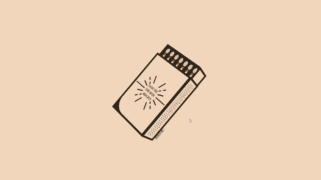
火柴盒动画(可复制源代码) 效果展示 640.gif图片 源代码 <!DOCTYPE html> <html lang="en"> <head> <meta charset="UTF-8"> <meta name="viewport" content="width=device-width, initial-scale=1.0"> <title>火柴盒动画</title> <style> @import url("https://fonts.googleapis.com/css?family=BenchNine:700&display=swap");:root{--color-outline:#302519;--color-background:#f1d6bc;--color-match:#b36b4a;--size-border:8px;--size-height:300px;--size-width:200px;--size-depth:100px}*{box-sizing:border-box;margin:0;padding:0;transition:all 0.3s ease}*:before,*:after{content:"";position:absolute}body{display:flex;justify-content:center;align-items:center;height:100vh;background:var(--color-background);font-family:"BenchNine",sans-serif}.container{width:500px;height:500px;position:relative;perspective:1200px;padding-left:80px;padding-top:180px}.box{width:var(--size-height);height:var(--size-width);position:absolute;transform-style:preserve-3d;transition:transform 0.5s;transform:rotate(-50deg) rotateX(30deg) translateZ(10px);cursor:pointer;transform-origin:center center}.box > div{position:absolute;text-align:center}.box .front,.box .back{width:var(--size-height);height:var(--size-width)}.box .front,.box .back{background:var(--color-background);border:var(--size-border) solid var(--color-outline)}.box .right,.box .left{width:var(--size-depth);height:var(--size-width)}.box .right,.box .left{left:var(--size-depth)}.box .top,.box .bottom{width:var(--size-height);height:var(--size-depth)}.box .top,.box .bottom{top:calc(var(--size-depth) / 2)}.box .right,.box .left,.box .top,.box .bottom{background:var(--color-background);border:var(--size-border) solid var(--color-outline);border-bottom-width:calc(var(--size-border) * 2)}.box .front{transform:translateZ(50px)}.box .back{transform:rotateX(-180deg) translateZ(50px)}.box .right{transform:rotateY(90deg) translateZ(150px)}.box .left{transform:rotateY(-90deg) translateZ(150px);background:var(--color-outline)}.box .top{transform:rotateX(90deg) translateZ(100px)}.box .bottom{transform:rotateX(-90deg) translateZ(100px);overflow:hidden;display:flex;justify-content:center;align-items:center}.box.outside .bottom:before{background-image:radial-gradient(var(--color-outline) 20%,transparent 20%),radial-gradient(var(--color-outline) 20%,transparent 20%);background-position:0 0,8px 8px;background-size:16px 16px;width:calc(100% - 20px);height:calc(100% - 22px)}.box.outside .front{z-index:1000}.box.outside .front:before{left:0;top:0;width:55px;height:55px;background:var(--color-outline);-webkit-mask-image:radial-gradient( circle 10px at 100% 100%,transparent 0,transparent 55px,var(--color-outline) 0px );mask-image:radial-gradient( circle 10px at 100% 100%,transparent 0,transparent 55px,var(--color-outline) 0px )}.box.outside .front:after{content:"Light the \A fire with \A matches";white-space:pre;font-size:16px;line-height:20px;letter-spacing:0.5px;color:var(--color-outline);text-transform:uppercase;transform:rotate(90deg);transform-origin:center center;background:var(--color-background);width:70px;height:84px;border-radius:50%;display:flex;justify-content:center;align-items:center;left:calc(50% - 35px);top:calc(50% - 42px)}.box.outside .front .line:nth-child(1),.box.outside .front .line:nth-child(2){position:absolute;display:flex;justify-content:center;align-items:center}.box.outside .front .line:nth-child(1){width:154px;height:120px;left:calc(50% - 77px);top:calc(50% - 60px)}.box.outside .front .line:nth-child(1):before{width:4px;height:140px;background:linear-gradient( to top,var(--color-outline),var(--color-outline) 10px,transparent 10px,transparent 16px,var(--color-outline) 16px,var(--color-outline) 124px,transparent 124px,transparent 130px,var(--color-outline) 130px,var(--color-outline) 140px )}.box.outside .front .line:nth-child(1):after{width:4px;height:174px;background-color:var(--color-outline);border-radius:4px;background:linear-gradient( to right,var(--color-outline),var(--color-outline) 10px,transparent 10px,transparent 16px,var(--color-outline) 16px,var(--color-outline) 158px,transparent 158px,transparent 164px,var(--color-outline) 164px,var(--color-outline) 174px )}.box.outside .front .line:nth-child(2){width:116px;height:106px;left:calc(50% - 58px);top:calc(50% - 53px);border-radius:50%}.box.outside .front .line:nth-child(2):before,.box.outside .front .line:nth-child(2):after{width:4px;height:140px;border-radius:4px;background:linear-gradient( to top,var(--color-outline),var(--color-outline) 14px,transparent 14px,transparent 22px,var(--color-outline) 22px,var(--color-outline) 118px,transparent 118px,transparent 126px,var(--color-outline) 126px,var(--color-outline) 140px )}.box.outside .front .line:nth-child(2):before{transform:rotate(-45deg)}.box.outside .front .line:nth-child(2):after{transform:rotate(45deg)}.box.outside .front .line:nth-child(3),.box.outside .front .line:nth-child(4){position:absolute;width:116px;height:106px;left:calc(50% - 58px);top:calc(50% - 53px);border-radius:50%;display:flex;justify-content:center;align-items:center}.box.outside .front .line:nth-child(3):before,.box.outside .front .line:nth-child(3):after,.box.outside .front .line:nth-child(4):before,.box.outside .front .line:nth-child(4):after{width:4px;border-radius:4px;background-color:var(--color-outline)}.box.outside .front .line:nth-child(3):before,.box.outside .front .line:nth-child(3):after{height:150px}.box.outside .front .line:nth-child(3):before{transform:rotate(67.5deg)}.box.outside .front .line:nth-child(3):after{transform:rotate(-67.5deg)}.box.outside .front .line:nth-child(4):before,.box.outside .front .line:nth-child(4):after{height:126px}.box.outside .front .line:nth-child(4):before{transform:rotate(22.5deg)}.box.outside .front .line:nth-child(4):after{transform:rotate(-22.5deg)}.box.inside .bottom:before,.box.inside .front:after,.box.inside .front:before{display:none}.box.inside .right{background-color:var(--color-outline)}.box.inside .back,.box.inside .front{width:var(--size-height);background-color:var(--color-outline);height:calc(var(--size-width) - calc(var(--size-border) * 1.5));margin-top:var(--size-border)}.box.inside .right,.box.inside .left{width:var(--size-depth);height:calc(var(--size-width) - calc(var(--size-border) * 1.5));background-color:var(--color-outline);left:var(--size-depth);top:var(--size-border)}.box.inside .left{opacity:0}.box.inside .top,.box.inside .bottom{width:var(--size-height);height:var(--size-depth)}.box.inside .bottom{top:calc(calc(var(--size-depth) / 2) + calc(var(--size-border) * -0.5));border-top-width:calc(var(--size-border) * 2)}.box.inside .top{background-color:var(--color-outline);top:calc(calc(var(--size-depth) / 2) + calc(var(--size-border) / 1))}.box.inside .front{background-color:transparent;display:flex;flex-direction:column;justify-content:space-around;align-items:flex-end;padding-right:30px}.box.inside .front .match{height:16px;width:200px;border:calc(var(--size-border) / 2) solid var(--color-outline);background-color:var(--color-background);position:relative}.box.inside .front .match:before{width:12px;height:100%;background-color:var(--color-match);right:0}.box.inside .front .match:after{height:16px;width:24px;background-color:var(--color-background);border:calc(var(--size-border) / 2) solid var(--color-outline);border-radius:50% 50% 50% 50% / 40% 50% 50% 40%;right:calc(-24px - calc(var(--size-border) / 2));top:calc((50% - 8px) - calc(var(--size-border) / 2));background-image:radial-gradient(var(--color-outline) 20%,transparent 20%),radial-gradient(var(--color-outline) 20%,transparent 20%);background-position:0 0,4px 4px;background-size:8px 8px}.box.inside{transform:translateX(55px) translateZ(-6px)}.box.inside .back{position:relative}.box.inside .back span{color:var(--color-outline);z-index:1000;position:absolute;top:0;left:calc(var(--size-border) * -6);margin-top:calc(var(--size-border) * -6);font-size:calc(var(--size-border) * 2);transform-origin:bottom center;transform:scaleY(-1);text-transform:uppercase;transition:opacity 0.2s linear 0.2s}.box:hover .box.inside .back span{opacity:0;transition:opacity 0.1s linear}.box:hover .box.inside{transform:translate(100px)}.box:hover{transform:rotate(-20deg) rotateX(35deg) rotateZ(-25deg)}.box:hover .box.inside .front{transform:translateZ(50px);transition:transform 0.2s ease}.box.inside .front{transform:translateZ(35px);border:none;transition:all 0.2s ease;transition-delay:0.3s}.box.inside .front .match{transition:all 0.2s ease;transition-delay:0.2s}.box:hover .box.inside .front .match{transition:all 0.3s ease-in}.box:hover .box.inside .front .match:nth-child(3){transform:translateX(20px)}.box:hover .box.inside .front .match:nth-child(4){transform:translateX(40px)}.box:hover .box.inside .front .match:nth-child(6){transform:translateX(70px)} </style> </head> <body> <div class="container"> <div class="box outside"> <div class="front"> <div class="line"></div> <div class="line"></div> <div class="line"></div> <div class="line"></div> </div> <div class="left"></div> <div class="top"></div> <div class="bottom"></div> <div class="box inside"> <div class="front"> <div class="match"></div> <div class="match"></div> <div class="match"></div> <div class="match"></div> <div class="match"></div> <div class="match"></div> <div class="match"></div> </div> <div class="back"><span>Hover Me~</span></div> <div class="right"></div> <div class="left"></div> <div class="top"></div> <div class="bottom"></div> </div> </div> </div> </body> </html>素材来源于网络,如侵删!
-
一个例子带着小白走进代码的世界——网页设计篇 在编程的世界里,每一行代码都如同构建数字世界的砖石,它们承载着逻辑、算法与创意,共同编织出软件与应用的宏伟蓝图。当你提出“帮我写段代码”的请求时,这不仅仅是一个简单的技术需求,更是一次深入探索编程艺术、解决实际问题或创造新事物的旅程。下面,我将以构建一个简单网页的JavaScript代码片段为例,带你走进编程的奇妙世界。 场景设定 假设我们需要创建一个简单的网页,该网页包含一个按钮,当用户点击这个按钮时,页面会显示当前的时间。这样的功能在日常生活中非常常见,比如显示新闻发布时间、用户登录时间等。接下来,我们将分步骤实现这一功能。 HTML结构 首先,我们需要定义网页的基本结构,即HTML部分。在这个例子中,我们将添加一个按钮(<button>)和一个用于显示时间的元素(<p>)。 <!DOCTYPE html> <html lang="en"> <head> <meta charset="UTF-8"> <meta name="viewport" content="width=device-width, initial-scale=1.0"> <title>显示时间</title> </head> <body> <button id="showTimeBtn">显示当前时间</button> <p id="timeDisplay">点击按钮查看时间</p> <!-- 引入JavaScript代码 --> <script src="script.js"></script> </body> </html>注意,<script src="script.js"></script>这一行告诉浏览器,JavaScript代码将存储在外部文件script.js中,这样做有助于保持HTML结构的清晰和JavaScript代码的可维护性。 JavaScript实现 接下来,我们在script.js文件中编写JavaScript代码,以实现点击按钮显示当前时间的功能。 // 获取按钮和时间显示元素的引用 const showTimeBtn = document.getElementById('showTimeBtn'); const timeDisplay = document.getElementById('timeDisplay'); // 为按钮添加点击事件监听器 showTimeBtn.addEventListener('click', function() { // 获取当前时间 const now = new Date(); // 格式化时间字符串 const formattedTime = now.toLocaleTimeString(); // 更新时间显示元素的内容 timeDisplay.textContent = formattedTime; });这段代码首先通过document.getElementById方法获取了页面上按钮和时间显示元素的引用。然后,使用addEventListener方法为按钮添加了一个点击事件监听器。当按钮被点击时,会执行一个匿名函数,该函数首先创建一个Date对象来获取当前时间,然后使用toLocaleTimeString方法将时间格式化为字符串(注意,这个时间格式会根据用户的地区设置有所不同),最后将这个格式化后的时间字符串设置为时间显示元素的文本内容。 深入理解 虽然这段代码看起来很简单,但它涵盖了JavaScript编程中的几个核心概念: DOM操作:通过document.getElementById等方法,我们可以访问和操作网页上的元素,这是JavaScript与HTML交互的基础。 事件监听:使用addEventListener方法可以为元素添加事件监听器,以便在特定事件发生时执行代码。这是实现交互式网页的关键。 日期和时间:Date对象提供了处理日期和时间的强大功能,包括获取当前时间、格式化时间等。 结论 通过上面的例子,我们不仅实现了一个简单的功能——点击按钮显示当前时间,还深入理解了JavaScript编程中的一些核心概念。编程不仅仅是编写代码,更是一种思考问题、解决问题的方式。
-
霓虹灯数字时钟(可复制源代码) nhd.gif图片 源码: <!DOCTYPE html> <html lang="en"> <head> <meta charset="UTF-8"> <meta name="viewport" content="width=device-width, initial-scale=1.0"> <title>霓虹灯数字时钟</title> <script src="https://cdnjs.cloudflare.com/ajax/libs/gsap/3.9.1/gsap.min.js"></script> <style> *{margin:0;padding:0;box-sizing:border}body{display:flex;justify-content:center;align-items:center;min-height:100vh;overflow:hidden;background:#2f363e}.clock{position:relative;width:280px;height:280px;display:flex;justify-content:center;align-items:center;scale:2;box-shadow:inset 5px 5px 25px rgba(0,0,0,0.25);border-radius:50%}#time{position:relative;width:250px;height:250px;display:flex;justify-content:center;align-items:center}#time .circle{position:absolute;display:flex;justify-content:center;align-items:center}#time .circle svg{position:relative;transform:rotate(270deg)}#time .circle:nth-child(1) svg{width:250px;height:250px}#time .circle:nth-child(2) svg{width:210px;height:210px}#time .circle:nth-child(3) svg{width:170px;height:170px}#time .circle svg circle{width:100%;height:100%;fill:transparent;stroke-width:5;stroke:var(--clr);transform:translate(5px,5px);opacity:0.25}#time .circle:nth-child(1) svg circle{stroke-dasharray:760;stroke-dashoffset:760}#time .circle:nth-child(2) svg circle{stroke-dasharray:630;stroke-dashoffset:630}#time .circle:nth-child(3) svg circle{stroke-dasharray:510;stroke-dashoffset:510}.dots{position:absolute;width:100%;height:100%;display:flex;align-items:flex-start;justify-content:center;z-index:10}.dots::before{content:"";position:absolute;top:-3px;width:15px;height:15px;background:var(--clr);border-radius:50%;box-shadow:0 0 20px var(--clr),0 0 40px var(--clr),0 0 60px var(--clr),0 0 80px var(--clr)}.niddles{position:absolute;width:200px;height:200px;border-radius:50%;display:flex;justify-content:center;align-items:flex-start;z-index:10}.niddles i{position:absolute;width:2px;background:var(--clr2);height:50%;opacity:0.75;border-radius:6px;transform-origin:bottom;transform:scaleY(0.5)}.niddles.niddles2{width:170px;height:170px;z-index:9}.niddles.niddles2 i{width:3px}.niddles.niddles3{width:140px;height:140px;z-index:8}.niddles.niddles3 i{width:4px}#time span{position:absolute;inset:55px;text-align:center;color:#999;font-family:Cambria,Cochin,Georgia,Times,"Times New Roman",serif;transform:rotate(calc(30deg * var(--i)))}#time span b{font-size:0.75em;font-weight:500;display:inline-block;transform:rotate(calc(-30deg * var(--i)))} </style> </head> <body> <div class="clock"> <div id="time"> <div class="circle" style="--clr:#ff2972"> <div class="dots sec_dot"></div> <svg> <circle cx="120" cy="120" r="120" id="ss"></circle> </svg> </div> <div class="circle" style="--clr:#fee800"> <div class="dots min_dot"></div> <svg> <circle cx="100" cy="100" r="100" id="mm"></circle> </svg> </div> <div class="circle" style="--clr:#04fc43"> <div class="dots hr_dot"></div> <svg> <circle cx="80" cy="80" r="80" id="hh"></circle> </svg> </div> <div class="niddles" style="--clr2:#ff2972;" id="sc"><i></i></div> <div class="niddles niddles2" style="--clr2:#fee800;" id="mn"><i></i></div> <div class="niddles niddles3" style="--clr2:#04fc43;" id="hr"><i></i></div> <span style="--i:1;"><b>1</b></span> <span style="--i:2;"><b>2</b></span> <span style="--i:3;"><b>3</b></span> <span style="--i:4;"><b>4</b></span> <span style="--i:5;"><b>5</b></span> <span style="--i:6;"><b>6</b></span> <span style="--i:7;"><b>7</b></span> <span style="--i:8;"><b>8</b></span> <span style="--i:9;"><b>9</b></span> <span style="--i:10;"><b>10</b></span> <span style="--i:11;"><b>11</b></span> <span style="--i:12;"><b>12</b></span> </div> </div> </body> <script> setInterval(()=>{let hh=document.getElementById("hh");let mm=document.getElementById("mm");let ss=document.getElementById("ss");let sec_dot=document.querySelector(".sec_dot");let min_dot=document.querySelector(".min_dot");let hr_dot=document.querySelector(".hr_dot");let hr=document.getElementById("hr");let mn=document.getElementById("mn");let sc=document.getElementById("sc");let h=new Date().getHours();let m=new Date().getMinutes();let s=new Date().getSeconds();hh.style.strokeDashoffset=510-(510*h)/12;mm.style.strokeDashoffset=630-(630*m)/60;ss.style.strokeDashoffset=760-(760*s)/60;sec_dot.style.transform=`rotateZ(${s*6}deg)`;min_dot.style.transform=`rotateZ(${m*6}deg)`;hr_dot.style.transform=`rotateZ(${h*30}deg)`;hr.style.transform=`rotateZ(${h*30}deg)`;mn.style.transform=`rotateZ(${m*6}deg)`;sc.style.transform=`rotateZ(${s*6}deg)`}); </script> </html>我的博客即将同步至腾讯云开发者社区,邀请大家一同入驻:https://cloud.tencent.com/developer/support-plan?invite_code=3c0nu17s7yck8
-
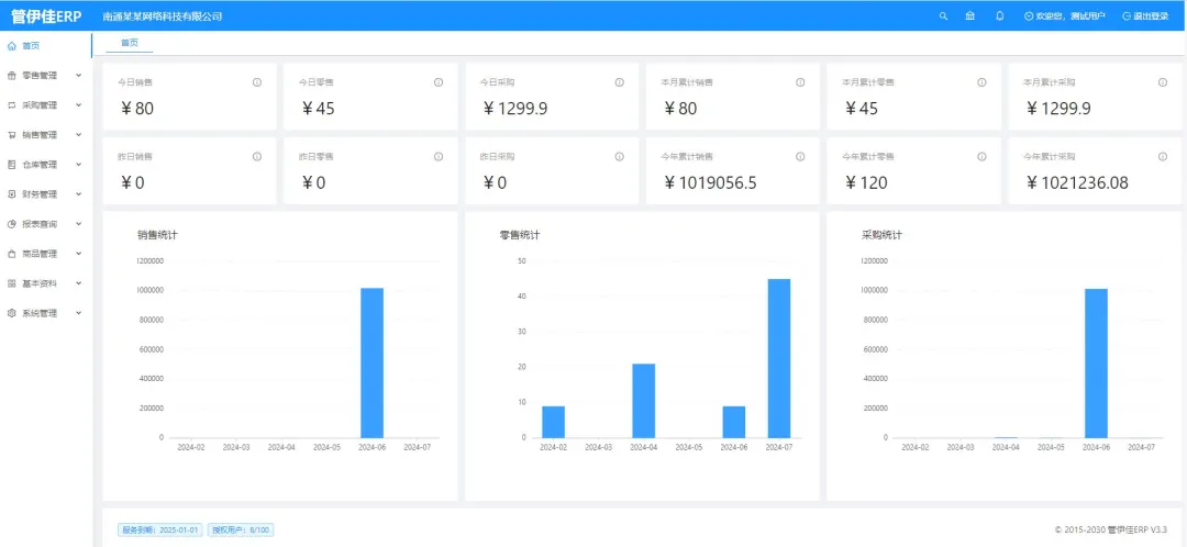
非常适合中小企业使用的开源ERP系统——JSH_ERP 今天,我想向大家推荐一个非常适合中小企业使用的开源ERP系统——JSH_ERP(原名:华夏ERP,英文名:jshERP)。这个项目不仅功能全面,还为开发者提供了极大的扩展和二次开发的空间。 2024-09-16T08:58:36.png图片 (首页) 项目概述 JSH_ERP 是一款基于 SpringBoot 和 Vue.js 的开源企业资源计划(ERP)系统,主要功能涵盖了进销存管理、财务管理以及生产管理。虽然目前功能集中在这些核心模块,但项目后续将推出更多完整的ERP功能。这个项目的开发初衷是为了帮助中小企业降低信息化成本,同时也为个人开发者提供了一个学习和二次开发的绝佳平台。 项目特点 1. 开源且灵活的架构 JSH_ERP 基于 SpringBoot 框架,结合 Mybatis 进行数据持久化,并且前端采用了流行的 Vue.js 框架和 Ant-Design-Vue 作为 UI 组件库。这种技术栈的选择不仅使得项目结构清晰、易于维护,同时也便于开发者根据需求进行二次开发。 2. 功能模块齐全 目前,JSH_ERP 主要提供以下功能模块: • 进销存管理:包括采购管理、销售管理、库存管理等,帮助企业高效管理供应链。 • 财务管理:实现了基本的财务报表功能,支持企业财务数据的录入和统计。 • 生产管理:覆盖了生产计划、生产进度等功能,适合制造业企业。 3. 前后端分离 JSH_ERP 采用前后端分离的架构,这使得前端开发者和后端开发者可以并行工作,提升开发效率。此外,前端使用的 Vue.js 框架与流行的单页应用(SPA)设计模式也使得用户体验更加流畅。 4. 易于二次开发 对于有二次开发需求的企业或个人开发者来说,JSH_ERP 提供了非常友好的扩展能力。你可以根据自身需求,灵活地修改或增加模块功能,而不必担心破坏原有系统的稳定性。 5. 全面的技术支持 项目不仅提供了详细的用户手册和接口文档,还分享了视频教程和部署指南,极大地方便了开发者快速上手和项目的实际部署。 功能截图 2024-09-16T09:01:47.png图片 (零售管理) 2024-09-16T09:01:50.png图片 (采购管理) 2024-09-16T09:01:56.png图片 (销售管理) 2024-09-16T09:02:04.png图片 (仓库管理) 2024-09-16T09:02:10.png图片 (财务管理) 2024-09-16T09:02:14.png图片 (报表查询) 2024-09-16T09:02:19.png图片 (商品管理) 2024-09-16T09:02:24.png图片 (基本资料) 2024-09-16T09:02:29.png图片 (系统管理) 总结 总的来说,JSH_ERP 是一个功能强大且灵活的开源ERP系统,特别适合中小企业。对于开发者来说,它提供了足够的二次开发空间,可以根据自己的需求进行定制。项目的技术栈也非常现代化,前后端分离的架构使得开发过程更加顺畅。如果你正在寻找一个易于上手的开源ERP系统,那么 JSH_ERP 绝对值得一试。希望这篇文章能够帮助大家更好地理解和使用这个项目,如果你对这个项目有兴趣,别忘了给它点个Star 哦! 仓库地址:https://gitee.com/jishenghua/JSH_ERP 部署文档地址:https://www.kdocs.cn/l/skPA3WycWXxg

