找到
49
篇与
源码
相关的结果
- 第 3 页
-
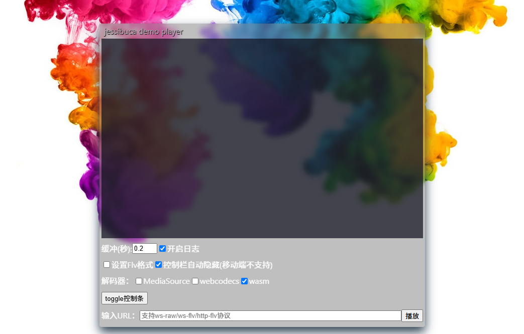
 一款开源的纯H5直播流播放器,兼容几乎所有浏览器 项目介绍 Jessibuca是一款开源的纯H5直播流播放器,它通过Emscripten技术将音视频解码库编译成JavaScript(WebAssembly)运行于浏览器之中。这款播放器兼容几乎所有浏览器,并能在PC、手机、微信等平台上无缝运行,无需用户安装任何额外插件。 应用场景 在线直播:适用于各类在线直播场景,如教育直播、娱乐直播、体育赛事直播等。 视频监控:可用于远程视频监控,如安防监控、智能家居监控等。 点播服务:支持MP4和HLS格式的点播文件播放,适用于视频点播、影视播放等场景。 多媒体应用:可作为多媒体应用中的视频播放组件,集成到各类Web应用中。 功能模块 核心播放:负责音视频流的解码和播放。 协议支持:支持多种传输协议,包括http-flv、websocket-flv、websocket-raw等。 解码能力:支持H.264、H.265视频解码,以及AAC、PCMA、PCMU等音频解码。 UI组件:提供底部UI操作栏,支持播放/暂停、音量调节、截屏、录制等功能。 扩展功能:支持视频录制、多屏播放、加密流解密等高级功能。 功能特点 跨平台兼容:兼容所有主流浏览器,支持PC、手机、微信等多平台播放。 低延迟播放:可设置播放缓冲区时长,支持0缓冲极限低延迟播放。 智能丢帧:采用WASM智能不花屏丢帧技术,确保前台长时间播放不累积延迟。 多实例支持:可同时创建多个播放实例,满足多路视频播放需求。 协议丰富:同时支持http-flv、websocket-flv等多种协议,以及websocket-raw私有协议。 安全传输:支持HTTPS/WSS加密视频传输,保障视频内容安全。 移动端优化:手机浏览器内打开视频不会全屏播放,且长时间不会息屏。 硬件解码:支持WebCodecs和MediaSourceExtensions硬件解码,提升播放性能。 高级功能:支持视频录制、画面旋转、镜像、水印添加等高级功能。 项目技术栈 前端技术:HTML5、JavaScript、CSS3 音视频处理:Emscripten、WebAssembly、FFmpeg 网络通信:WebSocket、HTTP/HTTPS UI框架:自定义UI组件,适配H5移动端和Web端 性能优化:WebWorker多核解码、OffscreenCanvas、GZIP压缩 安全加密:HTTPS/WSS、M7S加密、国标SM4加密、XOR加密 功能演示 mbexcdjw.png图片 mbexcp5z.png图片 开源地址 隐藏内容,请前往内页查看详情
-
在Bootstrap中设置一天一次的自动弹窗功能 m7c281q5.png图片 在 Bootstrap v5.3.0 中实现一天显示一次的自动弹窗功能,可借助 JavaScript 操作 localStorage 或 cookie 来记录弹窗的显示状态,结合 Bootstrap 的模态框组件实现该功能。下面给出一个使用 localStorage 的示例代码: 引入必要的文件 确保在 HTML 文件中引入 Bootstrap 的 CSS 和 JavaScript 文件,同时引入 jQuery(因为示例代码使用了 jQuery 简化 DOM 操作)。 <!DOCTYPE html> <html lang="en"> <head> <meta charset="UTF-8"> <meta name="viewport" content="width=device-width, initial-scale=1.0"> <!-- 引入 Bootstrap CSS --> <link href="https://cdn.jsdelivr.net/npm/bootstrap@5.3.0/dist/css/bootstrap.min.css" rel="stylesheet"> <title>One-time Popup</title> </head> <body> <!-- 模态框 --> <div class="modal fade" id="myModal" tabindex="-1" aria-labelledby="exampleModalLabel" aria-hidden="true"> <div class="modal-dialog"> <div class="modal-content"> <div class="modal-header"> <h5 class="modal-title" id="exampleModalLabel">每日提示</h5> <button type="button" class="btn-close" data-bs-dismiss="modal" aria-label="Close"></button> </div> <div class="modal-body"> 这是每天仅显示一次的弹窗提示信息。 </div> <div class="modal-footer"> <button type="button" class="btn btn-secondary" data-bs-dismiss="modal">关闭</button> </div> </div> </div> </div> <!-- 引入 jQuery --> <script src="https://code.jquery.com/jquery-3.6.0.min.js"></script> <!-- 引入 Bootstrap JavaScript --> <script src="https://cdn.jsdelivr.net/npm/bootstrap@5.3.0/dist/js/bootstrap.bundle.min.js"></script> <script> $(document).ready(function () { // 获取当前日期 const currentDate = new Date().toLocaleDateString(); // 从 localStorage 中获取上次显示弹窗的日期 const lastShownDate = localStorage.getItem('lastPopupDate'); if (lastShownDate !== currentDate) { // 如果上次显示日期与当前日期不同,则显示模态框 const myModal = new bootstrap.Modal(document.getElementById('myModal')); myModal.show(); // 更新 localStorage 中的日期 localStorage.setItem('lastPopupDate', currentDate); } }); </script> </body> </html>代码解释 HTML 部分: 创建了一个 Bootstrap 模态框,其 id 为 myModal,用于显示弹窗内容。 模态框包含标题、主体内容和底部的关闭按钮。 JavaScript 部分: 页面加载完成后,使用 $(document).ready() 函数执行代码。 获取当前日期并转换为字符串格式。 从 localStorage 中获取上次显示弹窗的日期。 若上次显示日期与当前日期不同,使用 bootstrap.Modal 实例化模态框并调用 show() 方法显示模态框。 将当前日期存储到 localStorage 中,以便下次访问时进行比较。 注意事项 兼容性:localStorage 在现代浏览器中得到广泛支持,但在旧版本浏览器中可能存在兼容性问题。若需要支持旧版本浏览器,可考虑使用 cookie 替代。 数据清除:localStorage 中的数据不会自动过期,若要清除数据,可手动调用 localStorage.removeItem('lastPopupDate') 或使用 localStorage.clear() 清除所有数据。
-
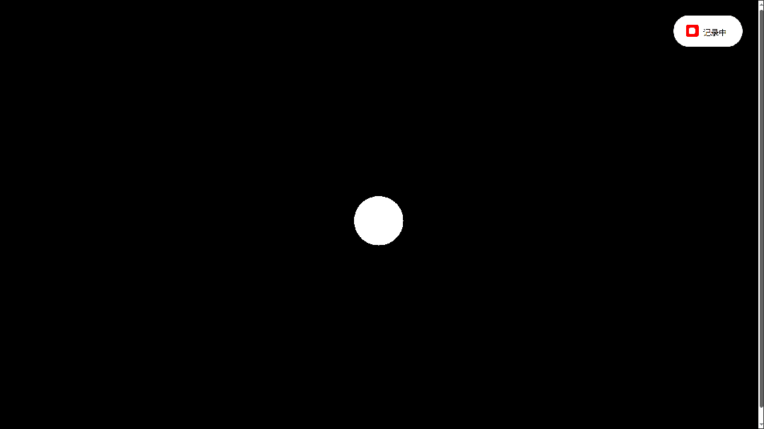
有趣的倒计时(可复制源代码) 比较有趣的倒计时效果,像贪吃蛇一样。 640.gif图片 <!DOCTYPE html> <html lang="en"> <head> <meta charset="UTF-8"> <meta name="viewport" content="width=device-width, initial-scale=1.0"> <title>有趣的倒计时</title> <script src="https://cdnjs.cloudflare.com/ajax/libs/gsap/3.9.1/gsap.min.js"></script> <script src="https://libs.baidu.com/jquery/2.1.4/jquery.min.js"></script> <style> body{height:100vh;display:flex;align-items:center;justify-content:center;background:#000000}.svg{width:400px}@media (max-height:400px){.svg{width:250px}}.svg .paths{display:none}.svg .circle{fill:#ffffff}.svg.gooey .circles{}.controller{position:fixed;top:20px;right:20px;color:#000;font-family:sans-serif;font-size:10px;text-transform:uppercase;padding:15px 20px 12px 15px;background:#fff;border-radius:20px}@media (max-height:400px){.controller{top:10px;right:10px}}.controller span{display:inline-block;position:relative;z-index:1}.controller span:before{content:"";position:absolute;top:-3px;left:-22px;width:16px;height:16px;background:red;border-radius:3px;-webkit-user-select:none;-moz-user-select:none;-ms-user-select:none;user-select:none;cursor:pointer}.controller span:after{content:"";background:#fff;position:absolute;z-index:1;top:1px;left:-18px;width:8px;height:8px;border-radius:2px;opacity:0;transition:opacity 0.2s ease-out}.controller input{opacity:0.01;height:0}.controller input:checked+span:after{opacity:1} </style> </head> <body> <svg viewbox="0 0 256 256" class="svg gooey"> <defs> <filter id="filter"> <fegaussianblur in="SourceGraphic" stddeviation="10" result="blur"></fegaussianblur> <fecolormatrix in="blur" mode="matrix" values="1 0 0 0 0 0 1 0 0 0 0 0 1 0 0 0 0 0 20 -14" result="filter"></fecolormatrix> <fecomposite in="SourceGraphic" in2="filter" operator="atop"></fecomposite> </filter> </defs> <g class="paths"> <path id="path_0" class="path" d="M185,131.2c0,25.5-5.1,45.6-15.4,60.3c-10.3,14.7-24.1,22-41.7,22c-17.5,0-31.4-7.3-41.5-22 c-10.1-14.7-15.2-34.8-15.2-60.3v-6.6c0-25.5,5.1-45.7,15.2-60.4C96.6,49.4,110.4,42,128,42c17.5,0,31.4,7.4,41.7,22.1 c10.3,14.8,15.4,34.9,15.4,60.4V131.2z"></path> <path id="path_1" class="path" d="M87.9,79.2c1.1-0.4,53.7-39.2,54.9-39.1v180.5"></path> <path id="path_2" class="path" d="M81.7,85.7c-1.4-67,112.3-55.1,90.2,11.6c-12.6,32-70.6,83.7-88.8,113.7h105.8"></path> <path id="path_3" class="path" d="M74.8,178.5c3,39.4,63.9,46.7,88.6,23.7c34.3-35.1,5.4-75.8-41.7-77c29.9,5.5,68.7-43.1,36.5-73.7 c-23.4-21.5-76.5-11.1-78.6,25"> </path> <path id="path_4" class="path" d="M161.9,220.8 161.9,41 72.6,170.9 208.2,170.9"></path> <path id="path_5" class="path" d="M183.2,43.7H92.1l-10,88.3c0,0,18.3-21.9,51-21.9s49.4,32.6,49.4,48.2c0,22.2-9.5,57-52.5,57 s-51.4-36.7-51.4-36.7"></path> <path id="path_6" class="path" d="M177.4,71.6c0,0-4.3-30.3-44.9-30.3s-57.9,45.6-57.9,88.8s9,86.5,56.2,86.5 c38.9,0,50.9-22.3,50.9-60.9c0-17.6-21-44.9-48.2-44.9c-36.2,0-55.2,29.6-55.2,58.2"></path> <path id="path_7" class="path" d="M73.3,43.7 177.7,43.7 97.9,220.6 "></path> <path id="path_8" class="path" d="M126.8,122.8c0,0,48.2-1.3,48.2-42.2s-48.2-39.9-48.2-39.9s-45.9,0-45.9,40.9 c0,20.5,18.8,41.2,46.9,41.2c29.6,0,54.9,18,54.9,47.2c0,0,2,44.9-54.2,44.9c-55.5,0-54.2-43.9-54.2-43.9s-0.3-47.9,53.6-47.9"> </path> <path id="path_9" class="path" d="M78.9,186.3c0,0,4.3,30.3,44.9,30.3s57.9-45.6,57.9-88.8s-9-86.5-56.2-86.5 c-38.9,0-50.9,22.3-50.9,60.9c0,17.6,21,44.9,48.2,44.9c36.2,0,55.2-29.6,55.2-58.2"> </path> </g> <g class="circles"></g> </svg> <div class="controller"> <label><input id="gooey" type="checkbox" checked=""> <span>记录中</span></label> </div> <a href="https://smalltool.github.io/" style="display:none;"></a> </body> <script> const $svg=document.querySelector('.svg');const $gooey=document.querySelector('#gooey');$gooey.addEventListener('change',()=>{$svg.classList.toggle('gooey')});const opts={num:31,radius:20};const init=()=>{const circles=document.querySelector('.circles');const namespace='http://www.w3.org/2000/svg';for(let i=0;i<opts.num;i++){const circle=document.createElementNS(namespace,'circle');circle.classList.add('circle');circle.setAttribute('r',opts.radius);circle.setAttribute('cx',128);circle.setAttribute('cy',128);circles.appendChild(circle)}let n=10;setInterval(()=>{n=n-1;animate(n);if(n===0)n=10},1200)};init();const animate=n=>{const paths=document.querySelectorAll('.path');const circles=document.querySelectorAll('.circle');if(!paths[n])return;const length=paths[n].getTotalLength();const step=length/opts.num;for(let i=0;i<opts.num;i++){const{x,y}=paths[n].getPointAtLength(i*step);gsap.to(circles[i],{cx:x,cy:y,ease:'power3.out',fill:i%2===0?'red':'white',delay:i*0.024})}};animate(); </script> </html>
-
真强啊!纯 CSS 撸一个小黄人 2024-10-18T15:26:54.png图片 这样的小黄人,谁不喜欢呢? 源代码 <!DOCTYPE html> <html lang="zh"> <head> <meta charset="UTF-8"> <meta name="viewport" content="width=device-width, initial-scale=1.0"> <title></title> </head> <style> body{display:flex;justify-content:center;margin-top:200px;background-color:#fff;} :before, :after { content:""; position:absolute; } .container { max-width:550px; padding:0; margin:0 auto; min-height:450px; display:inline; perspective:800px; perspective-origin:50% 50%; } .minion { position:absolute; top:calc(48% - (250px / 2)); left:calc(50% - (140px / 2)); height:250px; width:140px; } .minion * { position:absolute; } .minion .hair { top:-15px; margin:0; padding:0; } .minion .hair.back li:nth-of-type(1) { transform:rotate(-70deg); margin-top:36px; } .minion .hair.back li:nth-of-type(2) { transform:rotate(-50deg); margin-top:19px; } .minion .hair.back li:nth-of-type(3) { transform:rotate(-30deg); margin-top:12px; } .minion .hair.back li:nth-of-type(4) { transform:rotate(-10deg); margin-top:3px; } .minion .hair.back li:nth-of-type(5) { transform:rotate(2deg); border-left:1px solid #333333; border-radius:80% 0 0 0; } .minion .hair.back li:nth-of-type(6) { transform:rotate(10deg); margin-top:3px; } .minion .hair.back li:nth-of-type(7) { transform:rotate(30deg); margin-top:12px; } .minion .hair.back li:nth-of-type(8) { transform:rotate(50deg); margin-top:19px; } .minion .hair.back li:nth-of-type(9) { transform:rotate(70deg); margin-top:36px; } .minion .hair.front { margin-top:3px; z-index:4; } .minion .hair.front li:nth-of-type(1) { transform:rotate(-60deg); margin-top:21px; } .minion .hair.front li:nth-of-type(2) { transform:rotate(-46deg); margin-top:12px; } .minion .hair.front li:nth-of-type(3) { transform:rotate(-28deg); margin-top:7px; } .minion .hair.front li:nth-of-type(4) { transform:rotate(-12deg); margin-top:5px; } .minion .hair.front li:nth-of-type(5) { transform:rotate(-2deg); border-right:1px solid #333333; border-radius:0 80% 0 0; margin-top:3px; } .minion .hair.front li:nth-of-type(6) { transform:rotate(12deg); margin-top:6px; } .minion .hair.front li:nth-of-type(7) { transform:rotate(28deg); margin-top:7px; } .minion .hair.front li:nth-of-type(8) { transform:rotate(46deg); margin-top:12px; } .minion .hair.front li:nth-of-type(9) { transform:rotate(60deg); margin-top:21px; } .minion .hair li { list-style:none; height:30px; width:10px; float:left; } .minion .hair li:nth-of-type(n+6) { border-left:1px solid #333333; border-radius:80% 0 0 0; } .minion .hair li:nth-of-type(-n+4) { border-right:1px solid #333333; border-radius:0 80% 0 0; } .minion .minody { position:relative; height:250px; width:140px; border-radius:80px 80px 50px 50px; background:#FFCB4F; overflow:hidden; } .minion .minody:after, .minion .minody:before { top:0; left:0; } .minion .minody:before { width:80%; height:100%; border-radius:20px; background-image:radial-gradient(rgba(250, 250, 250, 0.6) 0%, rgba(250, 250, 250, 0) 60%); filter:blur(5px); z-index:1; left:-10px; } .minion .minody:after { height:250px; width:140px; border-radius:80px 80px 50px 50px; background-image:linear-gradient(left, rgba(0, 0, 0, 0) 70%, rgba(0, 0, 0, 0.2) 100%); filter:blur(5px); z-index:1; } .minion .minody .dunfrt { bottom:0; height:90px; width:140px; overflow:hidden; border-top:1px solid #4883b8; } .minion .minody .dunfrt:before { left:-30px; border-radius:0 0 35% 0; box-shadow:40px -40px 30px 40px #6D9CC6; } .minion .minody .dunfrt:after { right:-30px; box-shadow:-40px -40px 30px 40px #6D9CC6; border-radius:0 0 0 35%; } .minion .minody .dunfrt:before, .minion .minody .dunfrt:after { width:56px; height:75%; top:0; border:1px solid #4883b8; } .minion .minody .dunpet { bottom:35px; left:50%; margin-left:-17.5px; height:35px; width:35px; border-radius:0 0 15px 15px; border-left:1px solid #4883b8; border-right:1px solid #4883b8; border-bottom:1px solid #4883b8; } .minion .minody .dunpet:before { top:-13px; left:-2px; height:15px; width:37px; border-bottom:1px solid #4883b8; border-left:1px solid transparent; border-right:1px solid transparent; border-radius:20px; } .minion .minody .dunpet .logo { top:50%; left:50%; margin-left:-12.5px; margin-top:-10.5px; height:25px; width:25px; background:#333333; border-radius:50%; } .minion .minody .dunpet .logo:before { top:50%; left:50%; margin-left:-7.5px; margin-top:-7.5px; height:15px; width:15px; background:#6D9CC6; transform:rotate(45deg); } .minion .minody .dunpet .logo:after { top:50%; left:50%; margin-left:-3.5px; margin-top:-3.5px; height:7px; width:7px; background:#333333; border-radius:50%; z-index:5; } .minion .minody .dunpet .logo span { height:2px; background:#333333; border-bottom:1px solid #6D9CC6; width:12.5px; right:0; top:48%; margin-top:-1px; z-index:6; } .minion .minody .dunbtm { bottom:0; height:40px; width:140px; background-color:#6d9cc6; background-image:linear-gradient(top, #6d9cc6 45%, #4b6587 100%); border-top:1px solid #4883b8; } .minion .minody .dunsap { top:127px; height:60px; width:12px; background:#6D9CC6; border:1px solid #4883b8; } .minion .minody .dunsap.left { left:5px; transform:rotate(-65deg); } .minion .minody .dunsap.right { right:5px; transform:rotate(65deg); } .minion .minody .dunsap .button { bottom:0; left:2px; height:8px; width:8px; border-radius:50%; background:#333333; } .minion .hair li:nth-of-type(1) { transform:rotate(-70deg); position:absolute; left:8px; height:30px; } .minion .hair li:nth-of-type(2) { transform:rotate(-50deg); left:18px; } .minion .hair li:nth-of-type(3) { transform:rotate(-30deg); left:30px; } .minion .hair li:nth-of-type(4) { transform:rotate(-10deg); left:45px; } .minion .hair li:nth-of-type(5) { left:60px; } .minion .hair li:nth-of-type(6) { transform:rotate(10deg); left:76px; } .minion .hair li:nth-of-type(7) { transform:rotate(30deg); left:93px; } .minion .hair li:nth-of-type(8) { transform:rotate(50deg); left:107px; } .minion .hair li:nth-of-type(9) { transform:rotate(70deg); left:119px; height:30px; } .minion .gorap { top:68px; height:3px; background:black; width:16px; z-index:6; } .minion .gorap.left { left:-2px; } .minion .gorap.left:before, .minion .gorap.left:after { border-right:16px solid #444444; } .minion .gorap.right { right:-2px; } .minion .gorap.right:before, .minion .gorap.right:after { border-left:16px solid #444444; } .minion .gorap:before, .minion .gorap:after { height:6px; } .minion .gorap:before { top:-7px; border-top:2px solid transparent; } .minion .gorap:after { top:3px; border-bottom:2px solid transparent; } .minion .gorlnk { top:58px; height:25px; width:5px; background:#999999; z-index:7; } .minion .gorlnk.left { left:12px; } .minion .gorlnk.right { right:12px; } .minion .gofme { top:40px; height:50px; width:50px; border:5px solid #CCCCCC; border-radius:50%; overflow:hidden; z-index:8; } .minion .gofme.left { left:30%; margin-left:-30px; } .minion .gofme.left .goggle { left:-1px; } .minion .gofme.left .goggle .pupil { right:40%; } .minion .gofme.right { right:30%; margin-right:-30px; } .minion .gofme.right .goggle { right:-1px; } .minion .gofme.right .goggle .pupil { left:40%; } .minion .gofme .goggle { height:50px; width:50px; border:3px solid #666666; border-radius:50%; } .minion .gofme .goggle .eye { background:whitesmoke; height:46px; width:50px; border-radius:50%; margin:1px 0; box-shadow:inset 0px 2px 10px 0px rgba(51, 51, 51, 0.5), inset 0px -1px 5px 0px rgba(51, 51, 51, 0.3); } .minion .gofme .goggle .eye .pupil { top:50%; margin:-7.5px; height:15px; width:15px; background-color:#e7a452; background-image:radial-gradient(#e7a452 0%, #91695c 49%, #91695c 74%, #000000 99%); border-radius:50%; } .minion .gofme .goggle .eye .pupil .dot { top:50%; left:50%; margin-top:-2.5px; margin-left:-2.5px; height:5px; width:5px; background:#333333; border-radius:50%; } .minion .gogdow { height:75px; top:45px; border-radius:50%; background-image:radial-gradient(rgba(0, 0, 0, 0.8) 0%, rgba(0, 0, 0, 0) 50%); z-index:5; } .minion .gogdow.left { left:5px; width:130px; } .minion .gogdow.right { left:55px; width:100px; } .minion .mouth { top:110px; left:50%; margin-left:-30px; height:20px; width:60px; border-bottom:2px solid #DE9A33; border-right:1px solid tranparent; border-left:1px solid tranparent; border-radius:70%; z-index:5; box-shadow:inset 0 -1px 2px -1px rgba(0, 0, 0, 0.3); } .minion .arm { top:160px; height:80px; width:12px; z-index:-1; background:#FFCB4F; overflow:hidden; } .minion .arm.left { left:-12px; border-radius:20px 0 0 20px / 80px 0 0 20px; transform:rotate(0deg); } .minion .arm.left:before { background-image:linear-gradient(left, rgba(250, 250, 250, 0.3) 20%, rgba(0, 0, 0, 0) 100%); } .minion .arm.right { right:-12px; border-radius:0 20px 20px 0 / 0 80px 20px 0; transform:rotate(0deg); } .minion .arm.right:before { background-image:linear-gradient(left, rgba(0, 0, 0, 0.2) 0%, rgba(0, 0, 0, 0) 90%); } .minion .arm:before { height:100%; width:100%; filter-gradient:#000000, #000000, horizontal; } .minion .shoe { bottom:-26px; width:30px; height:10px; background:#222222; z-index:-2; } .minion .shoe.left { right:74px; border-radius:50px 20px 15px 10px; transform:rotate(-3deg); } .minion .shoe.left:before { right:0px; } .minion .shoe.left:after { right:0; border-radius:10px 0 0 10px; } .minion .shoe.right { left:74px; border-radius:20px 50px 10px 15px; transform:rotate(3deg); } .minion .shoe.right:before { left:0px; } .minion .shoe.right:after { left:0; border-radius:0 10px 10px 0; } .minion .ardow { top:180px; height:30px; width:5px; border-radius:50%; } .minion .ardow.left { left:0px; box-shadow:inset 2px 0 3px -1px rgba(0, 0, 0, 0.3); transform:rotate(5deg); } .minion .ardow.right { right:0px; box-shadow:inset -2px 0 3px -1px rgba(0, 0, 0, 0.3); transform:rotate(-5deg); } .minion .glove { bottom:0; width:17px; height:18px; background:#333333; border-radius:0 0 30px 30px; } .minion .glove:before { bottom:0px; height:20px; width:10px; background:#333333; border-radius:0 0 20px 20px; } .minion .glove:after { bottom:-4px; height:20px; width:10px; background:#333333; border-radius:0 0 20px 20px; } .minion .glove .finger { bottom:-6px; height:20px; width:10px; background:#333333; border-radius:0 0 20px 20px; z-index:10; } .minion .wrist { height:30px; width:16px; border-radius:40%; } .minion .wrist.front { bottom:15px; border-bottom:5px solid #333333; border-right:5px solid transparent; border-left:5px solid transparent; } .minion .wrist.back { bottom:-11px; border-top:5px solid #333333; border-right:5px solid transparent; border-left:5px solid transparent; z-index:-2; } .minion .wrist.left { left:-19px; } .minion .wrist.right { right:-19px; } .minion .leg { bottom:-15px; height:15px; width:25px; background:#4B6587; z-index:-1; border-left:1px solid #4883b8; border-right:1px solid #4883b8; } .minion .leg.left { left:40px; border-radius:0 0 10% 20% / 0 0 80% 80%; } .minion .leg.left:after { transform:rotate(55deg); left:-12px; } .minion .leg.right { right:40px; border-radius:0 0 20% 10% / 0 0 80% 80%; } .minion .leg.right:after { transform:rotate(-55deg); right:-12px; } .minion .leg:after { top:-10px; background:#4B6587; height:10px; width:20px; border-bottom:1px solid #4883b8; } .minion .glove.left { left:-14px; transform:rotate(-10deg); } .minion .glove.left:before { left:-2px; transform:rotate(20deg); } .minion .glove.left:after { left:13px; transform:rotate(-30deg); } .minion .glove.left .finger { left:5px; transform:rotate(0deg); } .minion .glove.right { right:-14px; transform:rotate(10deg); } .minion .glove.right:before { right:-2px; transform:rotate(-20deg); } .minion .glove.right:after { right:13px; transform:rotate(30deg); } .minion .glove.right .finger { right:5px; transform:rotate(0deg); } .minion .shoe:before { top:-10px; height:15px; width:22px; background:#222222; } .minion .shoe:after { bottom:-3px; height:3px; width:30px; background-image:linear-gradient(top, #666666 0%, #222222 58%); } .minion .shadow { bottom:-38px; left:-10%; width:140%; height:30px; background:radial-gradient(rgba(0, 0, 0, 0.4), rgba(0, 0, 0, 0.1) 40%, rgba(0, 0, 0, 0) 50%); z-index:-5; } </style> <body> <div class="container"> <div class="minion"> <ul class="hair back"> <li></li> <li></li> <li></li> <li></li> <li></li> <li></li> <li></li> <li></li> <li></li> </ul> <div class="minody"> <div class="dunbtm"></div> <div class="dunfrt"></div> <div class="dunpet"> <div class="logo"><span></span></div> </div> <div class="dunsap left"> <div class="button"></div> </div> <div class="dunsap right"> <div class="button"></div> </div> </div> <ul class="hair front"> <li></li> <li></li> <li></li> <li></li> <li></li> <li></li> <li></li> <li></li> <li></li> </ul> <div class="gorap left"></div> <div class="gorap right"></div> <div class="gorlnk left"></div> <div class="gorlnk right"></div> <div class="gofme left"> <div class="goggle"> <div class="eye"> <div class="pupil"> <div class="dot"></div> </div> </div> </div> </div> <div class="gofme right"> <div class="goggle"> <div class="eye"> <div class="pupil"> <div class="dot"></div> </div> </div> </div> </div> <div class="gogdow left"></div> <div class="gogdow right"></div> <div class="mouth"></div> <div class="ardow left"></div> <div class="ardow right"></div> <div class="arm left"></div> <div class="arm right"></div> <div class="glove left"> <div class="finger"></div> </div> <div class="glove right"> <div class="finger"></div> </div> <div class="wrist front left"></div> <div class="wrist front right"></div> <div class="wrist back left"></div> <div class="wrist back right"></div> <div class="leg left"></div> <div class="leg right"></div> <div class="shoe left"></div> <div class="shoe right"></div> <div class="shadow"></div> </div> </div> </body> <script type="module"> </script> </html>
-
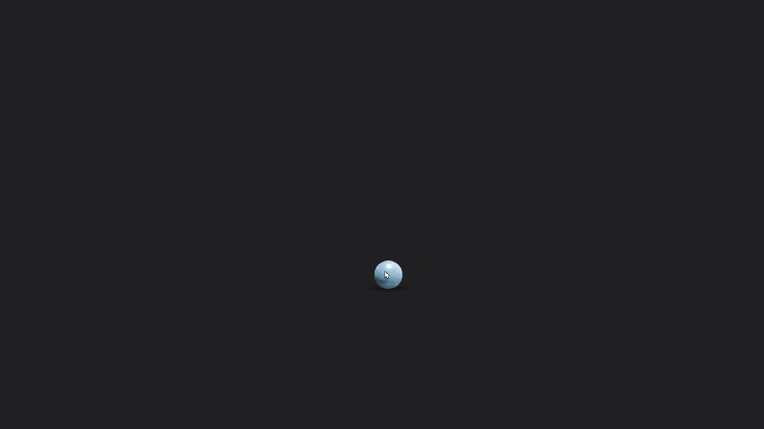
跟屁球(可复制源代码) 640.gif图片 小球会跟着鼠标移动,很有趣的效果。 源代码 <!DOCTYPE html> <html lang="en"> <head> <meta charset="UTF-8"> <meta name="viewport" content="width=device-width, initial-scale=1.0"> <title>跟屁球</title> <script src="https://cdnjs.cloudflare.com/ajax/libs/gsap/3.9.1/gsap.min.js"></script> <script src="https://libs.baidu.com/jquery/2.1.4/jquery.min.js"></script> <style> html,body{width:100%;height:100%;background:#202022;overflow:hidden}*{position:absolute;user-select:none} </style> </head> <body> <div class="ball"> <div class="marble"> <img class="lighting lighting1" draggable="false" src="https://assets.codepen.io/721952/marbleLighting.png" width="120" height="120"> <img class="lighting lighting2" draggable="false" src="https://assets.codepen.io/721952/marbleLighting.png" width="120" height="120"> </div> <div class="shadow"></div> </div> </body> <script> gsap.timeline().set('.ball',{scale:0.5,width:100,height:100,borderRadius:'50%',xPercent:-50,yPercent:-50}).set('.marble',{background:'url("https://assets.codepen.io/721952/marble.jpg") center',width:'100%',height:'100%',borderRadius:'50%',overflow:'hidden'}).set('.lighting',{left:'50%',top:'50%',xPercent:-50,yPercent:-50}).set('.lighting2',{mixBlendMode:'multiply',opacity:0.7}).set('.lighting1',{mixBlendMode:'overlay'}).set('.shadow',{width:'100%',height:'100%',scaleX:2.2,background:'radial-gradient(circle at 50% 60%, rgba(0, 0, 0, 0.4), rgba(0, 0, 0, 0.1) 40%, rgba(0, 0, 0, 0) 50%)'}).from('.ball',{autoAlpha:0,duration:0.5});let pos={x:window.innerWidth/2,y:window.innerHeight+500};let mouse={x:pos.x,y:window.innerHeight/2};let speed=0.05;let xSet=gsap.quickSetter(".ball","x","px");let ySet=gsap.quickSetter(".ball","y","px");let bgSet=gsap.quickSetter(".marble","backgroundPosition","");let lightRotSet=gsap.quickSetter(".lighting","rotation","deg");let lightYSet=gsap.quickSetter(".lighting","y","px");window.addEventListener("mousemove",e=>{mouse.x=e.x;mouse.y=e.y;});gsap.ticker.add(()=>{pos.x+=(mouse.x-pos.x)*speed;pos.y+=(mouse.y-pos.y)*speed;xSet(pos.x);ySet(pos.y);bgSet(pos.x+'px '+pos.y+'px');lightRotSet(-80+60*pos.x/window.innerWidth);lightYSet(-6+17*pos.y/window.innerHeight);gsap.set('.shadow',{x:35-70*pos.x/window.innerWidth,scaleY:0.2+0.3*pos.y/window.innerHeight,y:50-7*pos.y/window.innerHeight})}); </script> </html>